I have seen awesome visualizations about MTA Turnstile Data from Chris Whong’s visualization and I wondered if similar stuff can be done with Shiny.
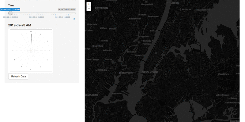
With limited css and JS knowledge, I have managed to get an 'Animated' leaflet map that shows whether a lot of people are entering a metro station in NYC at different times of the week from 02-23-2019 to 03-01-2019. The data can be found here.
The link to the app is: https://tiger-tang.shinyapps.io/NYC_MTA/.
The RStudio Cloud link is: Posit Cloud.
Vis insights:
- The dots are representing the number of people entering the specific station. (Blue < Pink < Red < Orange)
- The size of the dots reflect the number of people too.
- The map background will change from day to night and night to day according to the average time of the sunrise and sunset of that week.
- See that less people are using metro at mid night and much more people are using it at rush hour. See the size of the circle during weekend vs weekdays.
Behind the scenes:
- The slider input with a play button made the animation possible.
- The clock is made with ggplot.
- RenderCachePlot was used for faster generation with the clock.
- Promises were used with data update.