I want to simulate some data to use for the estimation of the elasticities of the linearized cobb douglas production function. I only have a problem when plotting my results. After adding the line of regression the scatterplot seems to change. I fixed the ranges of the x and y axis so this cannot be a result of changing the scales.
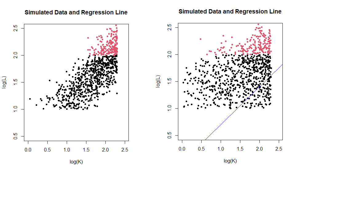
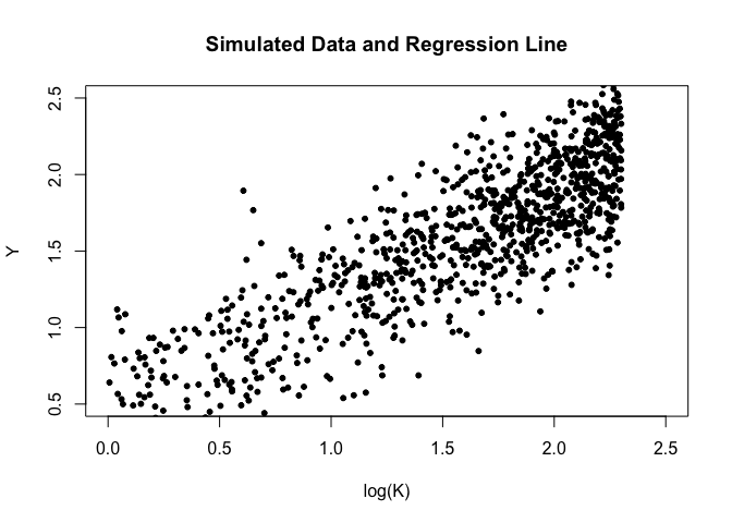
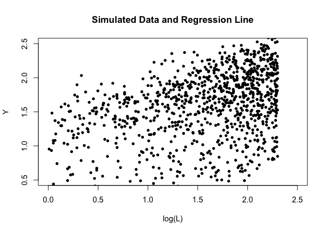
On the left the plot before adding abline, on the right after adding abline
# Set the true values of the parameters and number of simulations
alpha <- 0.7
beta <- 0.3

n <- 1000

# Generate random values for the inputs (capital and labor)
K <- runif(n, min = 1, max = 10)
L <- runif(n, min = 1, max = 10)

Y <- alpha*log(K) + beta*log(L)

# Add some normally distributed noise to the output
epsilon <- rnorm(n, mean = 0, sd = 0.2)
Y <- Y + epsilon

# Fit a linear regression model to the simulated data and plot
model <- lm(Y ~ log(K) + log(L)+0)

plot(Y ~ log(K) + log(L), main = "Simulated Data and Regression Line",
     xlab = "log(K)", ylab = "log(L)", pch = 20, col = Y, xlim = range(0,2.5), ylim = range(0.5,2.5))
abline(model, col = "blue")
summary(model)
I believe that the way i plotted it putting in a regression line does not make much sense. I try to represent the line Y'=alphalog(K)+betalog(L) in this graph , since the value for Y is encoded (or at least i tried to) in the color, or not at all on the plot itself.
This is what I get without manually setting the X and Y axis labels to log(K) and log(L), respectively:
# Set the true values of the parameters and number of simulations
alpha <- 0.7
beta <- 0.3
n <- 1000
# Generate random values for the inputs (capital and labor)
K <- runif(n, min = 1, max = 10)
L <- runif(n, min = 1, max = 10)
Y <- alpha*log(K) + beta*log(L)
# Add some normally distributed noise to the output
epsilon <- rnorm(n, mean = 0, sd = 0.2)
Y <- Y + epsilon
# Fit a linear regression model to the simulated data and plot
model <- lm(Y ~ log(K) + log(L) + 0)
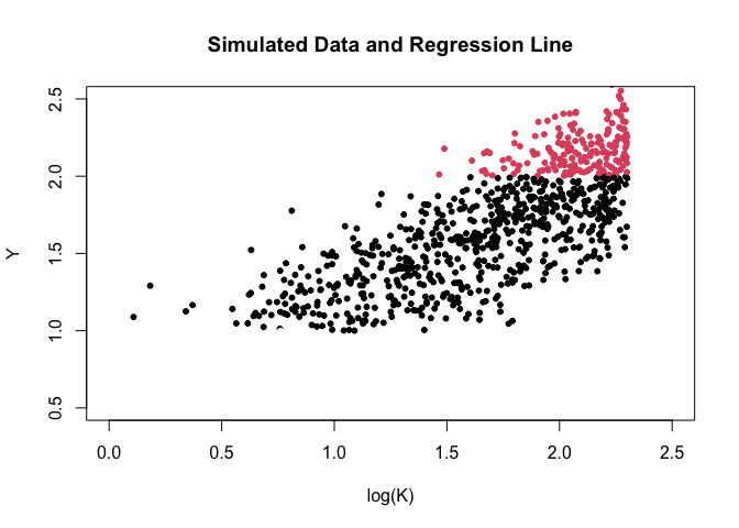
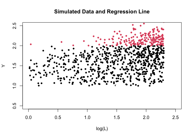
plot(Y ~ log(K) + log(L), main = "Simulated Data and Regression Line",
pch = 20, col = Y, xlim = range(0,2.5), ylim = range(0.5,2.5))
You have three variables, Y, K, and L. I believe that what you are getting is Y on the vertical axis and K and L on the horizontal, in different colors. I'm not sure what you are looking for in terms of a line. After all, this is a multiple regression.
Also, you have the values \alpha and \beta switched.
(Darned if I know why adding abline() change the plot though.)
The first plot is for Y and log(K) and the second for Y and log(L). With two plots, it appears that the subsequent abline( ) function only adds a line to the second one. This makes it appear as if the abline changes the graph, when the difference is actually what is on the horizontal axis.
The OP set col = Y so the colors of the symbols are based on the values of Y, which is on the vertical axis. With color based on a continuous variable, plot( ) will split the range into segments and assign a color to each range. In this case, it chose two ranges, above and below Y around 2.0, with red above that value and black below. There must be a way to specify the ranges and colors, but I am much less familiar with base R than ggplot.
Since I use ggplot almost exclusively, it seemed that way to me, too, but I have to admit that it isn't really fair to assume that plot() uses colors the same way that ggplot() does. There is no provision in plot(), as far as I know, to map data values to colors. The purpose of the col argument is to receive color values directly, as text ("red") or as hex values or as integers. The user has to do the mapping. I knew that at one time but I had forgotten it, so I didn't notice col = Y would cause a problem. Having thought about it more, I fell into the trap of assuming an unfamiliar function works just like a familiar one.