Adding a custom legend

Hi,

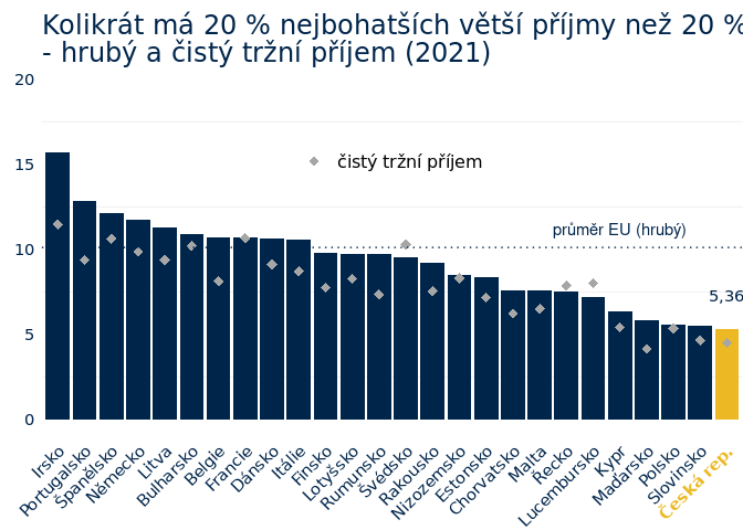
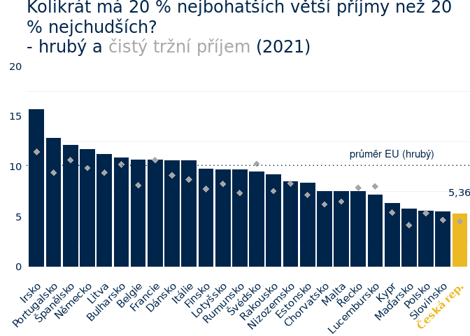
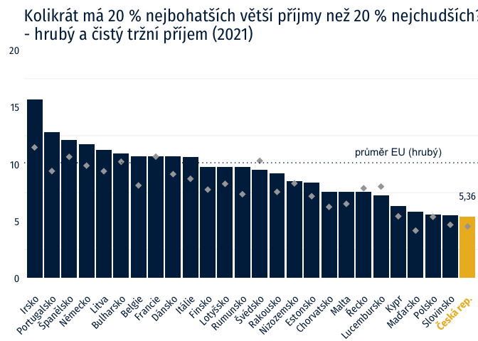
I'd like to ask for help with adding a custom legend to my graph.

I'd like to add a legend consisting of:
Screenshot 2022-10-02 at 13.25.25

and chacracter vector "čistý tržní příjem"

library(ggplot2)
data_plot<- structure(list(country = c("Irsko", "Portugalsko", "Španělsko", 
                                         "Německo", "Litva", "Bulharsko", "Belgie", "Francie", "Dánsko", 
                                         "Itálie", "Finsko", "Lotyšsko", "Rumunsko", "Švédsko", "Rakousko", 
                                         "Nizozemsko", "Estonsko", "Chorvatsko", "Malta", "Řecko", "Lucembursko", 
                                         "Kypr", "Maďarsko", "Polsko", "Slovinsko", "Česká rep."), 
                             net_market = c(11.47, 9.39, 10.64, 9.87, 9.38, 10.21, 8.13, 
                                            10.66, 9.12, 8.71, 7.76, 8.27, 7.36, 10.29, 7.56, 8.31, 7.18, 
                                            6.24, 6.51, 7.88, 8.03, 5.42, 4.16, 5.37, 4.67, 4.52), 
                           gross_market = c(15.69, 12.84, 12.14, 11.73, 11.27, 10.92, 10.72, 10.72, 10.66, 10.61, 
                                            9.77, 9.75, 9.73, 9.53, 9.21, 8.52, 8.38, 7.58, 7.58, 7.54, 
                                            7.24, 6.35, 5.83, 5.58, 5.53, 5.36), 
                           group = c("abroad", "abroad", "abroad", "abroad", "abroad", "abroad", "abroad", 
                                     "abroad", "abroad", "abroad", "abroad", "abroad", "abroad", 
                                     "abroad", "abroad", "abroad", "abroad", "abroad", "abroad", 
                                     "abroad", "abroad", "abroad", "abroad", "abroad", "abroad", 
                                      "Czech"), 
                           value = c(15.69, 12.84, 12.14, 11.73, 11.27, 10.92, 
                                     10.72, 10.72, 10.66, 10.61, 9.77, 9.75, 9.73, 9.53, 9.21, 
                                     8.52, 8.38, 7.58, 7.58, 7.54, 7.24, 6.35, 5.83, 5.58, 5.53, 
                                     5.36)), 
                      row.names = c(NA, -26L), class = c("tbl_df", "tbl", "data.frame"))                          


ggplot(data_plot,aes(x = reorder(country, -value), y=value, fill = group, 
                     label = scales::comma(gross_market, accuracy = 1, scale = 0.1, prefix = "", suffix = "",
                                           big.mark = " ", decimal.mark = ","))) +
  geom_col(show.legend = F) +
  scale_color_manual(values=c("#00254B", "#ECB925")) +
  scale_fill_manual(values=c("#00254B", "#ECB925")) +
  geom_text(vjust = - 2.5 , 
            aes(family=c("Fira Sans Condensed"),
                color = "#00254B",
                label = scales::comma(ifelse(group=="Czech", value, NA), 
                                      accuracy = 0.01, scale = 1, suffix = "",
                                      big.mark = " ", decimal.mark = ",")),
            show.legend = F) +
  geom_point(aes(y=net_market),
             stat="identity", shape=18, size=3, position = position_dodge(width=1),
             color = "#A6A6A6",
             show.legend = F) +
  theme_minimal()+
  theme(axis.text.x=element_text(angle=45, hjust=1,size=11,
                                 face=ifelse(data_plot$group=="Czech", "bold", "plain"),
                                 color=ifelse(data_plot$group!="Czech", "#00254B", "#ECB925")),
        axis.text.y=element_text(size=11, color="#00254B"),
        text=element_text(size=15, family="Fira Sans Condensed"),
        panel.grid.major = element_blank(),
        axis.title = element_blank(),
        plot.title = element_text(color="#00254B", vjust = -1.5),
        legend.position =  c(.5,.75),
        legend.title=element_blank(),
        plot.margin = margin(t = 0,  # Top margin
                             r = 0,  # Right margin
                             b = 00,  # Bottom margin
                             l = 10)) + # Left margin)
  ggtitle("Kolikrát má 20 % nejbohatších větší příjmy než 20 % nejchudších? \n- hrubý a čistý tržní příjem (2021)") +
  scale_y_continuous(label=scales::comma_format(accuracy = 1, scale = 1, prefix = "", suffix = "",
                                                big.mark = " ", decimal.mark = ","),
                     limits = c(0,20)) +
  geom_hline(yintercept=10.12, linetype='dotted', col = "#00254B") +
  annotate("text", x = "Kypr", y = 10.12
           , label = "průměr EU (hrubý)", vjust = -1,
           color = "#00254B") +
  guides(title = "none")
#> Warning: Vectorized input to `element_text()` is not officially supported.
#> Results may be unexpected or may change in future versions of ggplot2.
#> Warning: Removed 25 rows containing missing values (geom_text).

image

Many thanks,

Jakub

Map the shape aesthetic inside the geom_point() function and use scale_shape_manual(values = c("čistý tržní příjem" = 18))

I had to reorganize your code a little bit to make my way around it but I think you can get the idea from this example:

library(ggplot2)

data_plot <- structure(list(country = c("Irsko", "Portugalsko", "Španělsko", 
                                       "Německo", "Litva", "Bulharsko", "Belgie", "Francie", "Dánsko", 
                                       "Itálie", "Finsko", "Lotyšsko", "Rumunsko", "Švédsko", "Rakousko", 
                                       "Nizozemsko", "Estonsko", "Chorvatsko", "Malta", "Řecko", "Lucembursko", 
                                       "Kypr", "Maďarsko", "Polsko", "Slovinsko", "Česká rep."), 
                           net_market = c(11.47, 9.39, 10.64, 9.87, 9.38, 10.21, 8.13, 
                                          10.66, 9.12, 8.71, 7.76, 8.27, 7.36, 10.29, 7.56, 8.31, 7.18, 
                                          6.24, 6.51, 7.88, 8.03, 5.42, 4.16, 5.37, 4.67, 4.52), 
                           gross_market = c(15.69, 12.84, 12.14, 11.73, 11.27, 10.92, 10.72, 10.72, 10.66, 10.61, 
                                            9.77, 9.75, 9.73, 9.53, 9.21, 8.52, 8.38, 7.58, 7.58, 7.54, 
                                            7.24, 6.35, 5.83, 5.58, 5.53, 5.36), 
                           group = c("abroad", "abroad", "abroad", "abroad", "abroad", "abroad", "abroad", 
                                     "abroad", "abroad", "abroad", "abroad", "abroad", "abroad", 
                                     "abroad", "abroad", "abroad", "abroad", "abroad", "abroad", 
                                     "abroad", "abroad", "abroad", "abroad", "abroad", "abroad", 
                                     "Czech"), 
                           value = c(15.69, 12.84, 12.14, 11.73, 11.27, 10.92, 
                                     10.72, 10.72, 10.66, 10.61, 9.77, 9.75, 9.73, 9.53, 9.21, 
                                     8.52, 8.38, 7.58, 7.58, 7.54, 7.24, 6.35, 5.83, 5.58, 5.53, 
                                     5.36)), 
                      row.names = c(NA, -26L), class = c("tbl_df", "tbl", "data.frame"))                          


ggplot(data_plot,aes(x = reorder(country, -value), y = value)) +
    geom_col(aes(fill = group), show.legend = F) +
    geom_text(aes(label = scales::comma(ifelse(group=="Czech", value, NA), 
                                        accuracy = 0.01, scale = 1, suffix = "",
                                        big.mark = " ", decimal.mark = ",")),
              vjust = - 2.5 ,
              color = "#00254B",
              family = c("Fira Sans Condensed"),
              show.legend = F) +
    geom_point(aes(y = net_market, shape = "čistý tržní příjem"),
               size = 3,
               color = "#A6A6A6") +
    geom_hline(yintercept = 10.12,
               linetype = 'dotted',
               col = "#00254B") +
    annotate("text", x = "Kypr", y = 10.12
             , label = "průměr EU (hrubý)", vjust = -1,
             color = "#00254B") +
    scale_fill_manual(values = c("#00254B", "#ECB925")) +
    scale_shape_manual(values = c("čistý tržní příjem" = 18)) +
    scale_y_continuous(label = scales::comma_format(accuracy = 1, scale = 1, prefix = "", suffix = "",
                                                  big.mark = " ", decimal.mark = ","),
                       limits = c(0,20)) +
    ggtitle("Kolikrát má 20 % nejbohatších větší příjmy než 20 % nejchudších? \n- hrubý a čistý tržní příjem (2021)") +
    theme_minimal() +
    theme(axis.text.x = element_text(angle = 45, hjust = 1, size = 11,
                                   face = ifelse(data_plot$group == "Czech", "bold", "plain"),
                                   color = ifelse(data_plot$group != "Czech", "#00254B", "#ECB925")),
          axis.text.y = element_text(size = 11, color = "#00254B"),
          text = element_text(size=15, family="Fira Sans Condensed"),
          panel.grid.major = element_blank(),
          axis.title = element_blank(),
          plot.title = element_text(color="#00254B", vjust = -1.5),
          legend.position =  c(.5,.75),
          legend.title=element_blank(),
          plot.margin = margin(t = 0,
                               r = 0,
                               b = 00,
                               l = 10))
#> Warning: Vectorized input to `element_text()` is not officially supported.
#> Results may be unexpected or may change in future versions of ggplot2.
#> Warning: Removed 25 rows containing missing values (geom_text).

Created on 2022-10-02 with reprex v2.0.2

Another option is to encode the legend in your title

library(ggplot2)
library(ggtext)

data_plot <- structure(list(country = c("Irsko", "Portugalsko", "Španělsko", 
                                       "Německo", "Litva", "Bulharsko", "Belgie", "Francie", "Dánsko", 
                                       "Itálie", "Finsko", "Lotyšsko", "Rumunsko", "Švédsko", "Rakousko", 
                                       "Nizozemsko", "Estonsko", "Chorvatsko", "Malta", "Řecko", "Lucembursko", 
                                       "Kypr", "Maďarsko", "Polsko", "Slovinsko", "Česká rep."), 
                           net_market = c(11.47, 9.39, 10.64, 9.87, 9.38, 10.21, 8.13, 
                                          10.66, 9.12, 8.71, 7.76, 8.27, 7.36, 10.29, 7.56, 8.31, 7.18, 
                                          6.24, 6.51, 7.88, 8.03, 5.42, 4.16, 5.37, 4.67, 4.52), 
                           gross_market = c(15.69, 12.84, 12.14, 11.73, 11.27, 10.92, 10.72, 10.72, 10.66, 10.61, 
                                            9.77, 9.75, 9.73, 9.53, 9.21, 8.52, 8.38, 7.58, 7.58, 7.54, 
                                            7.24, 6.35, 5.83, 5.58, 5.53, 5.36), 
                           group = c("abroad", "abroad", "abroad", "abroad", "abroad", "abroad", "abroad", 
                                     "abroad", "abroad", "abroad", "abroad", "abroad", "abroad", 
                                     "abroad", "abroad", "abroad", "abroad", "abroad", "abroad", 
                                     "abroad", "abroad", "abroad", "abroad", "abroad", "abroad", 
                                     "Czech"), 
                           value = c(15.69, 12.84, 12.14, 11.73, 11.27, 10.92, 
                                     10.72, 10.72, 10.66, 10.61, 9.77, 9.75, 9.73, 9.53, 9.21, 
                                     8.52, 8.38, 7.58, 7.58, 7.54, 7.24, 6.35, 5.83, 5.58, 5.53, 
                                     5.36)), 
                      row.names = c(NA, -26L), class = c("tbl_df", "tbl", "data.frame"))                          


ggplot(data_plot,aes(x = reorder(country, -value), y = value)) +
    geom_col(aes(fill = group), show.legend = F) +
    geom_text(aes(label = scales::comma(ifelse(group=="Czech", value, NA), 
                                        accuracy = 0.01, scale = 1, suffix = "",
                                        big.mark = " ", decimal.mark = ",")),
              vjust = - 2.5 ,
              color = "#00254B",
              family = c("Fira Sans Condensed"),
              show.legend = F) +
    geom_point(aes(y = net_market),
               shape = 18,
               size = 3,
               color = "#A6A6A6") +
    geom_hline(yintercept = 10.12,
               linetype = 'dotted',
               col = "#00254B") +
    annotate("text", x = "Kypr", y = 10.12
             , label = "průměr EU (hrubý)", vjust = -1,
             color = "#00254B") +
    scale_fill_manual(values = c("#00254B", "#ECB925")) +
    scale_y_continuous(label = scales::comma_format(accuracy = 1, scale = 1, prefix = "", suffix = "",
                                                  big.mark = " ", decimal.mark = ","),
                       limits = c(0,20)) +
    labs(
        title = "Kolikrát má 20 % nejbohatších větší příjmy než 20 % nejchudších?<br>
        - hrubý a  <span style = 'color:#A6A6A6;'>čistý tržní příjem</span> (2021)") +
    theme_minimal() +
    theme(axis.text.x = element_text(angle = 45, hjust = 1, size = 11,
                                   face = ifelse(data_plot$group == "Czech", "bold", "plain"),
                                   color = ifelse(data_plot$group != "Czech", "#00254B", "#ECB925")),
          axis.text.y = element_text(size = 11, color = "#00254B"),
          text = element_text(size = 15, family = "Fira Sans Condensed"),
          panel.grid.major = element_blank(),
          axis.title = element_blank(),
          plot.title = element_textbox_simple(color="#00254B", vjust = -1.5),
          legend.position =  c(.5,.75),
          legend.title=element_blank(),
          plot.margin = margin(t = 0,
                               r = 0,
                               b = 00,
                               l = 10))
#> Warning: Vectorized input to `element_text()` is not officially supported.
#> Results may be unexpected or may change in future versions of ggplot2.
#> Warning: Removed 25 rows containing missing values (geom_text).

Created on 2022-10-02 with reprex v2.0.2

1 Like

This topic was automatically closed 7 days after the last reply. New replies are no longer allowed.

If you have a query related to it or one of the replies, start a new topic and refer back with a link.