It might be possible to do this with stat_function, but I'm not sure how or if it's possible to pass the desired means and standard deviations for each Species into stat_function. Instead, I've just calculated the normal densities for each Species separately and then plotted them using geom_line. I've also added kernel density distributions using geom_density. I've used @andrescs's sample plot code as the starting point for my example.
library(tidyverse)

dens = split(iris, iris$Species) %>%
  map_df(~ tibble(Sepal.Length=seq(0.8*min(.x[["Sepal.Length"]]), 1.2*max(.x[["Sepal.Length"]]), length=100),
                  density=dnorm(x=Sepal.Length, mean=mean(.x[["Sepal.Length"]]), sd=sd(.x[["Sepal.Length"]]))),
         .id="Species")

ggplot(iris, aes(x=Sepal.Length)) +
  #scale_x_continuous(breaks=c(2,3,4,5,6,7,8,9,10,11,12,13)) +
  #scale_y_continuous(limits=c(0,18000)) +
  geom_histogram(bins=12, colour = "white", fill="grey75") +
  #geom_vline(data=cdat, aes(xintercept=mean,  colour=Hersteller),linetype="dashed", size=1) +
  #geom_vline(data=ddat, aes(xintercept=max,  colour=Hersteller),linetype="dashed", size=1) +
  facet_wrap(~Species, scales = "free") +
  geom_density(aes(y=..density..*20), colour="blue") +
  geom_line(data=dens, aes(y=density*20), colour="red") +
  theme_classic()
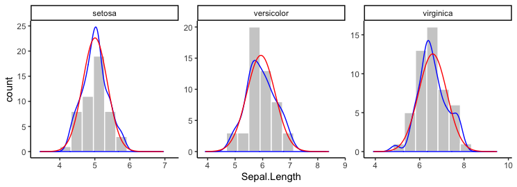
In the plot above, I scaled the densities by hand to be on a scale similar to the counts. Instead, you can plot the histogram as a density and everything will be automatically on the same scale. For example:
ggplot(iris, aes(x=Sepal.Length)) +
  geom_histogram(aes(y=..density..), bins=12, colour = "white", fill="grey75") +
  facet_wrap(~Species, scales = "free") +
  geom_density(aes(y=..density..), colour="blue") +
  geom_line(data=dens, aes(y=density), colour="red") +
  theme_classic()