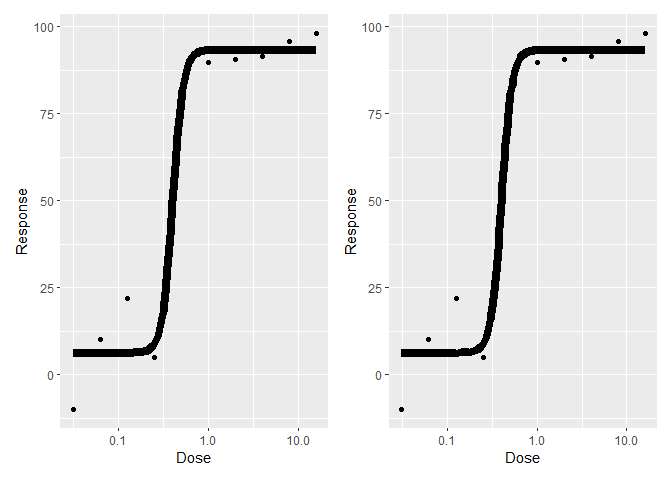
I calculate a dose-response curve using the dr4pl library. Using stat_function from ggplot2, it's possible to plot this curve (along with data points) in a ggplot. Minimal reprex:
library(ggplot2)
library(dr4pl)
library(plotly)
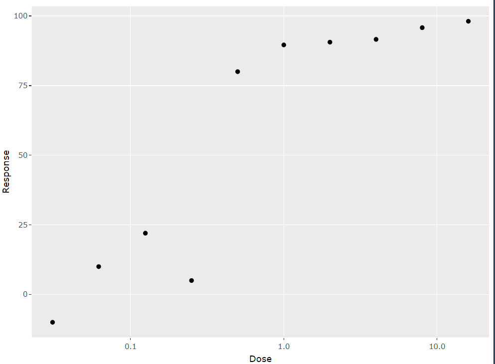
myresponse <- data.frame("Dose"=c(16,8,4,2,1,0.5,0.25,0.125,0.062,0.031),
"Response"=c(98.1,95.8,91.6,90.6,89.6,80,5,22,10,-10))
myresult <- dr4pl(myresponse, dose=Dose, response=Response)
p <- ggplot(myresult$data, aes(x=Dose, y=Response))+
geom_point() +
scale_x_log10() +
stat_function(fun = MeanResponse,
args = list(theta = myresult$parameters),
size=3)
p
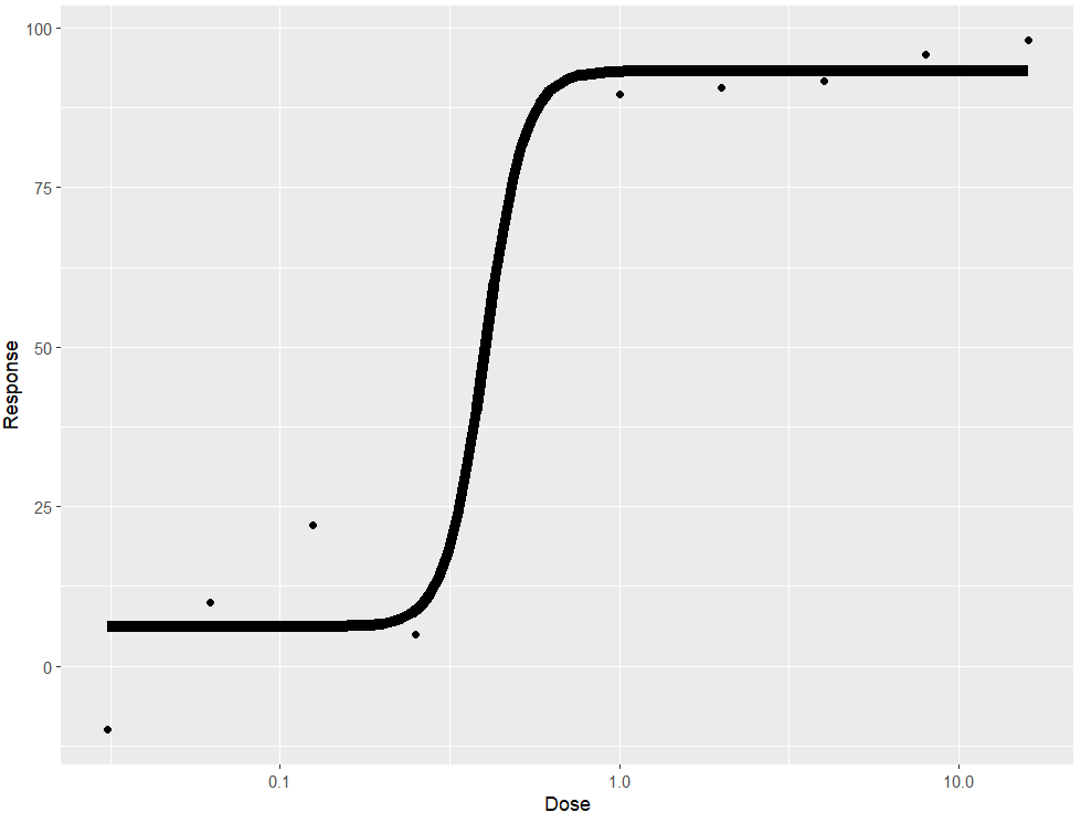
I want a way to make this work in ggplotly. If I just do ggplotly(p), there is this error and plot:
Warning message:
In geom2trace.default(dots[[1L]][[1L]], dots[[2L]][[1L]], dots[[3L]][[1L]]) :
geom_GeomFunction() has yet to be implemented in plotly.
If you'd like to see this geom implemented,
Please open an issue with your example code at
Issues · plotly/plotly.R · GitHub
Can geom_smooth be modified to plot this line? I tried playing around with that route but I don't even really know where to begin.