Assigning a line chart to a secondary axis in ggplot

Hi,

I need to represent a bar chart (left axis) and line chart (right axis) on the same plot.
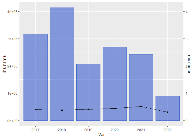

ggplot() +
  geom_bar(  aes(x =data[['Var']], y =data[['Count']]), stat = "identity" , fill = "royalblue3", color= "royalblue3", alpha=0.6)+
  geom_line( aes(x =data[['Var']], y =data[['line']], group=2, color='line') , stat = "identity") +
  geom_point(aes(x =data[['Var']], y =data[['line']], group=2, color='line') , stat = "identity") +
  geom_text( aes(x =data[['Var']], y =data[['line']], label = spec_transport[['line']], color='line'), size = 3, vjust = -1, stat = "identity") +
  scale_y_continuous("lhs name", sec.axis = sec_axis(~./10, name = "rhs name"))

Somehow it doesnt understand that it needs to assign a line to the rhs axis. Cant find anything on ggplot documentation either. All the examples online say the same thing, which doesnt help to solve my issue.

Thanks

Please post some data. A simple way to do that is to post the output of

dput(data)
structure(list(Var = structure(c(3L, 4L, 5L, 6L, 1L, 2L), .Label = c("2017", 
"2018", "2019", "2020", "2021", "2022"), class = "factor"), aggregation_var= c("N", 
"N", "N", "N", "N", "N"), Exposure = c(2066302.89, 2692807.33, 
2425331.3338829, 895257.111254915, 3174995.42, 4136834.02), LR = c(0.407212521490497, 
0.436803126200641, 0.511960251637911, 0.300507738634869, 0.39602928309106, 
0.380868848588709)), row.names = c(NA, -6L), class = c("data.table", 
"data.frame"), .internal.selfref = <pointer: 0x5565829a3790>)

I had trouble mapping the data you posted to the ggplot code. There are no columns named line or Count. Here is what I could do with your data. Is that something like what you want?
EDIT: I had an extra zero in my previous code.

data <- structure(list(Var = structure(c(3L, 4L, 5L, 6L, 1L, 2L), 
                               .Label = c("2017", "2018", "2019", "2020", "2021", "2022"), 
                               class = "factor"), aggregation_var= c("N", "N", "N", "N", "N", "N"), 
               Exposure = c(2066302.89, 2692807.33, 2425331.3338829, 895257.111254915, 3174995.42, 4136834.02), 
               LR = c(0.407212521490497, 0.436803126200641, 0.511960251637911, 0.300507738634869, 0.39602928309106, 0.380868848588709)), 
          row.names = c(NA, -6L), class = c("data.table", "data.frame"))

library(ggplot2)
ggplot(data = data) +
  geom_col(  aes(x =Var, y =Exposure), fill = "royalblue3", color= "royalblue3", 
             alpha=0.6)+
  geom_line( aes(x =Var, y =LR*1000000, group=1)) +
  geom_point(aes(x =Var, y =LR*1000000)) +
  #geom_text( aes(x =data[['Var']], y =data[['line']], label = spec_transport[['line']], color='line'), size = 3, vjust = -1, stat = "identity") +
  scale_y_continuous("lhs name", sec.axis = sec_axis(~./1000000, name = "rhs name"))

Created on 2022-12-23 with reprex v2.0.2

This is exactly what I needed.

I think I identified an issue in my code. I havent used the *100000 in my geom _line. I dont understand, why would I actually need it. All the resources I found online doesnt suggest doing this either.

Thanks

My understanding is that all of the values are plotted using the scale on the left. I had to multiply LR by 1000000 so they have reasonable values on that scale. The scale on the right merely labels the secondary values. It uses the inverse of the value adjustment so that the true values are displayed.

This topic was automatically closed 21 days after the last reply. New replies are no longer allowed.

If you have a query related to it or one of the replies, start a new topic and refer back with a link.