Barplot with double x-axis labels

Hi everyone,
I need to build a barplot showing the sold qty of three different services on a weekly basis. I need to add as x-axis label either the calendar week and the month.
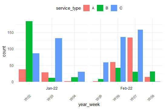
See the image for an example:

image

Here is my code:

sample <- data.frame(service_type = c("A","B","C","A","B","C","A","B","C","A","B","C","A","B","C","A","B","C","A","B","C"),
                     qty = c(38,185,87,29,12,133,2,14,31,2,9,59,60,43,137,135,31,159,15,32,1),
                     year_week = c("2022 - CW02","2022 - CW02","2022 - CW02","2022 - CW03","2022 - CW03","2022 - CW03","2022 - CW04","2022 - CW04","2022 - CW04","2022 - CW05","2022 - CW05","2022 - CW05","2022 - CW06","2022 - CW06","2022 - CW06","2022 - CW07","2022 - CW07","2022 - CW07","2022 - CW08","2022 - CW08","2022 - CW08"),
                     xlabel2 = c("Jan-22","Jan-22","Jan-22","Jan-22","Jan-22","Jan-22","Jan-22","Jan-22","Jan-22","Feb-22","Feb-22","Feb-22","Feb-22","Feb-22","Feb-22","Feb-22","Feb-22","Feb-22","Feb-22","Feb-22","Feb-22")
)

## To use annotate
sample %>%
  #arrange(desc(dat_cal_week_id)) %>%
  ggplot() +
  aes(x = year_week, fill = service_type, weight = qty) +
  geom_bar(position = "dodge") +
  scale_fill_hue(direction = 1) +
  theme_minimal() +
  #theme(legend.position = "left", axis.text.x = element_text(angle=90, hjust=1)) +
  theme(legend.position = "left", axis.text.x = element_blank()) +
  coord_cartesian(clip = "off") +
  annotate(geom = "text",
           x = 1:(nrow(sample)/3),
           y = min(sample$qty),
           label = unique(sample$xlabel2),
           vjust = 1,
           angle = 90)

## Using facet_wrap
sample %>%
  #arrange(desc(dat_cal_week_id)) %>%
  ggplot() +
  aes(x = year_week, fill = service_type, weight = qty) +
  geom_bar(position = "dodge") +
  scale_fill_hue(direction = 1) +
  theme_minimal() +
  theme(legend.position = "left", axis.text.x = element_text(angle=90, hjust=1)) +
  facet_wrap(sample$xlabel2, strip.position = "bottom")+
  theme(strip.placement = "outside")

The first try is with annotate but I receive the error 'Error in annotate():
! Unequal parameter lengths: x (7), label (2)'

The second try is with facet_wrap and I receive another error 'Error in eval_tidy(facet, mask) : object 'Jan' not found'

I'm not sure that any of these approaches are correct.
I really appreciate anyone who can help me with this.
Thanks

It is not clear what you want here.

Here is a very basic bar-chart. What do you need to do?

sample <- data.frame(service_type = c("A","B","C","A","B","C","A","B","C","A","B","C","A","B","C","A","B","C","A","B","C"),
                     qty = c(38,185,87,29,12,133,2,14,31,2,9,59,60,43,137,135,31,159,15,32,1),
                     year_week = c("2022 - CW02","2022 - CW02","2022 - CW02","2022 - CW03","2022 - CW03","2022 - CW03","2022 - CW04","2022 - CW04","2022 - CW04","2022 - CW05","2022 - CW05","2022 - CW05","2022 - CW06","2022 - CW06","2022 - CW06","2022 - CW07","2022 - CW07","2022 - CW07","2022 - CW08","2022 - CW08","2022 - CW08"),
                     xlabel2 = c("Jan-22","Jan-22","Jan-22","Jan-22","Jan-22","Jan-22","Jan-22","Jan-22","Jan-22","Feb-22","Feb-22","Feb-22","Feb-22","Feb-22","Feb-22","Feb-22","Feb-22","Feb-22","Feb-22","Feb-22","Feb-22")
)

ggplot(sample, aes(year_week, qty, fill = service_type)) +
  geom_bar(stat = "identity",  position = "dodge") 

Hi jrkrideau,
I need to add another x-axis label with the xlabel2 values. The xlabel2 values should not be repeated for each year_week but unique for each single month. I put an image above on how the plot should look like.

Thanks,

Oh, I see what you are doing now. I am having a blank moment and do not see why you are having the problem. I am sorry not to be of more help.

At the moment, the only thing I can think of doing is something like this but it needs fiddling.

library(ggplot2)
dat1 <- data.frame(service_type = c("A","B","C","A","B","C","A","B","C","A","B","C","A","B","C","A","B","C","A","B","C"),
                   qty = c(38,185,87,29,12,133,2,14,31,2,9,59,60,43,137,135,31,159,15,32,1),
                   year_week = c("2022 - CW02","2022 - CW02","2022 - CW02","2022 - CW03",
                                 "2022 - CW03","2022 - CW03","2022 - CW04","2022 - CW04","2022 - CW04","2022 - CW05","2022 - CW05","2022 - CW05","2022 - CW06","2022 - CW06","2022 - CW06","2022 - CW07","2022 - CW07","2022 - CW07","2022 - CW08","2022 - CW08","2022 - CW08"),
                   xlabel2 = c("Jan-22","Jan-22","Jan-22","Jan-22","Jan-22","Jan-22","Jan-22",
                               "Jan-22","Jan-22","Feb-22","Feb-22","Feb-22","Feb-22","Feb-22","Feb-22","Feb-22",
                               "Feb-22","Feb-22","Feb-22","Feb-22","Feb-22"))

ggplot(dat1, aes(year_week, qty, colour = xlabel2, fill = service_type)) +
  geom_bar(stat = "identity",  position = "dodge", show.legend = FALSE)  + 
  coord_cartesian(clip = "off", ylim = c(0, 175)) +
  annotate("rect", xmin = 0, xmax = 4.5, ymin = -10, ymax = 0,
               alpha = .1, colour = "blue" ) +
  annotate("rect", xmin = 4.5, xmax = 7.6, ymin = -10, ymax = 0,
           alpha = .1, colour = "blue" ) +
  annotate(geom = "text",
           x = 2, y = -5,
           label = "January") +
  annotate(geom = "text",
           x = 6, y = -5,
           label = "February")

key issues;
impose an ordering on the character strings xlabel2 : 'Jan-22'/'Feb-22'
cutdown on clutter i.e. not useful week numbers '2022 - CW02' could be "W02" and seemingly communicate everything.... ; use scales = "free_x"on the facet wrap to drop the week numbers that dont appear in a given facet.

library(tidyverse)
dat1 <- data.frame(service_type = c("A","B","C","A","B","C","A","B","C","A","B","C","A","B","C","A","B","C","A","B","C"),
                   qty = c(38,185,87,29,12,133,2,14,31,2,9,59,60,43,137,135,31,159,15,32,1),
                   year_week = c("2022 - CW02","2022 - CW02","2022 - CW02","2022 - CW03",
                                 "2022 - CW03","2022 - CW03","2022 - CW04","2022 - CW04","2022 - CW04","2022 - CW05","2022 - CW05","2022 - CW05","2022 - CW06","2022 - CW06","2022 - CW06","2022 - CW07","2022 - CW07","2022 - CW07","2022 - CW08","2022 - CW08","2022 - CW08"),
                   xlabel2 = c("Jan-22","Jan-22","Jan-22","Jan-22","Jan-22","Jan-22","Jan-22",
                               "Jan-22","Jan-22","Feb-22","Feb-22","Feb-22","Feb-22","Feb-22","Feb-22","Feb-22",
                               "Feb-22","Feb-22","Feb-22","Feb-22","Feb-22"))


(dat2 <- dat1 |> mutate(year_week=substr(year_week,
                                        9,12),
                       xlabel2 = factor(xlabel2,
                                        levels=c("Jan-22",
                                                 "Feb-22"))))
  ggplot(dat2) +
  aes(x = year_week, 
      fill = service_type,
      weight = qty) +
    scale_x_discrete(drop=TRUE) + 
  geom_bar(position = "dodge") +
  scale_fill_hue(direction = 1) +
  theme_minimal() +
  theme(legend.position = "top", 
        axis.text.x = element_text(angle=45, hjust=1)) +
  facet_wrap(~xlabel2, strip.position = "bottom",
             scales = "free_x")+
  theme(strip.placement = "inside")

image

This topic was automatically closed 42 days after the last reply. New replies are no longer allowed.

If you have a query related to it or one of the replies, start a new topic and refer back with a link.