Change the axis in stacked bar graph for relative abundance

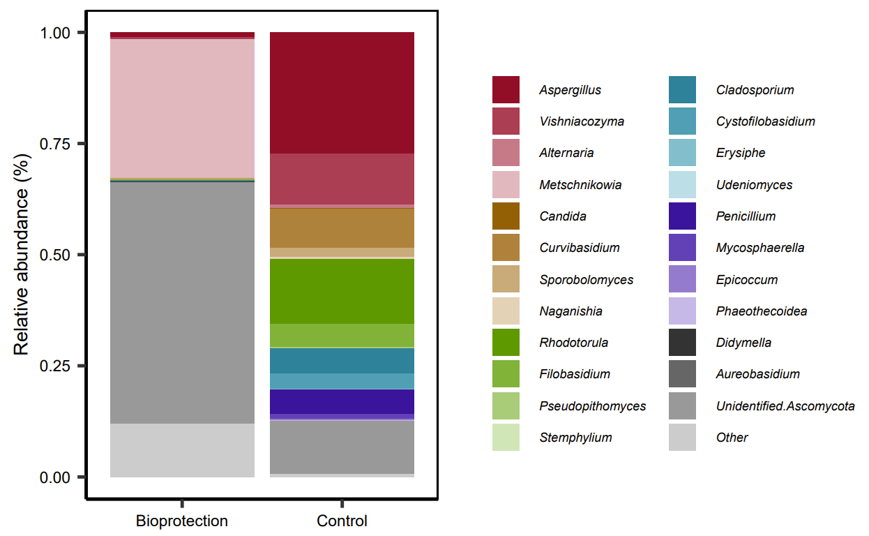
Hi, I need help to tidy up my species relative abundance stacked bar graph. I want to be able to change the y-axis values from 0 - 1.0 to 0 - 100 without impacting the data, so that my axis label 'Relative Abundance (%)' is applicable. This is what I have used so far:

library(dplyr)
lvl6.short.T4 <- lvl_25[-c(1:6),] 

melt.2.T4<-melt(lvl6.short.T4, id.vars = "Treatment", 
                variable.name = "Genera", 
                value.name = "Abundance")

lvl6_bars <- ggplot(melt.2.T4, aes(x = Treatment, y = Abundance, fill = Genera)) +
  labs(x=NULL, y='Relative abundance (%)') +
  geom_bar(position = 'fill', stat='identity') + 
  theme_bw() + scale_fill_manual(name=NULL, values = c(as.vector(stepped(24)))) +
  theme(axis.title=element_text(size=6),
        axis.text=element_text(size=5, colour = 'black'),
        strip.text=element_text(size=3),
        strip.background=element_rect(fill=NA, color='black', size=0.5),
        panel.border=element_rect(fill=NA, color='black'),
        legend.position='right',
        legend.text=element_text(size=4, face = "italic"),
        legend.key.size = unit(10, 'pt'),
        panel.grid.major = element_blank(), 
        panel.grid.minor = element_blank(),
        panel.background = element_blank(), 
        axis.line = element_line(colour = "black"))

lvl6_bars

which produces:

Try adding this code:

scale_y_continuous(labels = scales::percent)

Thanks, I have tried that, my issue with using that is that it leaves % on the axis values, I wanted just the plain number on the axis (% will be in the axis label)!

I can’t check the code (I’m writing from phone), please try label_percent(scale = 100, prefix = "", suffix = "")

Ok thanks, I tried adding that, it's coming back with this error

Error in label_percent(scale = 100, prefix = "", suffix = "") : 
  could not find function "label_percent"

The full code is

  scale_y_continuous(labels = scales::label_percent(scale = 100, prefix = "", suffix = ""))

Oh that is amazing thank you! (sorry I am very much new to R!!)

I do have a further, probably more complicated, question in relation to these graphs,

I want to graph what is in the 'Other' segment of the original graph,

When I use this code (the same as above):

lvl6.others.T4 <- others[-c(1:6,13),] 

melt.others.T4<-melt(lvl6.others.T4, id.vars = "Treatment", 
               variable.name = "Genera", 
               value.name = "Abundance")

lvl6_bars_T4_others <- ggplot(melt.others.T4, aes(x = Treatment, y = Abundance, fill = Genera)) +
 labs(x=NULL, y='Relative abundance (%)') +
 geom_bar(position='fill', stat='identity') + 
 scale_y_continuous(labels = scales::label_percent(scale = 100, prefix = "", suffix = "")) +
 theme_bw() + scale_fill_manual(name=NULL, values = c(as.vector(stepped2(20)))) +
 theme(axis.title=element_text(size=6),
       axis.text=element_text(size=5, colour = 'black'),
       strip.text=element_text(size=3),
       strip.background=element_rect(fill=NA, color='black', size=0.5),
       panel.border=element_rect(fill=NA, color='black'),
       legend.position='right',
       legend.text=element_text(size=4, face = "italic"),
       legend.key.size = unit(10, 'pt'),
       panel.grid.major = element_blank(), 
       panel.grid.minor = element_blank(),
       panel.background = element_blank(), 
       axis.line = element_line(colour = "black")) +
 guides(fill=guide_legend(ncol=2))

lvl6_bars_T4_others

I get this graph:

However, I do not want the axis to be to 100, I want it to be the same proportion as the original graph. For example, for the 'Bio-protection' data the 'Other' segment was approx. 15%, so the bars in the second graph should only go to 15 for the 'Bio-protection' treatment and the control would only be a few %.

Is there are way to change the axis to accommodate that?

If you remove this line scale_fill_manual(name=NULL, values = c(as.vector(stepped2(20))))are the bars shown?

The bars are shown, just the colour scheme is changed

If I remove from

position = 'fill'

from

geom_bar(position = 'fill', stat='identity') + 

this is closer to what I need, however the scale is not what I want...

I would prefer the scale to go from 0 to 15 (%)

Yes to achive that you should remove “fill”, but you have to mutate your data to calcolate the %. Then plot the mutated variable to the y.

OK that sounds good, how do you do that? Sorry, very much new to R!

total <- melt.others.T4 %>%
summarise(t = sum(Abundance)) %>% pull(t)

melt.others.T4 %>%
mutate(percent = Abundance/total) %>%
ggplot(aes(x = Treatment, y = percent, fill = Genera)) +
……

You should check if the column I used are right and if you need to group_by() before mutate or summarise the data, for example.
If you paste a reproducible dataset is easier to reproduce

That's great, thanks for the help! I'll keep playing around but I think this will work!

This topic was automatically closed 42 days after the last reply. New replies are no longer allowed.

If you have a query related to it or one of the replies, start a new topic and refer back with a link.