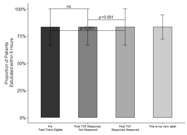
Welcome to the community @sjelacic74! Below is one way to combine two groups into a single bar. Since only a portion of the data was provided, I first duplicated the pre-intervention data twice to create (what I'm assuming are) groups 2 and 3. This resulted in a data frame with 6 observations for each of the 3 groups. Then, I created a new category (2 & 3 combined) by binding these two groups to MVdata and renaming their fgroupplot name. This added 12 observations for 2 & 3 combined (as expected). Finally, the plot was generated, adding a new x label for the combined category (other plot features may need to be updated).
library(tidyverse)
library(ggpubr)
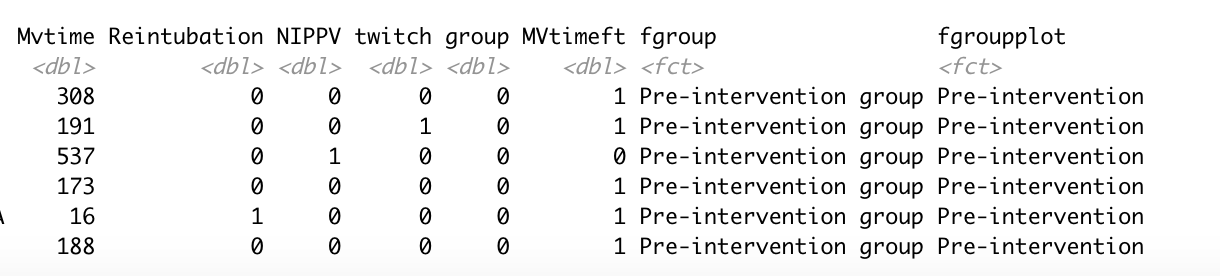
# sample data provided
MVdata = data.frame(
Mvtime = c(308, 191, 537, 173, 16, 188),
Reintubation = c(0,0,0,0,1,0),
NIPPV = c(0,0,1,0,0,0),
twitch = c(0,1,0,0,0,0),
group = 0,
MVtimeft = c(1,1,0,1,1,1),
fgroup = 'Pre-intervention group',
fgroupplot = 'Pre-intervention'
) %>%
# add the exact same rows with new fgroupplot names (more sample data)
bind_rows(
(.) %>% mutate(fgroupplot = 'FT Protocol Non-compliant'),
(.) %>% mutate(fgroupplot = 'FT Protocol Compliant')
)
count(MVdata, fgroupplot)
#> fgroupplot n
#> 1 FT Protocol Compliant 6
#> 2 FT Protocol Non-compliant 6
#> 3 Pre-intervention 6
# add a "new" category (2 & 3 combined)
# by filtering to groups 2 & 3 and then
# changing the fgroupplot name
MVdata = MVdata %>%
bind_rows(
(.) %>%
filter(fgroupplot %in% c('FT Protocol Compliant', 'FT Protocol Non-compliant')) %>%
mutate(fgroupplot = '2 & 3 combined')
)
count(MVdata, fgroupplot)
#> fgroupplot n
#> 1 2 & 3 combined 12
#> 2 FT Protocol Compliant 6
#> 3 FT Protocol Non-compliant 6
#> 4 Pre-intervention 6
# generate plot
ggbarplot(
MVdata, x = "fgroupplot", y = "MVtimeft", fill = "fgroupplot",
add = c("mean_se"), width = 0.5,
xlab = FALSE,
ylab = "Proportion of Patients\n Extubated within 6 Hours",
yticks.by = 0.25
) +
geom_bracket(
xmin = c("Pre-intervention", "FT Protocol Non-compliant", "Pre-intervention"),
xmax = c("FT Protocol Compliant", "FT Protocol Compliant", "FT Protocol Non-compliant"),
y.position = c(0.8, 0.9, 1), label = c("p<0.001", "p<0.001", "ns"),
tip.length = 0.02
) +
scale_y_continuous(labels = scales::percent) +
scale_x_discrete(labels= c("Pre-intervention"="Pre\n Fast-Track Eligible",
"FT Protocol Non-compliant"="Post TOF Response\n Not Measured",
"FT Protocol Compliant"="Post TOF\n Response Measured",
'2 & 3 combined' = "This is my new label"
)
) +
scale_fill_grey() +
theme(legend.position='none') +
theme(axis.text.x = element_text(size = 8))
The plot looks a little "funny" because all of the data is duplicated. Once the actual data is used, I think this will get to your intended result.
Created on 2022-12-24 with reprex v2.0.2.9000