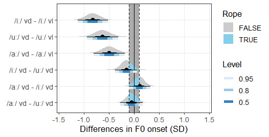
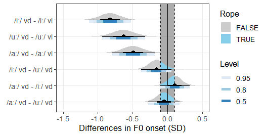
This is more of a consultation question. I 'm keen to know your thoughts and opinions about these two plots. They are exactly the same plots expect for the limits of the x-axis. The x-axis limit is the first plot extends from -1.5 to +1.5. In the second plot, the x-axis limit extends from -1.5 to 0.5. I feel that the first plot takes more visual space (even in the document) due the existence of the empty area on the positive side. However, the second plot fixes this issue, and it saves me some visual space. I recall that I read somewhere (I can't remember where) that plots like the second one might be misleading(?) or does not provide the whole psychological effect as would the first plot. So may I get your thoughts on this? And which plot do you think is better to use in my dissertation?
Also, what size do you generally recommend for these graphs in a dissertation document?
I like the first plot where the x-axis has the same extent on either side of zero exactly because of the psychological effect of seeing an equivalent range on both sides. But maybe which plot to use could also be a matter of specific subject knowledge. Is it even physically possible for the values to be positive and that far from zero for your particular research question? If not, then it might not make sense to have the x-axis extend the same distance in each direction.
A couple of other comments:
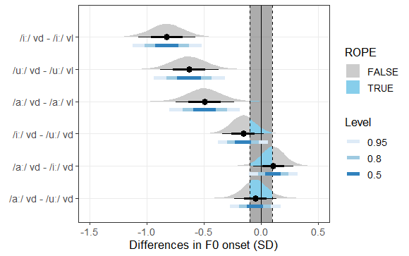
What does the black part of each density/interval plot represent?
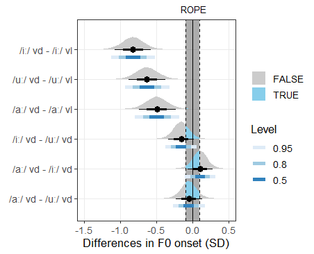
I would suggest getting rid of the Rope legend (it's a bit confusing, because the density slabs are also gray) and instead just put the word "ROPE" on top of the plot panel, just above the gray ROPE band in the plot. Also, ROPE is an acronym, so it should probably be in all capital letters.
Thank you so much @joels!
These are very thoughtful suggestions. I'll incorporate them in the plot.
Is it even physically possible for the values to be positive and that far from zero for your particular research question?
Yes, it is possible.
The black part of each density has just been modified to reflect the median plus 65% and 90% credible interval as an additional layer of information for the reader.
Is this what you meant? Do you think it is now visually understandable that the TRUE/FALSE distinction represents blue/grey distinction in relation to the ROPE? I would eventually write this under the graph in the document, but it is visually understandable this way without the word "ROPE" in the legend above TRUE/FALSE?
I actually think you don't need the TRUE/FALSE legend at all. If your audience knows what the ROPE is, wouldn't the blue shading for the density areas that overlap the ROPE speak for themselves? Or maybe that shading should be red, so as not to be confused with the blue shading of the intervals.
Regarding the black intervals: I think they confuse more than enlighten. I like the blue intervals just below density slabs like you had before (maybe with a vertical black median line added) but I don't think you need the black intervals.