Hello! I'm triying to do a bar graphic with 2 x-variables, where both of them are categorical. My data is about the actual health of a n number of people where I'm studying HTA where some people have (1) and other ones no (0), so I wanted a graphic where in X I have age range (the base already classifies it in 1,2,3,4) and gender (masculine and feminine). My problem is that I made a graphic with this two X variables but my "Y" is the total of my population without distinction between having or not having HTA.
I made a quick and rudimentary drawing of how I would like it to be

1 Like
Hi @Josex , remember put a reproducible example for better help all the community.
https://forum.posit.co/t/faq-draft-tips-for-writing-r-related-questions/47267
With toy data Im try this for guide you.
library(tidyverse)

  toy_data <- tribble(
    ~"Genre", ~"HTA",
    "F", 80,
    "F",  70,
    "F",  60,
    "M",  82,
    "M",  75,
    "M",  65
  )

  toy_data %>%
    mutate(Size_Category = cut(HTA, breaks = seq(0, 90, 15))) %>%
    ggplot(data = ., aes(x = Size_Category, y= HTA, fill=Genre)) +
    geom_bar(stat = "identity", position = 'dodge')

An online search for "grouped barchart in r" may have been quicker than asking here. Note that geom_bar and geom_col are very similar, but the latter does not require stat = "identity" for a grouped chart. Also, the charts would look the same if I had not converted Gender and Age to factors.
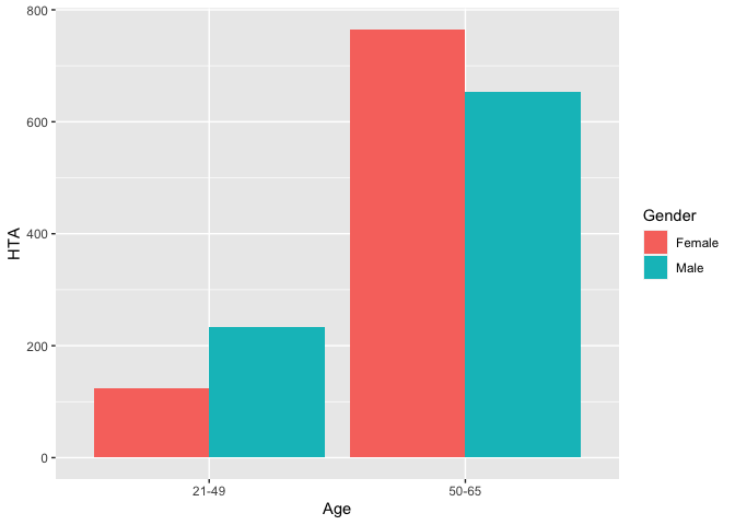
library(tidyverse)

df1 <- data.frame(Gender = as_factor(c("Female", "Male", "Female", "Male")),
                  Age = as_factor(c("21-49","21-49", "50-65", "50-65")),
                  HTA = c(123, 234, 765, 654))

df1 %>% ggplot(aes(fill = Gender, x = Age, y = HTA)) +
  geom_bar(position = "dodge", stat = "identity")
# or

df1 %>% ggplot(aes(fill = Gender, x = Age, y = HTA)) +
  geom_col(position = "dodge")
Created on 2022-11-16 with reprex v2.0.2
1 Like
This topic was automatically closed 42 days after the last reply. New replies are no longer allowed.
If you have a query related to it or one of the replies, start a new topic and refer back with a link.