Hello! I am working on project and I would like to do a map where I can put de prevalence of a variable for each region that I am studying right now (AHT), If I can also add a color depending on the frequency per region that would be great!
Im working with Chile (16 regions) and I dont have a map :c
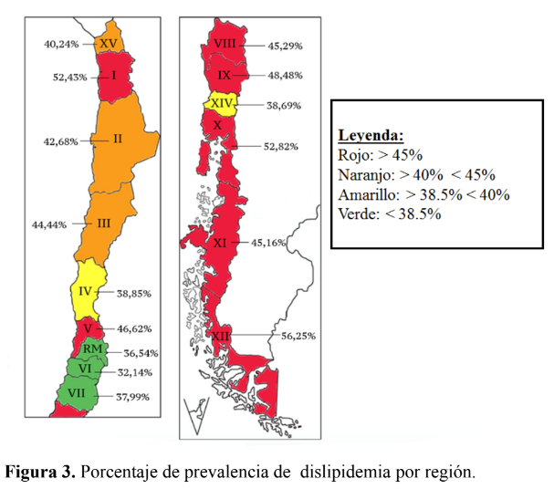
Here is a picture of what I would like to do
It's possible. This is called a thematic or chloropeth map. It can be produced by the {sf} package and annotated by the {ggplot2} package for the percentage designators.
There are many sources of SF maps for Chile, including this one
This topic was automatically closed 42 days after the last reply. New replies are no longer allowed.
If you have a query related to it or one of the replies, start a new topic and refer back with a link.