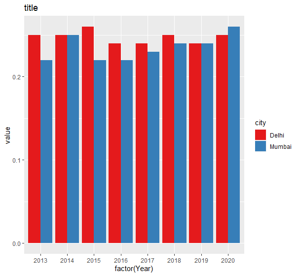
I am trying to create a grouped bar chart using the ggplot2 package. I am following this example but I am having difficulty to set the parameters inside the ggplot function. Basically, I want the x axis to be the Year column of my data.frame, and the blue and red bars (showing in the example I mention in the link) to be the value of Mumbai and Delhi instead of the decline or improved.
Here is the code:
ggplot(df, aes(factor(Year),  c(Mumbai, Delhi),  fill = ???)) +
  geom_bar(stat = "identity",  position = "dodge") +
  scale_fill_brewer(palette = "Set1")
Here is my data.frame:
df <- read.table(
header = TRUE, text = 'Year Mumbai Delhi
1 2013 0.22 0.25
2 2014 0.25 0.25
3 2015 0.22 0.26
4 2016 0.22 0.24
5 2017 0.23 0.24
6 2018 0.24 0.25
7 2019 0.24 0.24
8 2020 0.26 0.25')