It has five columns, one with the ID of the pathway, one called Description in which there is the name of the pathway, one called GeneRatio, in which you have the ratio of the number of my genes found on the pathway divided by the total number of genes in the pathway, the pvalue of the pathway and a column called count, in which you have the number of the my genes found in the pathway.
So, when I run the code:
ggplot(a, aes(x = GeneRatio, y = Description, fill = Description)) +
geom_density_ridges() +
theme_ridges() +
theme(legend.position = "none")
I have absolutely nothing
And me... I would like to make a Basic ridgeline of my data, with the GeneRatio and ideally colouring the curbes I obtain according to their pvalue, but I obtain ABSOLUTELY nothing. What am I doing so wrong?
I hope you can help
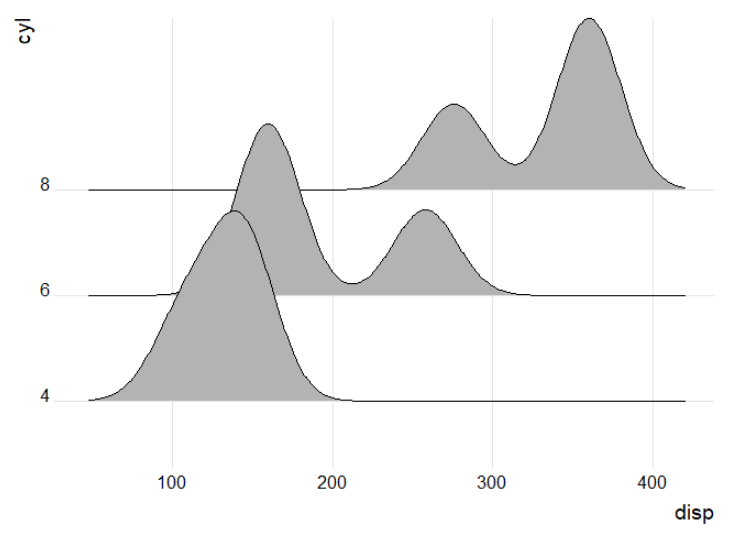
Hello @MartaLagg! The ridgeline plot is used to show the distribution of numerical values for various groups. In the data you shared, it appears each Description has only one GeneRatio. Thus, when the plot is created, there is no distribution to show for each Description, rather a single value.
Below is an example using the mtcars data set. For data set a, each cyl has a single disp value, and the plot is unsuccessful. However, in data set b, which has 3 values for each cyl, the plot is generated. Hope this helps!
library(tidyverse)
library(ggridges)

# only 1 value per group
a = mtcars |>
  mutate(cyl = as.character(cyl)) |>
  group_by(cyl) |>
  filter(disp == max(disp)) |>
  ungroup() |>
  select(cyl, disp)

a
#> # A tibble: 3 × 2
#>   cyl    disp
#>   <chr> <dbl>
#> 1 6      258
#> 2 4      147.
#> 3 8      472

ggplot(a, aes(x = disp, y = cyl)) +
  geom_density_ridges() +
  theme_ridges() +
  theme(legend.position = 'none')
Hard to say exactly what could be the reason it doesn't work for you because there is no data included in your example. However, I've drawn up some example data and I can produce such a plot. See below:
# package library
library(tidyverse)
#> Warning: package 'tidyverse' was built under R version 4.2.2
#> Warning: package 'ggplot2' was built under R version 4.2.3
#> Warning: package 'tibble' was built under R version 4.2.3
#> Warning: package 'tidyr' was built under R version 4.2.2
#> Warning: package 'readr' was built under R version 4.2.2
#> Warning: package 'purrr' was built under R version 4.2.2
#> Warning: package 'dplyr' was built under R version 4.2.3
#> Warning: package 'stringr' was built under R version 4.2.2
#> Warning: package 'forcats' was built under R version 4.2.2
#> Warning: package 'lubridate' was built under R version 4.2.2
library(ggridges)
#> Warning: package 'ggridges' was built under R version 4.2.2

# sample data, since none was provided
set.seed(12)
sample_a <- tibble(
  id = as.character(seq(1, 50, 1)),
  desc = as.character(sample(
    x = c("apple", "berry", "cherry", "eggplant", "garlic"),
    size = 50,
    replace = TRUE)),
  gene_ratio = sample(
    x = rnorm(
      n = 1000,
      mean = 0.05,
      sd = 0.005
    ),
    size = 50,
    replace = TRUE
  ),
  p_adjust = sample(
    x = rnorm(
      n = 1000,
      mean = 0.005,
      sd = 0.0005
    ),
    size = 50,
    replace = TRUE
  ),
  count = sample(
    x = seq(10, 100, 1),
  size = 50,
  replace = TRUE
))

head(sample_a)
#> # A tibble: 6 × 5
#>   id    desc     gene_ratio p_adjust count
#>   <chr> <chr>         <dbl>    <dbl> <dbl>
#> 1 1     berry        0.0537  0.00508    73
#> 2 2     berry        0.0586  0.00563    84
#> 3 3     cherry       0.0500  0.00494    87
#> 4 4     garlic       0.0491  0.00493    14
#> 5 5     garlic       0.0501  0.00515    92
#> 6 6     eggplant     0.0437  0.00535    55

# attempt plot
ggplot(data = sample_a) +
  geom_density_ridges(
    mapping = aes(
      x = gene_ratio,
      y = desc,
      fill = desc
    )) +
  theme_ridges() +
  theme(legend.position = "none")
#> Picking joint bandwidth of 0.002
Thanks very much for your answers.
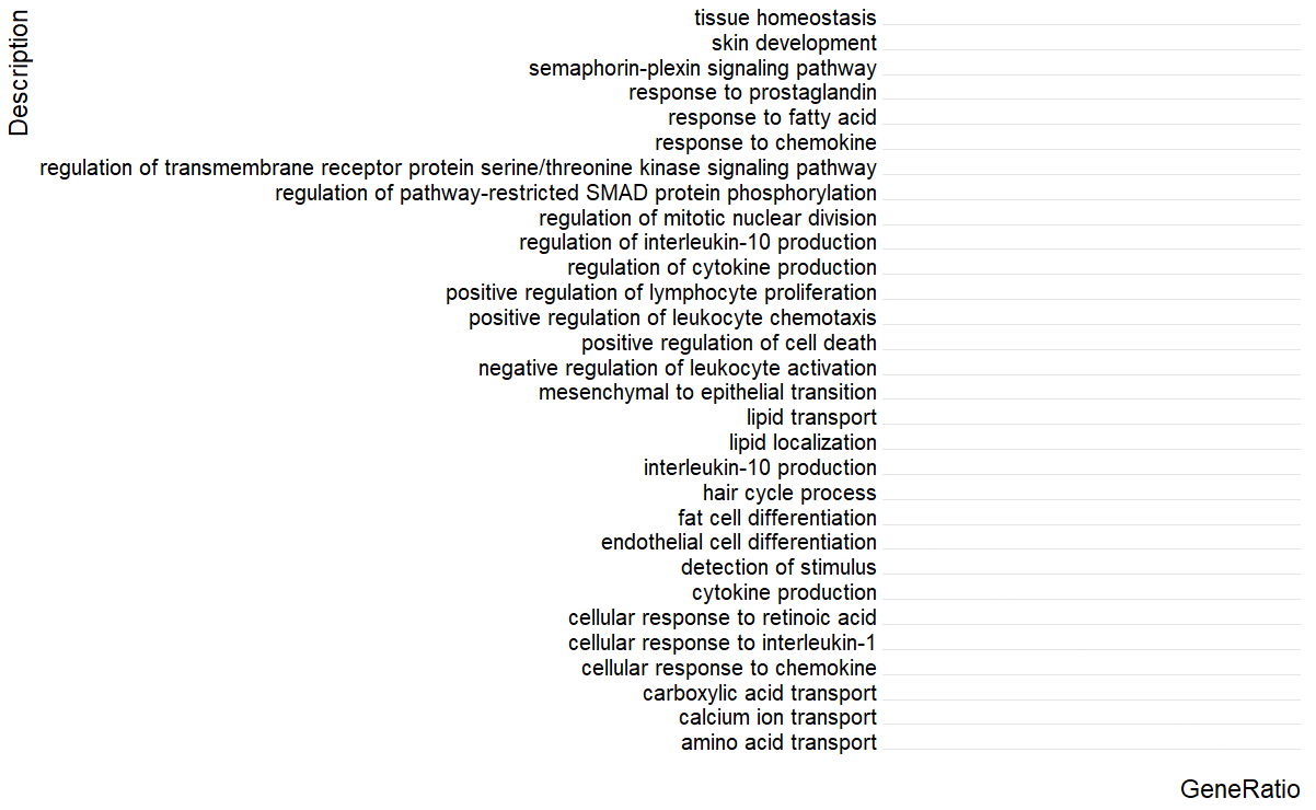
I have put a picture of my data, I can share the excel file if it is better for you, just let me know.
In all the cases, I still have the problem! In fact, I want to use this type of graph for RNAseq results. This means that I would like to plot the Generatio of each pathway (it is a single value! Unless that I make two columns one for “my genes” found in that pathway and one for the genes of that pathway”… but I don’t know if I add a bias in the interpretation of pathways) and colour my data according to the pvalue. I am wondering if it is the right graph to use , but that’s a pity because it is so beautiful!
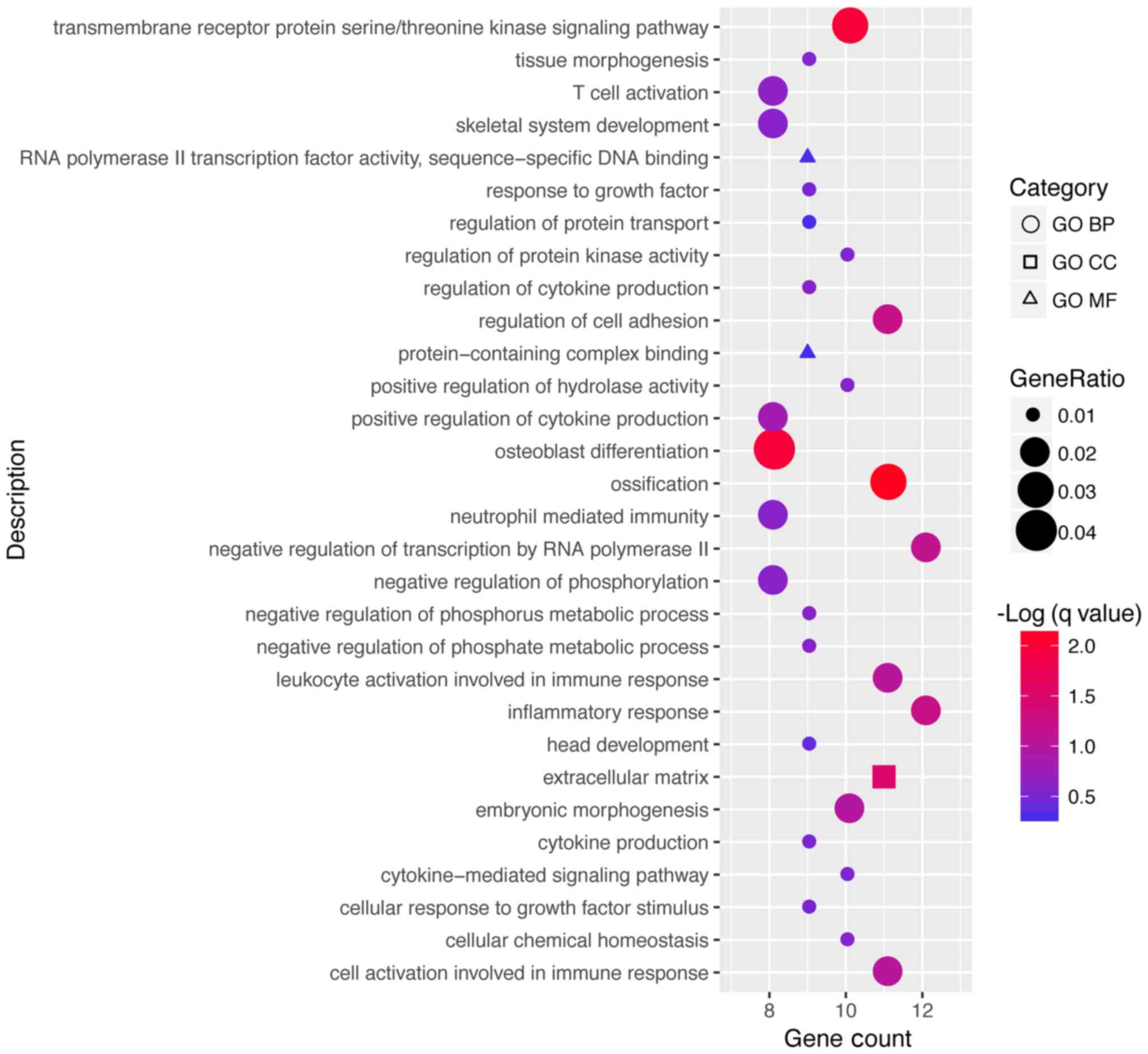
As stated by scotty you cannot use a ridgeplot here with only a single value, but you can think of another approach, as plotting the GeneRatio as point on the x axis and use the size and/or colour to show the other values of interest as p-value and count.
Something like this:
Merci Rene,
Could you explain me why your code works with only one value for gene_ratio?
Your table is exactly as mine... and your data is plotted while mine no!
Your table: head(sample_a)
#> # A tibble: 6 × 5
#> id desc gene_ratio p_adjust count
#>
#> 1 1 berry 0.0537 0.00508 73
#> 2 2 berry 0.0586 0.00563 84
#> 3 3 cherry 0.0500 0.00494 87
#> 4 4 garlic 0.0491 0.00493 14
#> 5 5 garlic 0.0501 0.00515 92
#> 6 6 eggplant 0.0437 0.00535 55
My table:
ID Description GeneRatio p.adjust Count
1 GO:0043588 skin development 0.0253 0.00842 38
2 GO:0001817 regulation of cytokine production 0.0539 0.00836 81
3 GO:0006816 calcium ion transport 0.0319 0.00825 48
4 GO:0046942 carboxylic acid transport 0.0220 0.00825 33
5 GO:0002690 positive regulation of leukocyte chemota… 0.0106 0.00823 16
6 GO:0001894 tissue homeostasis 0.0240 0.00807 36
7 GO:0051606 detection of stimulus 0.0173 0.00795 26
8 GO:0002695 negative regulation of leukocyte activat… 0.0166 0.00772 25
9 GO:0071347 cellular response to interleukin-1 0.0120 0.00751 18
10 GO:0010876 lipid localization 0.0373 0.00724 56
It is exactly the same thing!
What's wrong with my table? You can download it here FileSender
Thank you in advance
Marta
No it's not, in the table you see "berry" is found twice and "garlic", too. And these are just the 6 first lines. Actually, Renes example has 50 rows, so each fruit has (in average) 12 numbers.
Edit: Of course it should be 10 numbers in average.
See the difference for yourself. Maybe the ridgeline is not the best choice for this data. Matthias presented excellent alternatives.
# in my sample data, desc > 1
sample_a %>%
  count(desc)
#> # A tibble: 5 × 2
#>   desc         n
#>   <chr>    <int>
#> 1 apple        4
#> 2 berry       12
#> 3 cherry       8
#> 4 eggplant    12
#> 5 garlic      14

# in the original data you have described, desc == 1
a %>%
  count(Description)