Creating Bar chart based on proportion of categorical variables

Hi,
I have a data of teacher attendance. The attendance appears as categorical variable (either "present" or "absent"). I have to show a bar plot where on the X-axis, weeks will appear and on the Y-axis, the proportion of teachers present will be shown. How can I do this?

library(tidyverse)

data<-tibble::tribble(
  ~teacher, ~week, ~attendance,
       "A",    1L,   "Present",
       "B",    1L,   "Present",
       "C",    1L,   "Present",
       "D",    1L,   "Present",
       "E",    1L,   "Present",
       "F",    1L,   "Present",
       "G",    1L,   "Present",
       "H",    1L,    "Absent",
       "K",    1L,    "Absent",
       "I",    1L,    "Absent",
       "L",    1L,   "Present",
       "M",    1L,   "Present",
       "N",    1L,   "Present",
       "A",    2L,   "Present",
       "B",    2L,   "Present",
       "C",    2L,   "Present",
       "D",    2L,   "Present",
       "E",    2L,    "Absent",
       "F",    2L,    "Absent",
       "G",    2L,    "Absent",
       "H",    2L,    "Absent",
       "K",    2L,   "Present",
       "I",    2L,   "Present",
       "L",    2L,   "Present",
       "M",    2L,    "Absent",
       "N",    2L,    "Absent"
  )

data<-data %>% 
  mutate(week=as.character(week))
Created on 2022-09-21 by the reprex package (v2.0.1)
Hi @kuttan98 ,

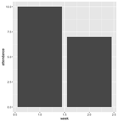
You could try manipulating your data by grouping by week and assigning values to "Present" and "Absent" to help with your visual. If you assign the value of one to "Present" and the value of zero to "Absent", then group your data by week and add up the attendance column, you're left with the number of "Present" teachers.

data_subset <- data %>% # create a new dataframe
  mutate(attendance = case_when( # modify the attendance variable to represent 1 or 0
    attendance == "Present" ~ 1,
    attendance == "Absent" ~ 0
  )) %>% 
  group_by(week) %>% # group by the week column
  summarize(attendance = sum(attendance)) # add up the attendance values

ggplot(data_subset, aes(week, attendance)) +
  geom_col() # a basic bar plot to visualize the number of present teachers

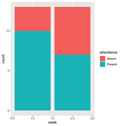
Or without modifying your data at all, you can use the fill of your bar plot to denote the "Present" or "Absent" groups:

ggplot(data, aes(week)) +
  geom_bar(aes(fill=attendance))

Hope that helps!

Thank you very much. the second graph was the one I was looking for exactly.

Regards,
Nithin

This topic was automatically closed 7 days after the last reply. New replies are no longer allowed.

If you have a query related to it or one of the replies, start a new topic and refer back with a link.