Hi,
I am working with a water quality dataset that has many monitoring sites. I am trying to create a scatter plot where I can differentiate categories for those monitoring sites (multiple sites under one category). Each category being color coded and monitoring sites having unique shapes.
My Current Code resembles this:
###Example Code
library(ggplot2)
require(ggplot2)
library(tidyverse)
mpg%>%
ggplot(mapping=aes(x = displ, y = hwy, color =factor(cyl)))+
geom_point(aes(shape = class))
The legend is split apart with color directed to factor(cyl) and shape for the class.
............................................
However, I would like it to be categorized by factor(cyl) in the legend and look something like this:
factor(cyl) 4
-2seater (with color for cyl and unique shape)
-compact (with color for cyl and unique shape)
-etc...
factor(cyl) 5
-subcompact (with color for cyl and unique shape)
-midsize (with color for cyl and unique shape)
-etc...
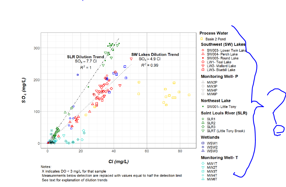
This is the example chart that I am trying to somewhat replicate:
Does anyone have experience breaking apart categories like this? Any help would be much appreciated!
Thanks,
Tony