Hi everyone,
I'm trying to find more streamlined ways of doing things but don't know how to:
- add up several columns ready for plotting into a bar graph;
- create a new variable using conditional logic across multiple columns;
- combine the results of 1 and 2 in a stacked bar graph/geom_bar (although, I think I might have this one and just want to check that I'm on the right track)
My sample dataframe is:
                    ID = c(1L, 2L, 3L, 4L, 5L, 6L),
             More.Info = c(1L, 1L, NA, 1L, NA, 1L),
  Better.Understanding = c(NA, 1L, 1L, 1L, NA, 1L),
            Reg.Reform = c(NA, 1L, 1L, NA, NA, 1L),
         More.capacity = c(NA, 1L, NA, NA, 1L, 1L),
                 Other = c(1L, NA, NA, NA, NA, NA),
               Group.A = c(1L, 3L, 2L, NA, 3L, 2L),
               Group.B = c(2L, 1L, NA, 2L, 2L, 2L),
               Group.C = c(1L, 1L, 3L, 1L, NA, NA),
               Group.D = c(1L, 1L, 2L, 1L, 3L, 1L),
               Group.E = c(2L, 3L, 3L, NA, NA, 3L),
               Group.F = c(3L, 3L, 3L, NA, 2L, 1L),
               Group.G = c(1L, 2L, 1L, 1L, 3L, 1L),
               Group.H = c(3L, 3L, 1L, 1L, 2L, 2L),
               Group.I = c(3L, 3L, NA, 1L, 1L, 3L),
               Group.J = c(3L, 2L, 2L, 3L, 2L, NA),
               Group.K = c(1L, 1L, 2L, 1L, 3L, 2L),
               Group.L = c(1L, 1L, 2L, 3L, NA, 3L),
               Group.M = c(1L, 3L, 3L, NA, 1L, 2L),
               Group.N = c(3L, 1L, NA, 3L, 3L, 1L),
               Group.O = c(3L, 3L, 2L, 2L, 2L, 3L)
                    )
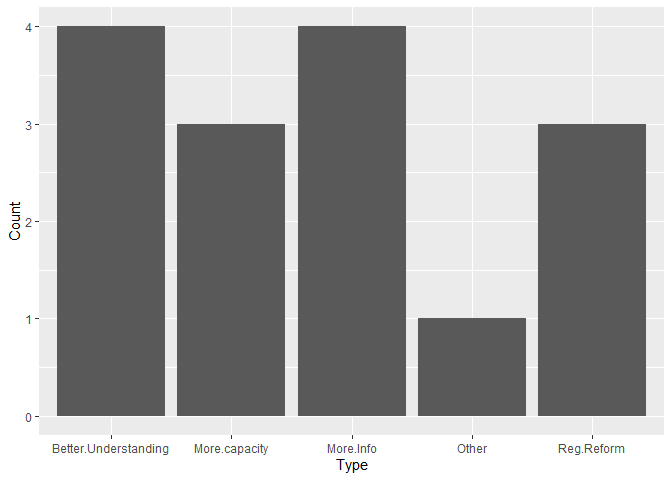
The columns "More.Info", "Better.Understanding", "Reg.Reform", "More.capacity" and "Other" the types of assistance survey respondents selected. To plot this information, I would normally switch over to Excel and tally up each of these columns and create a manual dataframe e.g.
cols<-c("More.Info", "Better.Understanding", "Reg.Reform", "More.Capacity", "Other")
responses<-c(7, 6, 5, 4, 1)

df<-tibble(cols, responses)
head(df)

df %>%
  ggplot(aes(x = cols, y = responses))+
  geom_col()
Is there an easier way to do this in R? I have tried the following code (different iterations, not all one code) - none of them work:
tally<-sdat%>%
  summarise(count(Better.Understanding))%>%
  summarise(count(More.capacity))%>%
  summarise(count(More.Info))%>%
  summarise(count(Other))%>%
  summarise(count(Reg.Reform))

tally<-sdat%>%
  count(Better.Understanding)%>%
  count(More.capacity)%>%
  count(More.Info)%>%
  count(Other)%>%
  count(Reg.Reform)

tally<-sdat%>%
  summarise(sum(Better.Understanding))%>%
  summarise(sum(More.capacity))%>%
  summarise(sum(More.Info))%>%
  summarise(sum(Other))%>%
  summarise(sum(Reg.Reform))

tally<-sdat%>%
  cumsum(Better.Understanding)%>%
  cumsum(More.capacity)%>%
  cumsum(More.Info)%>%
  cumsum(Other)%>%
  cumsum(Reg.Reform)
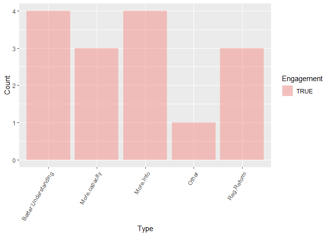
I then want to calculate (from the remaining variables) the respondents level of engagement in professional organisations (Group A-0). To calculate a new column 'Engagement', a respondent would need to have a "1" (=Well Connected) or "2"(=Somewhat Connected) in any of the columns GroupA:GroupO.
I tried the following code, but it does not work:
df <- within(df, {
  Engagement <- NA
  Engagement["Group.A":"Group.O" < 3] <- "Engaged"
  Engagement["Group.A":"Group.O" >= 3] <- "Not Engaged"
})
Once I've calculated the Engagement variable, could I plot the types of assistance (i.e. "More.Info", "Better.Understanding", "Reg.Reform", "More.capacity" and "Other") along the x axis, grouped by "Engagement" using the following code:
df %>%
  ggplot(aes(x = 2:6, y = tally, group = Engagement, fill = Engagement)) +
  geom_histogram(stat='identity', alpha = 0.4, width = 0.9)+
  theme(axis.text.x = element_text(angle = 60, hjust = 1))
Apologies for the multiple questions - I thought it might be more efficient than multiple posts given it is all related.
Thank you, in advance, for any help or guidance you can provide.