This is more of an iterative trying than a fully justified answer:
First, use position_dodge() rather than position_dodge2(). Second, in that case a width of 1 works better than 0.2 (which would mean having the bars intersecting, since the width of the dodge becomes smaller than the width of the bar). Third, you have a small problem of the sex influencing the dodge; that can be arranged by specifying explicitly the grouping in the common aes (and adding the fill and color in the separate ones). Fourth, in geom_jitter() specifying a position via position_dodge() will actually eliminate all jitter. You need position_jitterdodge(). So something like that seems to give you the right output:
library(tidyverse)
# create fake data
CHE3w_hemograms <- expand_grid(time_point = c("24H", "1W"),
treatment = c("Ctrl","Urethane"),
sex = c("FEMALE","MALE"),
genotype = c("WT","KO")) |>
add_column(WBC = map(runif(16, min=1, max = 10),
~ rnorm(10, .x, 1) |> abs())) |>
unnest(WBC)
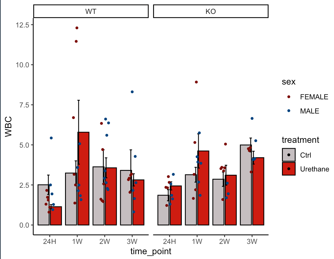
ggplot(data = CHE3w_hemograms, mapping = aes(x = time_point,
y = WBC,
group = treatment)) +
stat_summary(aes(fill = treatment),
fun.data = mean_se, geom = "col", color ="black", position = position_dodge(1)) +
stat_summary(fun.data = mean_se, geom = "errorbar", width = 0.2, position = position_dodge(1)) +
geom_jitter(aes(colour = sex),
position = position_jitterdodge(dodge.width = 1, jitter.width = .1),
size = 1) +
scale_color_manual(values = c("#7D0006", "#004480")) +
scale_fill_manual(values = c("#C5BEC0", "#CE1812")) +
theme_classic() +
facet_wrap(~genotype)
Created on 2022-10-15 by the reprex package (v2.0.1)
Note that for the example, I had to create fake data, where there the mean is random for each condition, so the male and females can easily have very different means and look weird.
I imagine it's not hard but I've started this week with R studio.
I love ggplot, but to be honest that particular aspect of position_dodge() is something I never fully understood and I always have to try until it fits (often, I need position_dodge(0.8) but no idea why). So, I would say you are starting with one of the harder cases!