Hi there!
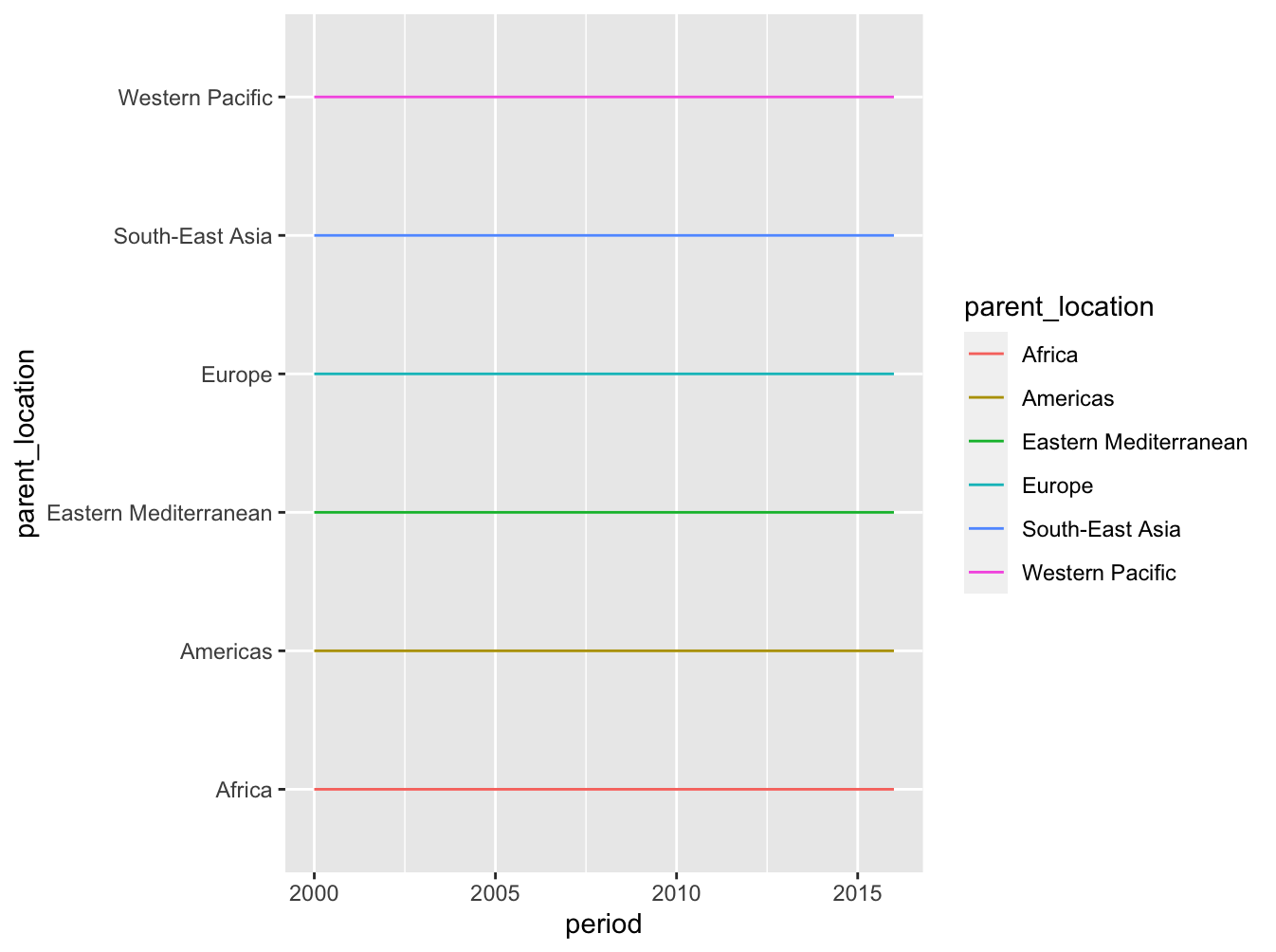
I'm trying to use multiple variables to plot a line chart to show a trend but for some reason that I cannot identify, the line charts are weird straight lines.
Here is a sample dataset:
df <- data.frame(stringsAsFactors=FALSE,
                 parent_location = c("Africa", "Europe", "Asia", "Latin America", "Middle East", "North America"),
                 location = c("Kenya", "Norway", "Thailand", "Brazil", "Turkey", "Canada"),
                 period = c(2016, 2016, 2016, 2016, 2016, 2016),
                 mortality_rate = c(101.4, 89.6, 88.3, 67.5, 77.4, 89.7))
Note: in my original dataset, the period ranges from the year 2000 to 2015 for each country so my sample data may be limiting but hope it gives you an idea of what I'm trying to achieve.
code:
df |>
  select(parent_location, mortality_rate, period) |>
  group_by(parent_location, period) |>
  summarise (mort_rate = mean(mortality_rate)) |>
  ggplot(mapping = aes(
    x = period,
    y = parent_location,
    colour = parent_location)) +
  geom_line()
And here is the "silly" ![]() chart my code is dishing out
chart my code is dishing out
thanks for your help.