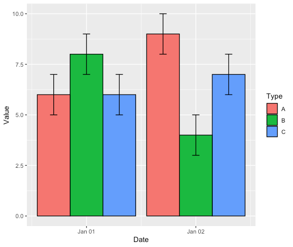
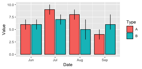
The date format seems to be the difference. Can you reproduce this?
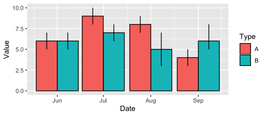
Here as strings is fine.
DF <- tibble(Date = c("2018-06-01", "2018-07-01", "2018-08-01", "2018-09-01", "2018-06-01", "2018-07-01",  "2018-08-01", "2018-09-01"),
             Type = c("A", "A", "A", "A", "B", "B", "B", "B"),
             Value = c(6, 9, 8, 4, 6, 7, 5, 6),
             conf.low = c(5,8,7,3,5,6, 3, 5),
             conf.high = c(7,10, 9,5,7,8, 7, 8))

ggplot(DF, aes(Date, Value, fill = Type)) +
  geom_col(position = 'dodge', colour = 'black') +
  geom_errorbar(aes(ymin=conf.low, ymax=conf.high),
                size=.5, width=.2, colour = 'black',
                position = position_dodge(0.9))
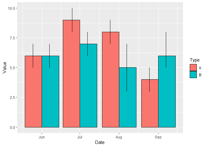
As dates,
DF <- tibble(Date = ymd("2018-06-01", "2018-07-01", "2018-08-01", "2018-09-01", "2018-06-01", "2018-07-01",  "2018-08-01", "2018-09-01"),
             Type = c("A", "A", "A", "A", "B", "B", "B", "B"),
             Value = c(6, 9, 8, 4, 6, 7, 5, 6),
             conf.low = c(5,8,7,3,5,6, 3, 5),
             conf.high = c(7,10, 9,5,7,8, 7, 8))

ggplot(DF, aes(Date, Value, fill = Type)) +
  geom_col(position = 'dodge', colour = 'black') +
  geom_errorbar(aes(ymin=conf.low, ymax=conf.high),
                size=.5, width=.2, colour = 'black',
                position = position_dodge(0.9))
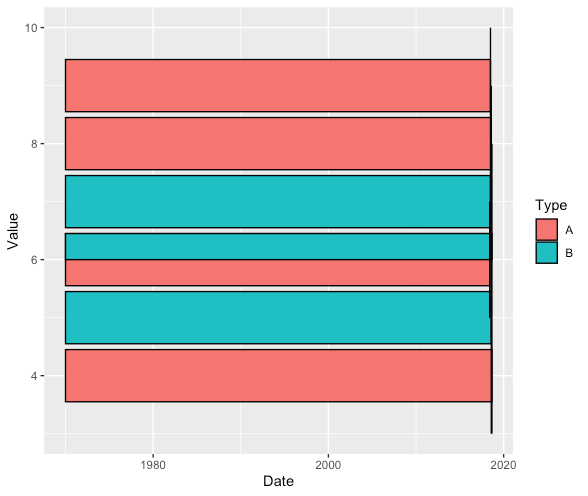
Seriously weird!