Hi,
I want to apply the power fit in the given dataset.
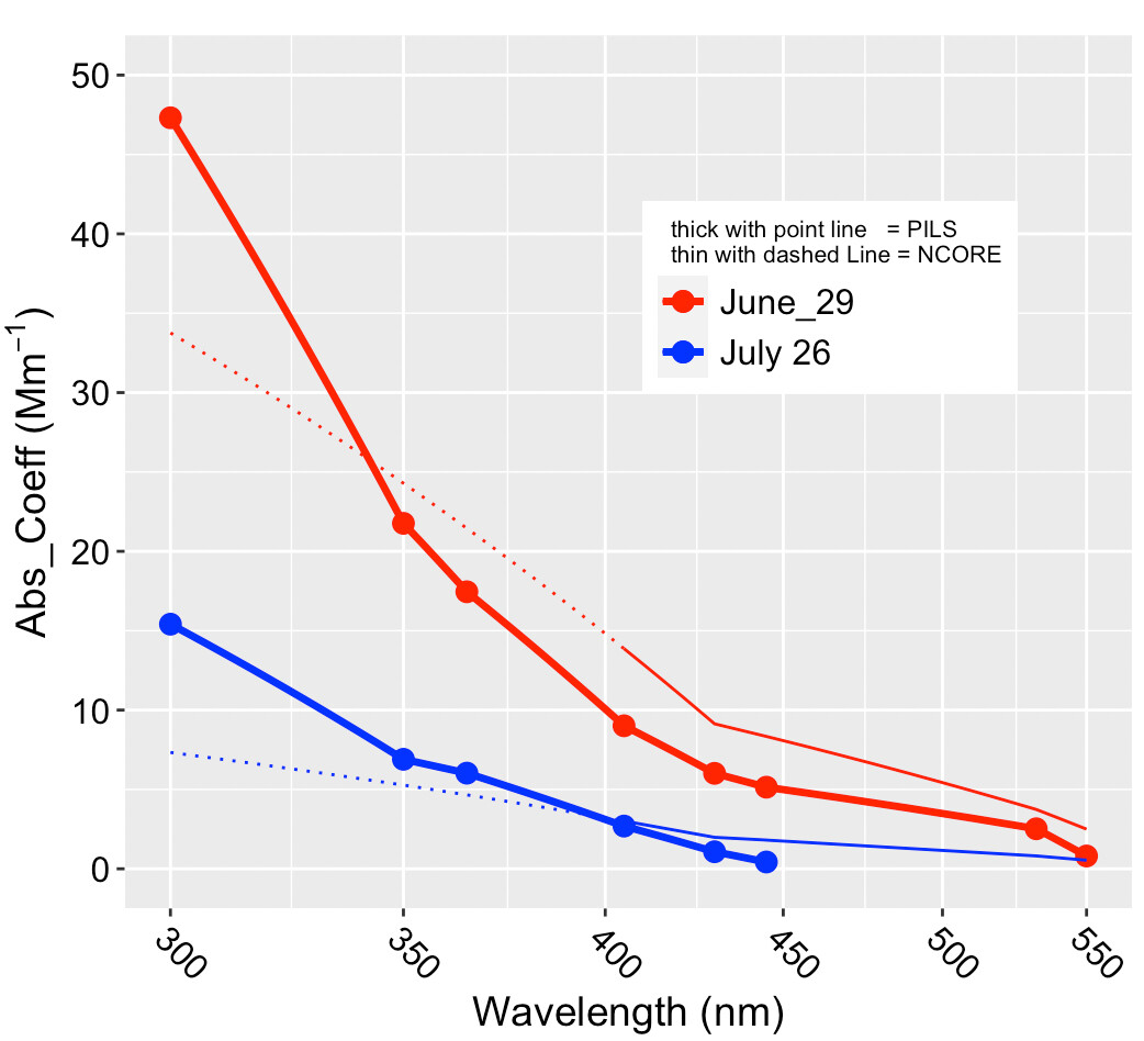
For the given dataset, I can create the line plot. like
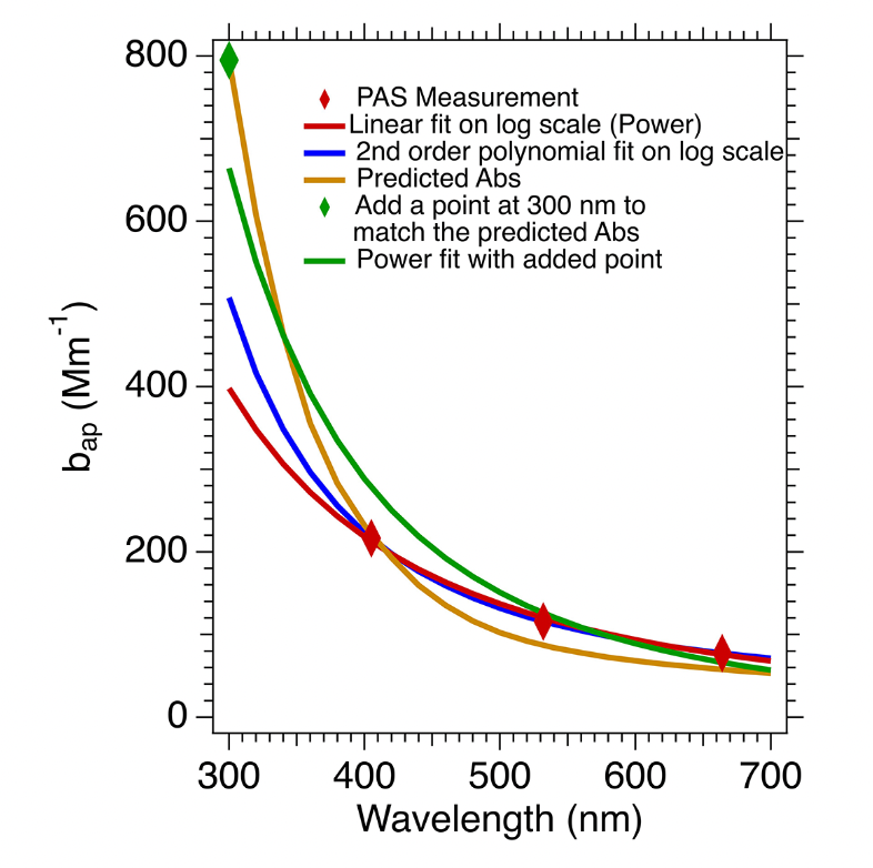
But I need to apply the power fit in the given plot so that I can get the plot something like the given below
For the line plot, I am using the code
wavelength01 <- read_csv("~/wavelength_JUNE_JULY1.csv")

head(wavelength01,12)

wavelength01
DF2 <- wavelength01
head(DF2)


DF2$NCORE_June_29_High <- DF2$NCORE_June_29
DF2 <- DF2 |> mutate(NCORE_June_29_High = ifelse(Wavelength >= 405,NCORE_June_29_High,NA))

DF2$NCORE_June_29_Low <- DF2$NCORE_June_29
DF2 <- DF2 |> mutate(NCORE_June_29_Low = ifelse(Wavelength <= 405,NCORE_June_29,NA))


DF2$NCORE_July_26_High <- DF2$NCORE_July_26
DF2 <- DF2 |> mutate(NCORE_July_26_High = ifelse(Wavelength >= 405,NCORE_July_26_High,NA))
DF2$NCORE_July_26_Low <- DF2$NCORE_July_26
DF2 <- DF2 |> mutate(NCORE_July_26_Low = ifelse(Wavelength <= 405,NCORE_July_26,NA))


View(DF2)

wavelength01 |>
  #select(-c(NCORE_July_23,PILS_July_23)) |>
  filter(Wavelength <=430) |>
  pivot_longer(NCORE_June_29:PILS_July_26) |>
  ggplot(aes(Wavelength, value)) +
  geom_point(aes(Wavelength, PILS_June_29, color = "red"),
              data = DF2, se = FALSE,size = 3) +
  geom_point(aes(Wavelength, PILS_July_26, color = "blue"),
             data = DF2, se = FALSE,size = 3) +


  geom_line(aes(Wavelength, PILS_June_29, color = "red"),
              data = DF2, se = FALSE,size = 1.2) +
  geom_line(aes(Wavelength, PILS_July_26, color = "blue"),
              data = DF2, se = FALSE,size = 1.2) +


  geom_line(aes(Wavelength, NCORE_June_29_High, color = "red"),
              data = DF2, se = FALSE,size = 0.5) +
  geom_line(aes(Wavelength, NCORE_June_29_Low, color = "red"),
              data = DF2, se = FALSE, linetype = 3)+


  geom_line(aes(Wavelength, NCORE_July_26_High, color = "blue"),
                data = DF2, se = FALSE,size = 0.5) +
  geom_line(aes(Wavelength, NCORE_July_26_Low, color = "blue"),
                data = DF2, se = FALSE, linetype = 3)+

  stat_smooth(method = 'nls', formula = 'y~a*x^b', method.args = list(start= c(a = 1,b=1)),se=FALSE) +

  theme(legend.text=element_text(size=12)) +
  theme(legend.title=element_text(size=8)) +
  theme(legend.position = c(0.7, 0.7)) +
  theme(axis.title = element_text(face="plain",size=14,color="black"),
        axis.text=element_text(size=12,face="plain", color="black"),
        axis.text.x=element_text(hjust=0.0, angle = -45),
        plot.title = element_text(size=15)) +
  #theme(panel.background = element_rect(colour = "black", size=1)) +
  #theme(panel.background = element_rect(fill = "white")) +
  #scale_color_brewer(palette="Set1")+
  ylab(bquote('Abs_Coeff ('*Mm^-1*')')) +
  xlab(bquote('Wavelength ('*nm*')')) +
  labs(title = "")+ ylim(0,50)+
  coord_trans(x="log10")+
  scale_color_identity(name =  "  thick with point line   = PILS
  thin with dashed Line = NCORE",
                       breaks = c("red","blue"),
                       labels = c("June_29","July 26"),
                       guide = "legend")
Kindly let me know how to convert my existing plot into a smooth curve (power law) plot (without changing the format, like the thick and thin lines in the plots).
Thanks