Hi.
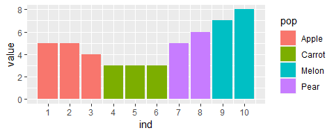
I have a data set that looks like this:
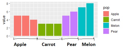
And what I want to do is to group the individuals on the X-axis into their respective populations, rather than displaying the individual number. So, something like this:
Any ideas?
Dataset:
pop <- c("Apple", "Apple", "Apple", "Carrot", "Carrot", "Carrot", "Pear", "Pear", "Melon", "Melon")
2 Likes
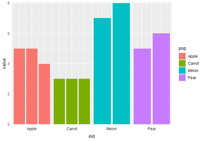
I think this is the most idiomatic way
pop <- c("Apple", "Apple", "Apple", "Carrot", "Carrot", "Carrot", "Pear", "Pear", "Melon", "Melon")
value <- c(5, 5, 4, 3, 3, 3, 5, 6, 7, 8)
ind <- 1:10
df <- data.frame(pop = pop, value = value, ind = ind)


ggplot(
  data = df,
  aes(
    x = ind,
    y = value,
    fill = pop
  )
) +
  geom_col() +
  scale_y_continuous(expand=c(0,0.05))+
  facet_wrap(~pop,
             nrow = 1,
             scales = "free_x",
             strip.position = "bottom"
  ) +
  theme(
    axis.ticks = element_blank(),
    axis.text.x = element_blank(),
    panel.spacing.x = unit(0,"cm"),
    strip.background = element_blank()
  )
4 Likes
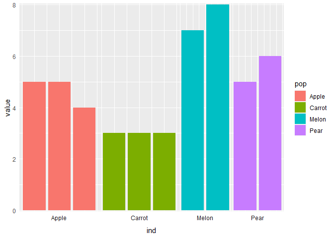
Just to note also, you can preserve your column width if you use facet_grid() with the space argument:
library(ggplot2)

pop <- c("Apple", "Apple", "Apple", "Carrot", "Carrot", "Carrot", "Pear", "Pear", "Melon", "Melon")
value <- c(5,5,4,3,3,3,5,6,7,8)
ind <- 1:10
df <- data.frame(pop = pop, value = value, ind = ind)

plt <-
  ggplot(
  data = df,
  aes(
    x = ind,
    y = value,
    fill = pop
  )
) +
  geom_col() +
  scale_y_continuous(expand=c(0,0.05)) +
  theme(
    axis.ticks = element_blank(),
    axis.text.x = element_blank(),
    panel.spacing.x = unit(0,"cm"),
    strip.background = element_blank()
  )

plt +
  facet_grid(~pop,
             scales = "free_x",
             space = "free",
             switch = "x"
  )
Created on 2023-05-02 with reprex v2.0.2
1 Like
One more question. Is it possible to delimit the populations bars more clearly? For instance, adding a black line between them, or something similar?
Edit: Found a solution:
scale_x_discrete(expand=c(0.05,0))
system
May 9, 2023, 4:03pm
6
This topic was automatically closed 7 days after the last reply. New replies are no longer allowed.