graph with 2 Y axis

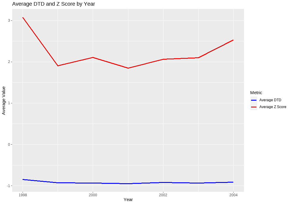
I want to make a graph with avg_dtd and avg_z_score on y-axis and year on x-axis.

Please help me.

Thanks in advance.

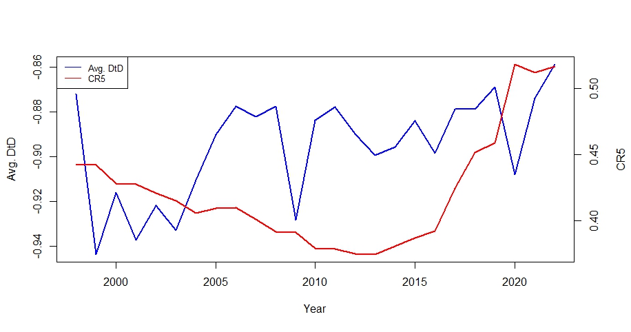
i need a plot like this

sample data

 year    avg_dtd avg_z_score
1  1998 -0.8494250   3.0749152
2  1999 -0.9243417   1.9019057
3  2000 -0.9327150   2.1070027
4  2001 -0.9476348   1.8469422
5  2002 -0.9219417   2.0596909
6  2003 -0.9330407   2.1005644
7  2004 -0.9105481   2.5303976
8  2005 -0.8901966   1.6997613
9  2006 -0.8774600   1.6466320
10 2007 -0.8821097   1.7427188
11 2008 -0.8775625   1.8189388
12 2009 -0.9283313   1.7801628
13 2010 -0.8837750   1.8235299
14 2011 -0.8776889   2.0809473
15 2012 -0.8899694   1.9391788
16 2013 -0.8994000   1.9373609
17 2014 -0.8955194   1.4455262
18 2015 -0.8840861   1.4934418
19 2016 -0.8984444   0.9167424
20 2017 -0.8787171   1.0241830
21 2018 -0.8788143   0.2988725
22 2019 -0.8688545   0.1482809
23 2020 -0.9080214   0.4062937
24 2021 -0.8736815   1.0834293
25 2022 -0.8587393   1.5107370
1 Like

Hi @zeeshan0112

df <- data.frame(
  year = c(1998, 1999, 2000, 2001, 2002, 2003, 2004),
  avg_dtd = c(-0.8494250, -0.9243417, -0.9327150, -0.9476348, -0.9219417, -0.9330407, -0.9105481),
  avg_z_score = c(3.0749152, 1.9019057, 2.1070027, 1.8469422, 2.0596909, 2.1005644, 2.5303976)
)

# create the plot
ggplot(df, aes(x = year)) +
  geom_line(aes(y = avg_dtd, color = "Average DTD"), size = 1.2) +
  geom_line(aes(y = avg_z_score, color = "Average Z Score"), size = 1.2) +
  scale_color_manual(values = c("blue", "red")) +
  labs(title = "Average DTD and Z Score by Year",
       x = "Year",
       y = "Average Value",
       color = "Metric")

1 Like

i want a graph like this

change geom_line() by geom_point()

Take a look at sec.axis. It provides a limited facility for adding a second y-axis. See https://r-graph-gallery.com/line-chart-dual-Y-axis-ggplot2.html.

See
https://r-graph-gallery.com/line-chart-dual-Y-axis-ggplot2.html.

Unless avg_dtd and avg_dtd are the same measure in different units (speed in miles per hour versus kilometres per hour for example) there are serious caveats to a two y-axis plot.

ggplot2 only directly supports charts with a second axis where that second axis can be set up as a known transformation of the first. Do you know, or can you find a transformation ?
However, your example plot does not look like a ggplot2 , but rather a base R plot. You probably do have more freedom to overlay one chart over another including a second right axis in base R. Take a look at this example
Draw Plot with Two Y-Axes in R (Example) | Second Axis in Graphic (statisticsglobe.com)

1 Like

I suddenly remembered that although I disapprove of two-y-axis plots I did one as an exercise years ago. I'd suggest two independent charts stuck together with {patchwork} or {cowplot.

It is roughly equivalent to the example nirgrahamuk has linked to.

Multiple Y-axis

What we are doing is plotting two different graphs into the same frame or
space with the same x-axis scale but different y-axis scales. There is no
reason why we could not have used a different x-axis scale, plotted on the
top of the plot (well, except if Hadley saw it he might get violent).

We find that mtext() does not support rotated text for placing the y2 label
Thus, we need to use text() and adjust the 'srt' argument to rotate the text
and adjust the x and y axis values for placement. We also set the 'xpd'
argument so that the text is not clipped at the plot region.

 Create the data to be graphed
        x<-1:10
        y1<-x
        y2<-x^2

 Set the par values
        op  <- par(las=1,xaxs="r",mai=c(1,0.75,1,1))

 Draw first plot        
        plot(x,y1,xlim=c(0,10),ylim=c(0,10), ylab="y1", las = 1)
        title(main="Multiple Y-Axes in R")
 Draw second plot
        par(new=TRUE)
        plot(x,y2,xlim=c(0,10),xaxt="n",yaxt="n",ylab="",pch=16)
        axis(4,at=c(0,20,40,60,80,100))
        text(12, 50, "y2", srt = 270, xpd = TRUE)
        par(op)  # reset par 

See ?text, ?par and ?mtext for more information.

Like is easier since the advent of {ggplot2}

1 Like

Thanks a lot for sharing the link. In the graph I am observing additional space between the line starting point and the line starting point on left and right side.

how to remove this?

Thanks in advance

code

par(mar = c(5, 4, 4, 4) + 0.3)              
plot(data_plot$year, data_plot$avg_dtd,type = "l",lty=1, xlab = "Year", 
     ylab = "Avg. DtD",lwd=2,col="blue")              
par(new = TRUE)                             
plot(data_plot$year, data_plot$cr5, type = "l",lty=1, col = "red",              
     axes = FALSE, xlab = "", ylab = "",lwd=2)
axis(side = 4, at = pretty(range(data_plot$cr5)))      
mtext("CR5", side = 4, line = 3)  
legend("topleft", legend = c("Avg. DtD", "CR5"), col = c("blue", "red"), lty = 1,
       cex = 0.8)

uses xaxs ='i' in a plot() to make the axis entend the full range of the plot window without a padding space.

data_plot <- data.frame(
  year = c(1998, 1999, 2000, 2001, 2002, 2003, 2004),
  avg_dtd = c(-0.8494250, -0.9243417, -0.9327150, -0.9476348, -0.9219417, -0.9330407, -0.9105481),
  avg_z_score = c(3.0749152, 1.9019057, 2.1070027, 1.8469422, 2.0596909, 2.1005644, 2.5303976)
)

par(mar = c(5, 4, 4, 4) + 0.3)              
plot(data_plot$year, data_plot$avg_dtd,type = "l",lty=1, 
     xlab = "Year", 
     ylab = "Avg. DtD",lwd=2,col="blue",
     xaxs="i")              
par(new = TRUE)                             
plot(data_plot$year, data_plot$cr5, type = "l",lty=1, col = "red",              
     axes = FALSE, xlab = "", ylab = "",lwd=2,
     xaxs="i")
axis(side = 4, at = pretty(range(data_plot$cr5)))      
mtext("CR5", side = 4, line = 3)  
legend("topleft", legend = c("Avg. DtD", "CR5"), col = c("blue", "red"), lty = 1,
       cex = 0.8)

1 Like

This topic was automatically closed 7 days after the last reply. New replies are no longer allowed.

If you have a query related to it or one of the replies, start a new topic and refer back with a link.