The simple answer is that @ron's example code will draw the same type of diagram. The challenge comes in tweaking the details. It's a little hard to make out what's going on in the original plot due to the resolution of the screenshot being low (can you possibly get a higher-res screenshot?), but what I see:
- The g values may have been rescaled or normalized
- The four plots have different x and y axis limits, and different main panel sizes. This probably means they were created independently of each other, and then composed into this grid as a separate step
- I have no idea what the colors represent. Is there a caption or legend with the original plot that might explain it? Without knowing this, it's hard to guess how to recreate the effect.
- The lines are very smooth and loopy — maybe tree branches accelerate this way (?), but I wonder if the data has been smoothed somehow.
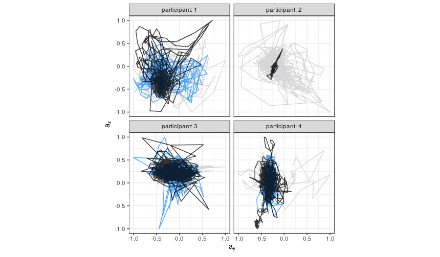
I found some accelerometer data to play with, and so far this is the best I've got. Here, the colors just indicate the order in which the readings were taken (earliest = gray, mid = blue, latest = black).
library(tidyverse)

# Data downloaded from:
#   https://archive.ics.uci.edu/ml/machine-learning-databases/00287/Activity%20Recognition%20from%20Single%20Chest-Mounted%20Accelerometer.zip
# Metadata:
#   https://archive.ics.uci.edu/ml/datasets/Activity+Recognition+from+Single+Chest-Mounted+Accelerometer

file_list <- list.files(
  "Activity Recognition from Single Chest-Mounted Accelerometer/",
  pattern = "\\.csv$",
  full.names = TRUE
)

accel <- map_dfr(
  file_list,
  read_csv,
  col_names = c("id", "x", "y", "z", "activity"),
  col_types = "nnnnn",
  .id = "participant"
) %>%
  mutate(
    activity = factor(
      activity,
      labels = c(
        "Working at Computer",
        "Standing Up, Walking and Going Up/Down Stairs",
        "Standing",
        "Walking",
        "Going Up/Down Stairs",
        "Walking and Talking with Someone",
        "Talking while Standing"
      ),
      exclude = "0"
    ),
    participant = factor(participant, levels = as.character(1:15))
  ) %>%
  filter(!is.na(activity))

hz <- 52 # frequency of readings
three_mins <- (3 * 60) * hz

# Filter data to manageable subset and prep for plotting
accel_3min <- accel %>%
  filter(participant %in% c(1:4), activity == "Standing") %>%
  group_by(participant) %>%
  slice(1:three_mins) %>%
  mutate(
    x = scales::rescale(x, to = c(-1, 1)),
    y = scales::rescale(y, to = c(-1, 1)),
    z = scales::rescale(z, to = c(-1, 1)),
    id = row_number()
  )

# Color first third of readings lightest color, second third mid color,
# last third darkest color
accel_3min %>%
  ggplot() +
  geom_path(aes(x = y, y = z, colour = cut(id, 3)), alpha = 0.8, size = 0.5) +
  facet_wrap( ~ participant, labeller = label_both) +
  coord_fixed() +
  scale_color_manual(
    values = c("gray80", "dodgerblue", "black"),
    guide = "none"
  ) +
  theme_bw() +
  labs(x = expression(a[y]), y = expression(a[z]))
If anybody else wants to play with this, I put my attempt in a shared RStudio Cloud project: