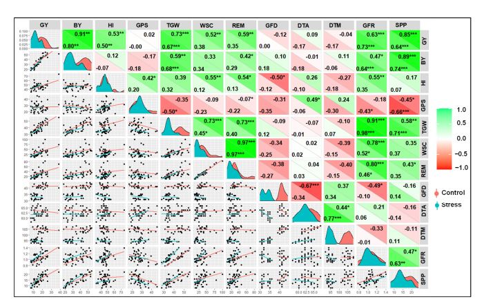
It looks like that plot is based on the GGally package but I do not see how to produce some of the features, such as the color coding of the correlation coefficients. Maybe there is another package that expands on GGally.
library(GGally)
#> Warning: package 'GGally' was built under R version 4.1.3
#> Loading required package: ggplot2
#> Registered S3 method overwritten by 'GGally':
#>   method from
#>   +.gg   ggplot2
DF <- data.frame(Grp=rep(c("A","B"),each=20),
                 Q=rnorm(40),
                 W=rnorm(40,3,2),
                 E=rnorm(40,-2,1))
ggpairs(DF,mapping = aes(color=Grp),columns = 2:4,
        lower = list(continuous=wrap(ggally_smooth,se=FALSE)),legend = 4)
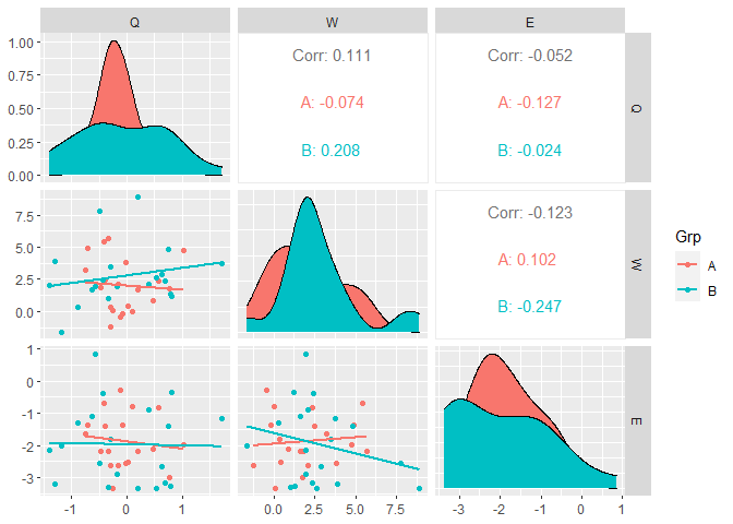
Created on 2022-08-16 by the reprex package (v2.0.1)
1 Like
Thank you for your reply. However, how could I add the correction values diagonally with a color heatmap as in the figure?