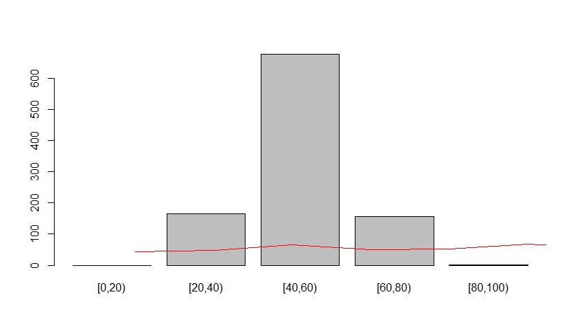
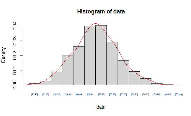
Hi, Continuous variables are divided and frequencies counted in different interval, histograms are drawn, and probability density curves are fitted. The horizontal coordinates are of the form of different intervals [a,b). Now it seems that the graph I made has problems with both the horizontal coordinates ( no scale lines)and vertical coordinates. You could also use other data to show your opinion.
Thank you for your help in advance.
@AlexisW Thank you for your help. I got the following picture using your code. While how could I change the labels of x-axis? As it shows, every bar in the plot has a corresponding interval [a, b), values of a and b are different between every bar. Is it possible to show them in x-axis? And not show the breaks value.