How to derive a forecast density for a specified point-in-time with the R Fable package forecast() function?

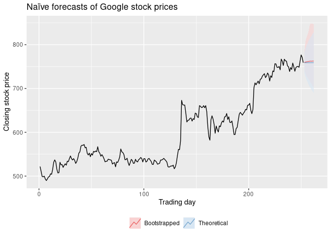
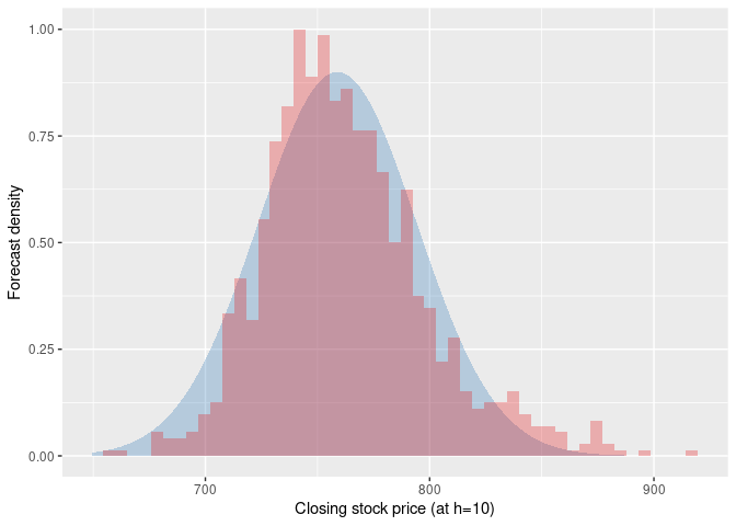
In the book Forecasting: Principles and Practice, at the very end of Chapter 5.5 "Distributional forecasts and prediction intervals" ([5.5 Distributional forecasts and prediction intervals | Forecasting: Principles and Practice (3rd ed)](https://Forecasting: Principles and Practice (3rd ed) Rob J Hyndman and George Athanasopoulos)), there are 2 plots: the first plot shows naive forecasts of Google stock price for 10 trading days using 80% and 95% confidence intervals, and the second plot shows the forecast density histogram for the 10th forecast day of Google stock.

What is the code for obtaining the latter, the forecast density histogram used in this example? Essentially, I don't understand how to obtain a forecast density from the forecast function of the Fable package.


Referred here by Forecasting: Principles and Practice, by Rob J Hyndman and George Athanasopoulos

Here is the code to create those two graphs.

library(fpp3)
library(ggdist)

# Filter data of interest
google_2015 <- gafa_stock |>
  filter(Symbol == "GOOG", year(Date) == 2015) |>
  mutate(day = row_number()) |>
  update_tsibble(index = day, regular = TRUE)
# Fit model
fit <- google_2015 |>
  model(naive = NAIVE(Close))
# Generate forecasts
fc <- bind_rows(
  forecast(fit, h = 10) |> mutate(.model = "Theoretical"),
  forecast(fit, h = 10, bootstrap = TRUE, times = 1000) |> mutate(.model = "Bootstrapped")
)

# Time plot
fc |>
  autoplot(google_2015, alpha = 0.6, level = 95) +
  ggtitle("Naïve forecasts of Google stock prices") +
  labs(y = "Closing stock price", x = "Trading day", fill = NULL, colour = NULL) +
  scale_fill_brewer(palette = "Set1") +
  scale_color_brewer(palette = "Set1") +
  theme(legend.position = "bottom") +
  guides(level = "none")


# Density + histogram plot
fc10 <- fc |> filter(day == max(day))
ggplot() +
  stat_dist_slab(aes(dist = Close, y = 0, fill = "Theoretical"),
    data = fc10 |> filter(.model == "Theoretical"),
    colour = NA, alpha = 0.3
  ) +
  geom_histogram(aes(x = x, y = after_stat(ndensity), fill = "Bootstrapped"),
    data = tibble(x = fc10 |>
      filter(.model == "Bootstrapped") |>
      pull(Close) |>
      unlist()),
    colour = NA, bins = 50, alpha = 0.3
  ) +
  scale_color_brewer(palette = "Set1") +
  scale_fill_brewer(palette = "Set1") +
  labs(x = "Closing stock price (at h=10)", y = "Forecast density") +
  theme(legend.position = "none")

Created on 2023-01-26 with reprex v2.0.2

1 Like

Thank you Mr. Hyndman, I am learning so much through your book. I am poring through it a second time and am assiduously running through the examples using both your AUS data and other data I have so I can really get my head around the material. This is a new age of learning/education.

This topic was automatically closed 7 days after the last reply. New replies are no longer allowed.

If you have a query related to it or one of the replies, start a new topic and refer back with a link.