How to displace correctly the labels out of the bar chart with a segment?

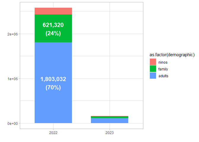
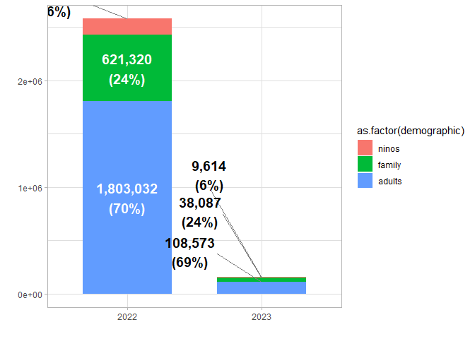
#I created this data:

data_gtp<-data.frame(
  calendar_year = c(2022,2022,2022,2023,2023,2023),
  demographic = c("ninos", "family", "adults","ninos", "family", "adults"),
  number = c(153832,621320,1803032,9614,38087,108573)
)%>%
  mutate(demographic = factor(demographic, levels = c("ninos","family","adults")))%>%
   dplyr::group_by(calendar_year)%>%
  dplyr::mutate(total = sum(number))%>%
  group_by(demographic) %>%
  mutate(prop = number/total)%>%
   mutate(percentage = paste0(round(prop * 100), "%"))%>%
mutate(label_en = paste(scales::comma(number), "\n","(", percentage, ")", sep = ""))%>%
  mutate(calendar_year = factor(calendar_year))%>%
  dplyr::group_by(calendar_year)%>%
  mutate(pos = cumsum(number))

#This is the basic plot code:
p<-ggplot(data_gtp,aes(x = calendar_year, y= number,  fill= as.factor(demographic)))+
geom_col(width = 2/3)+
theme_light()+
labs(x = "", y = "")
#I set the labels above 180000 inside of the chart:
p1 <-p+geom_text(data = subset(data_gtp, number>180000),
aes(label = label_en),
position = position_stack(vjust = 0.5),
color = "white", fontface = "bold",
size = 5)
p1

#Here comes the problem:
p1+ geom_text_repel(data = subset(data_gtp, number\<180000),#get rid of the NNA label in this stage
aes(label = label_en, y = pos, x = calendar_year),
direction = 'y',
size = 5,
fontface = "bold",
segment.color = 'grey50',
force_pull  = 1,
vjust=-0.75,
position="identity")

#I want that all labels that are under the certain threshold can be displaced out of the barchart to the #right #side with a segment.More importantly, I need that the labels displaced outside indicate the correct #category with the right order

This is closer to what I think you want. It obviously needs a lot of cleanup.

library(tidyverse)
library(ggrepel)
data_gtp<-data.frame(
  calendar_year = c(2022,2022,2022,2023,2023,2023),
  demographic = c("ninos", "family", "adults","ninos", "family", "adults"),
  number = c(153832,621320,1803032,9614,38087,108573)
)%>%
  mutate(demographic = factor(demographic, levels = c("ninos","family","adults")))%>%
  dplyr::group_by(calendar_year)%>%
  dplyr::mutate(total = sum(number))%>%
  group_by(demographic) %>%
  mutate(prop = number/total)%>%
  mutate(percentage = paste0(round(prop * 100), "%"))%>%
  mutate(label_en = paste(scales::comma(number), "\n","(", percentage, ")", sep = ""))%>%
  mutate(calendar_year = factor(calendar_year))%>%
  dplyr::group_by(calendar_year)%>%
  mutate(pos = cumsum(number))

#This is the basic plot code:
p<-ggplot(data_gtp,aes(x = calendar_year, y= number,  fill= as.factor(demographic)))+
  geom_col(width = 2/3)+
  theme_light()+
  labs(x = "", y = "")
#I set the labels above 180000 inside of the chart:
p1 <-p+geom_text(data = subset(data_gtp, number>180000),
                 aes(label = label_en),
                 position = position_stack(vjust = 0.5),
                 color = "white", fontface = "bold",
                 size = 5)
p1


#Here comes the problem:
NewDat <- data_gtp |> arrange(desc(number)) |> 
  group_by(calendar_year) |> 
  mutate(pos = cumsum(number)) |> 
  filter(number < 180000)
p1+ geom_text_repel(data = NewDat,#get rid of the NNA label in this stage
                    aes(label = label_en, y = pos, x = calendar_year),
                    direction = 'y',
                    size = 5,
                    fontface = "bold",
                    segment.color = 'grey50',
                    force_pull  = 1,
                    vjust=-0.75,
                    position="identity")

Created on 2023-02-23 with reprex v2.0.2

1 Like

This topic was automatically closed 42 days after the last reply. New replies are no longer allowed.

If you have a query related to it or one of the replies, start a new topic and refer back with a link.