Hi, I'm a new beginner of R. I predict some economic burden by using ARIMA MODEL,and I want to draw a beautiful forecast line ,but I don't know how to do it!
g3_time=ts(G_forecast$us,start = min(G_forecast$year),max(G_forecast$year))
plot(g3_time)
ndiffs(g3_time)
dus <- diff(g3_time,2)
plot(dus)
adf.test(dus)
acf(dus)
pacf(dus)
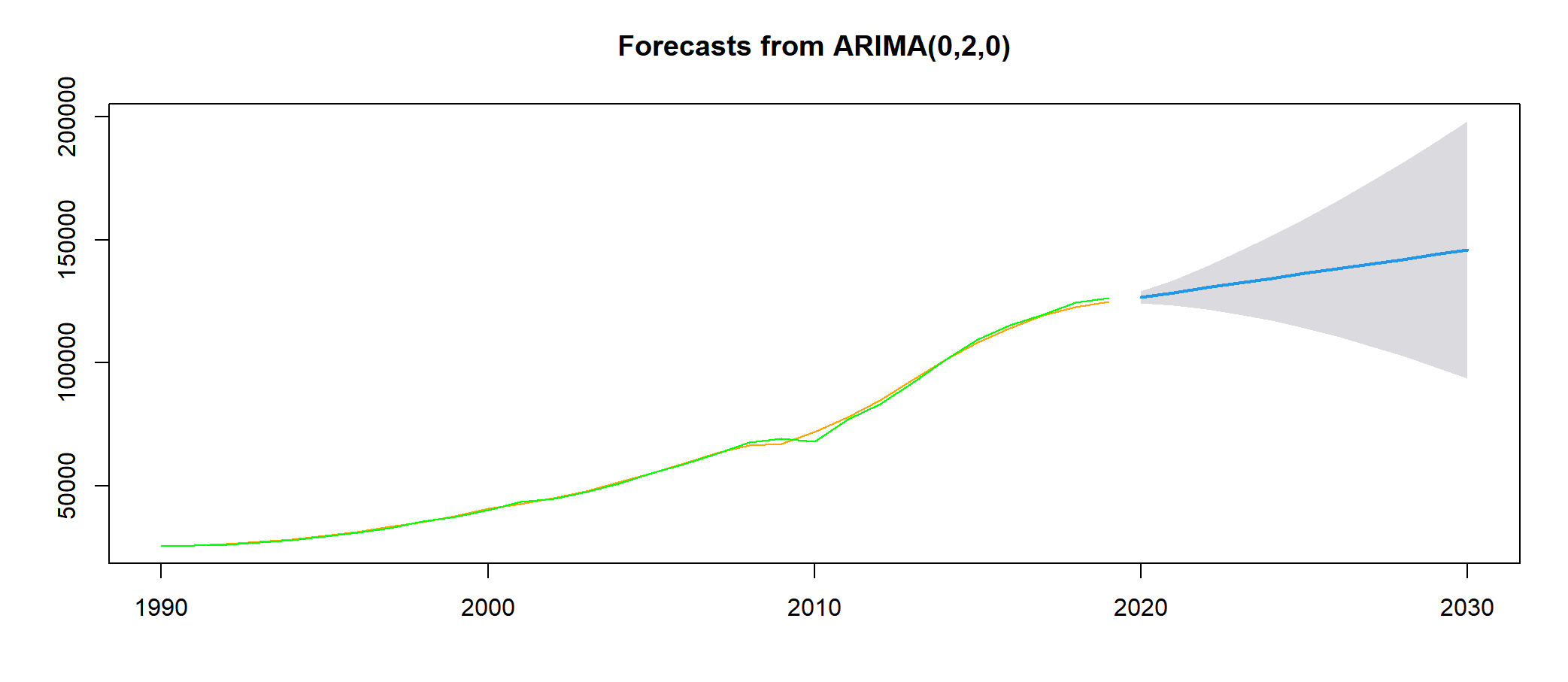
fit <- arima(g3_time,order=c(0,2,0))
fit
accuracy(fit)
qqnorm(fit$residuals)
qqline(fit$residuals)
Box.test(fit$residuals,type="Ljung-Box")
f_p1 <- forecast(fit,h=11,level=c(95))
plot(f_p1)
lines(f_p1$fitted,col="green")
lines(g3_time,col="orange")
This is my final plot
HOW CAN I DRAW THIS PLOT BEAUTIFUL?
Thank you so much
My personal suggestions to you are:
Use ggplot. ggplot gives beautiful graphs.
If you are ready to go a step ahead, use the package plotly. It gives you interactivity.
Use nice themes (like theme_minimal and hundreds of themes are available in R).
Increase the size of lines. (give size 1.5 for example).
Hope it helps,
junjun1
October 20, 2022, 10:04am
3
Thank you so much for your reply, kuttan.But the problem is I don't know how to put the three different values(existing values&forecast values&fitted values)in one table ,and then I can use ggplot2
It would be useful if you can provide a sample data of yours.
junjun1
October 20, 2022, 10:11am
5
SURE! THIS IS MY EXAMPLE DATA:
G_forecast<-structure(list(year = 1990:2019, us = c(25578.2787763689, 25955.303661286,
26607.4952715988, 27284.2726771786, 28470.3454469103, 29723.5508466642,
31386.8965981198, 33484.2558245705, 35484.6077885256, 37888.8342144187,
40746.5610245587, 42754.7873459213, 45094.2076872047, 47974.2296121668,
51638.4571215021, 55204.5341690812, 59170.5868424335, 63426.3357531801,
66401.4002328101, 67191.3108071306, 72055.2297680338, 77662.0388629392,
84823.0535243136, 93065.2340556945, 101378.210402337, 108379.42056402,
114001.553113478, 119217.426273179, 122812.286428169, 124737.879190838
)), class = "data.frame", row.names = c(NA, -30L))
Thank you so much!!!!
junjun1
October 20, 2022, 12:17pm
6
Hi,guys. I found a way to show beautiful forecast plot in StackOverflow(This is the link:How to plot a subset of forecast in R? - Stack Overflow ), this is the code:
   library(lubridate)
    library(tidyverse)
    library(scales)
    library(ggfortify)

    # Convert pred from list to data frame object
    df1 <- fortify(pred) %>% as_tibble()

    # Convert ts decimal time to Date class
    df1$Date <- as.Date(date_decimal(df1$Index), "%Y-%m-%d")
    str(df1)

    # Remove Index column and rename other columns
    # Select only data pts after 2017
    df1 <- df1 %>%
      select(-Index) %>%
      filter(Date >= as.Date("2017-01-01")) %>%
      rename("Low95" = "Lo 95",
             "Low80" = "Lo 80",
             "High95" = "Hi 95",
             "High80" = "Hi 80",
             "Forecast" = "Point Forecast")
    df1

    ### Updated: To connect the gap between the Data & Forecast,
    # assign the last non-NA row of Data column to the corresponding row of other columns
    lastNonNAinData <- max(which(complete.cases(df1$Data)))
    df1[lastNonNAinData, !(colnames(df1) %in% c("Data", "Fitted", "Date"))] <- df1$Data[lastNonNAinData]

    # Or: use [geom_segment](http://ggplot2.tidyverse.org/reference/geom_segment.html)

    plt1 <- ggplot(df1, aes(x = Date)) +
      ggtitle("Ticket amount") +
      xlab("Time frame") + ylab("Quantity") +
      geom_ribbon(aes(ymin = Low95, ymax = High95, fill = "95%")) +
      geom_ribbon(aes(ymin = Low80, ymax = High80, fill = "80%")) +
      geom_point(aes(y = Data, colour = "Data"), size = 4) +
      geom_line(aes(y = Data, group = 1, colour = "Data"),
                linetype = "dotted", size = 0.75) +
      geom_line(aes(y = Fitted, group = 2, colour = "Fitted"), size = 0.75) +
      geom_line(aes(y = Forecast, group = 3, colour = "Forecast"), size = 0.75) +
      scale_x_date(breaks = scales::pretty_breaks(), date_labels = "%b %y") +
      scale_colour_brewer(name = "Legend", type = "qual", palette = "Dark2") +
      scale_fill_brewer(name = "Intervals") +
      guides(colour = guide_legend(order = 1), fill = guide_legend(order = 2)) +
      theme_bw(base_size = 14)
    plt1
I tried so many times, but I still can't repeat his results in my data, can you guys help me?
system
December 1, 2022, 12:18pm
7
This topic was automatically closed 42 days after the last reply. New replies are no longer allowed.