How would I go about making rank abundance curves to compare tree species from two different years? I dont have data to share here, but any general code guidance would be very helpful!
@williaml thanks. I did see that in my search, but I am having a hard time interpreting what they are describing to make code out of it. Or rather I am not sure where to plug things in to compare the abundance of 15 species (the species are in one column) in two different years...
This is the example dataset that they use: R: Vegetation releves from Scheden (r-project.org)
Your species are in one column, but you could use something like dplyr::pivot_wider() to get them in to many columns so that they're in the same shape.
See also: R: Rank Abundance Curves (r-project.org)
I was curious what a rank abundance curve is.
It may be of advantage to feed it in into a dedicated package, maybe you want to obtain some other parameters describing or differentiating the curves / populations (see: https://esajournals.onlinelibrary.wiley.com/doi/full/10.1002/ecs2.2881)
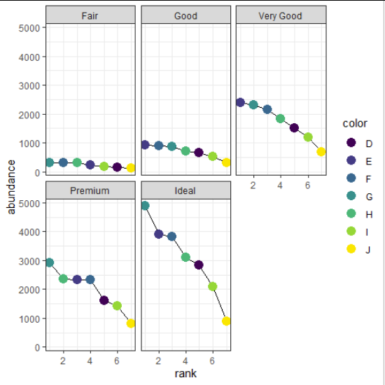
However the plot is quite simple, you just need the rank and the abundance (the counts?)
library(tidyverse)

# Calculate values based on the diamonds dataset
rank_abundance = diamonds %>%
   # count
  count(cut, color, name = "abundance") %>%
   # add ranks within the readout groups (here: cut)
  group_by(cut) %>%
  mutate(rank = rank(desc(abundance))) %>%
   # add normalised abundance
  mutate(norm_abundance = abundance / max(abundance))

# check the outcome
rank_abundance
# A tibble: 35 x 5
# Groups:   cut [5]
   cut   color abundance  rank norm_abundance
   <ord> <ord>     <int> <dbl>          <dbl>
 1 Fair  D           163     6          0.519
 2 Fair  E           224     4          0.713
 3 Fair  F           312     2          0.994
 4 Fair  G           314     1          1
 5 Fair  H           303     3          0.965
 6 Fair  I           175     5          0.557
 7 Fair  J           119     7          0.379
 8 Good  D           662     5          0.710
 9 Good  E           933     1          1
10 Good  F           909     2          0.974
# ... with 25 more rows

# plot with total abundance
ggplot(rank_abundance,
       aes(x = rank,
           y = abundance)) +
  geom_line() +
  geom_point(aes(colour = color),
             size = 4) +
  theme_bw() +
  facet_wrap(~ cut)
# plot with normalised abundance
ggplot(rank_abundance,
      aes(x = rank,
          y = norm_abundance)) +
 geom_line() +
 geom_point(aes(colour = color),
            size = 4) +
 theme_bw() +
 facet_wrap(~ cut)

# all in one
ggplot(rank_abundance,
      aes(x = rank,
          y = abundance,
          colour = cut)) +
 geom_line() +
 geom_point(size = 7) +
 geom_text(aes(label = color),
            colour = "grey70",
            fontface = "bold") +
 theme_bw()

This topic was automatically closed 21 days after the last reply. New replies are no longer allowed.
If you have a query related to it or one of the replies, start a new topic and refer back with a link.