Hello
I am trying to "make pretty" a graph below.
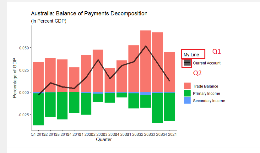
Specifically, I want for Q1, I want to remove the words "My Line". I've tried using scale_color_discrete(name = "") but this doesn't work.
For Q2, I want to remove the grey box around the black line.
Below is the dput output for dat1 which is the data I'm using. Also attached is my code. Sorry if it's not very good, I'm still learning.
structure(list(year = c("Q1 2019", "Q2 2019", "Q3 2019", "Q4 2019",
"Q1 2020", "Q2 2020", "Q3 2020", "Q4 2020", "Q1 2021", "Q2 2021",
"Q3 2021", "Q4 2021"), current_account = c(-1109.02667393265,
3660.72528764784, 2139.92399300988, 1486.36342433968, 5515.29390026161,
12064.9430330826, 5022.83386227289, 9913.46475323625, 13303.9556437895,
20135.4601644229, 12518.021780825, 4878.9121836567), balance_on_goods_and_services = c(11801.8387671099,
13297.5303303175, 12799.1033701068, 9568.76352533526, 13843.5061283231,
15801.9999571294, 8970.41928486537, 11837.168974812, 20421.3013504932,
26861.9146673647, 26041.3654940305, 17482.4650165682), primary_income_credit = c(12546.1758732497,
11863.2151611759, 11189.7050563377, 12043.3023573049, 11084.5431930097,
9310.18322646373, 10899.1417022828, 10769.0933481838, 12155.2236224838,
12160.4561654009, 12758.3289971177, 14049.3723657532), primary_income_debit = c(24983.3722467487,
21420.8807438295, 21846.8281323522, 20217.9594984319, 19092.9710217002,
12476.0914260247, 14594.905800346, 12461.369016348, 18767.0035539964,
17569.0401021531, 25983.3096222044, 26400.0525283542), primary_income_net = c(-12437.196373499,
-9557.6655826536, -10657.1230760145, -8174.657141127, -8008.4278286905,
-3165.90819956097, -3695.7640980632, -1692.2756681642, -6611.7799315126,
-5408.5839367522, -13224.9806250867, -12350.680162601), secondary_income_credit = c(1867.60946631433,
1915.45507207133, 1878.08832186004, 1879.99346223377, 1742.36438175766,
1516.72445434643, 1644.70802583184, 1722.2080678168, 1786.48701294582,
1803.88829106719, 1792.38318207304, 1826.95038751716), secondary_income_debit = c(2341.27853385782,
1994.59453208744, 1880.14462294237, 1787.73642210234, 2062.1487811286,
2087.87317883227, 1896.52935036112, 1953.63662122838, 2292.05278813689,
3121.75885725675, 2090.7462701918, 2079.82305782767), secondary_income_net = c(-473.66906754349,
-79.13946001611, -2.05630108233004, 92.2570401314301, -319.78439937094,
-571.14872448584, -251.82132452928, -231.42855341158, -505.56577519107,
-1317.87056618956, -298.36308811876, -252.87267031051), nominal_gdp = c(348056.96609927,
348056.96609927, 348056.96609927, 348056.96609927, 331725.264780802,
331725.264780802, 331725.264780802, 331725.264780802, 388166.840809015,
388166.840809015, 388166.840809015, 388166.840809015)), class = c("tbl_df",
"tbl", "data.frame"), row.names = c(NA, -12L))
# open file for Australia
# I cleaned this file by hand
dat1 <- read_excel("Australia_BOP.xlsx")

# dput(dat1)

# create the percentage of gdp columns
dat1$pct_current_account <- dat1$current_account / dat1$nominal_gdp
dat1$pct_balance_on_goods_and_services <- dat1$balance_on_goods_and_services / dat1$nominal_gdp
dat1$pct_primary_income_net <- dat1$primary_income_net / dat1$nominal_gdp
dat1$pct_secondary_income_net <- dat1$secondary_income_net / dat1$nominal_gdp

# select a smaller subset of our original data frame
dat2 <- dat1[, c("year", "pct_current_account", "pct_balance_on_goods_and_services", "pct_primary_income_net","pct_secondary_income_net")]

# change to long form
# have our indexes be "year" and "pct_current_account"
dat3 <- melt(dat2, id.vars = c("year", "pct_current_account"),
                    variable.name = "category",
                    value.name = "total_percent_gdp")

# dat3


theme_set(theme_classic())

# make the plot
pl1 <- ggplot(data = dat3, aes(fill = category, x = factor(year, level = c("Q1 2019", "Q2 2019", "Q3 2019", "Q4 2019", "Q1 2020", "Q2 2020", "Q3 2020", "Q4 2020", "Q1 2021", "Q2 2021", "Q3 2021", "Q4 2021")) , y = total_percent_gdp))
pl2 <- pl1 + geom_bar(stat = "identity", show.legend = TRUE)
pl3 <- pl2 + geom_line(size = 1.5, alpha = 0.7,  aes(year, pct_current_account, linetype = "Current Account", group=1), color="black") +
  scale_linetype_manual(name = 'My Line',values='solid')


# make prettier
pl3 <- pl3 + labs(title = "Australia: Balance of Payments Decomposition")
pl3 <- pl3 + labs(subtitle = "(In Percent GDP)")
pl3 <- pl3 + labs(x = "Quarter", y = "Percentage of GDP")
pl3 <- pl3 + labs(fill = "Category")
pl3 <- pl3 + scale_fill_discrete(labels = c("Trade Balance", "Primary Income", "Secondary Income"), name = "")
pl3 <- pl3 + scale_colour_discrete(labels = c("Current Account"), name = "")
pl3