Hi! I have this code where I want to replace the NA at the bottom of the chart with the age range that I have coded. For some reason it does not work. Any ideas on how to fix this without having to change my entire assignment? Here is the code:
nobel_winners["Age_Range"] = cut(nobel_winners$Age_Range, c(0, 30, 44,60, 75, Inf), c("0-30", "31-44", "45-59", "46-74", ">74"), include.lowest = TRUE)
nobel_winners$Age_Range <- factor( nobel_winners$Age_Range ,
levels=c("Not Appl (Organisation)","Less than 30 yo", "30-44 yo", "45-59 yo","60-74 yo", "75 yo or more"))
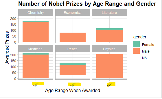
#Plot3 - Number of Nobel Prizes by Age Range
ggplot(nobel_winners, aes( x = Age_Range, fill = gender)) +
geom_bar() + scale_fill_brewer(palette = "Set2") +
facet_wrap(~ category ) +
labs(title = "Number of Nobel Prizes by Age Range and Gender") +
xlab("Age Range When Awarded") +
ylab("Awarded Prizes") +
theme(axis.text.x = element_text(angle = 55, hjust = 1),
axis.title.x = element_text(size = 12),
axis.title.y = element_text(size = 12),
plot.title = element_text(size = 15, face = "bold"))
The cut() function returns a factor. In your second step, you use factor() with levels that do not match the values of Age_Range. This produces NAs. Leave out the second step and see if you get the plot you want.
Here is an example of using cut() followed by factor(), as you are now doing.
DF <- data.frame(Age = c(31,55,76,27,44))
DF["Age_Range"] = cut(DF$Age, c(0, 30, 44,60, 75, Inf),
                      c("0-30", "31-44", "45-59", "46-74", ">74"),
                      include.lowest = TRUE)
DF
#>   Age Age_Range
#> 1  31     31-44
#> 2  55     45-59
#> 3  76       >74
#> 4  27      0-30
#> 5  44     31-44

#Age_Range is a factor already
str(DF)
#> 'data.frame':    5 obs. of  2 variables:
#>  $ Age      : num  31 55 76 27 44
#>  $ Age_Range: Factor w/ 5 levels "0-30","31-44",..: 2 3 5 1 2

DF$Age_Range <- factor( DF$Age_Range ,
                        levels=c("Not Appl (Organisation)","Less than 30 yo", "30-44 yo",
                                 "45-59   yo","60-74 yo", "75 yo or more"))
#Now Age_range is all NA
DF
#>   Age Age_Range
#> 1  31      <NA>
#> 2  55      <NA>
#> 3  76      <NA>
#> 4  27      <NA>
#> 5  44      <NA>
I'm sorry, I'm really new to this so I guess I don't understand how to plot this in using the data I have. The data set I have is called nobel_winners. I just don't understand which one I should change. I'm not sure if you could just code what I should paste in my R Markdown based on the dataset I have?
I pasted what you did above and got the right graph but I need to plot it into a bar chart which isn't working for me and I'm not sure if its because the dataset got changed