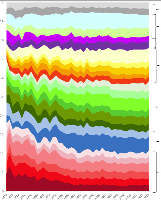
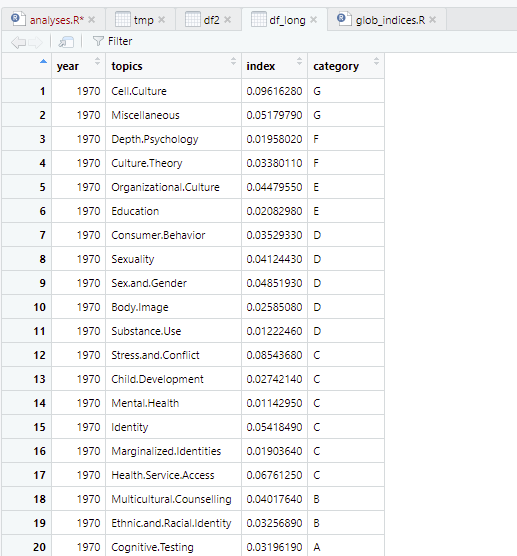
Is there is a way to distinguish between the overarching groupings in the variables plotted? See category in df
Plot:
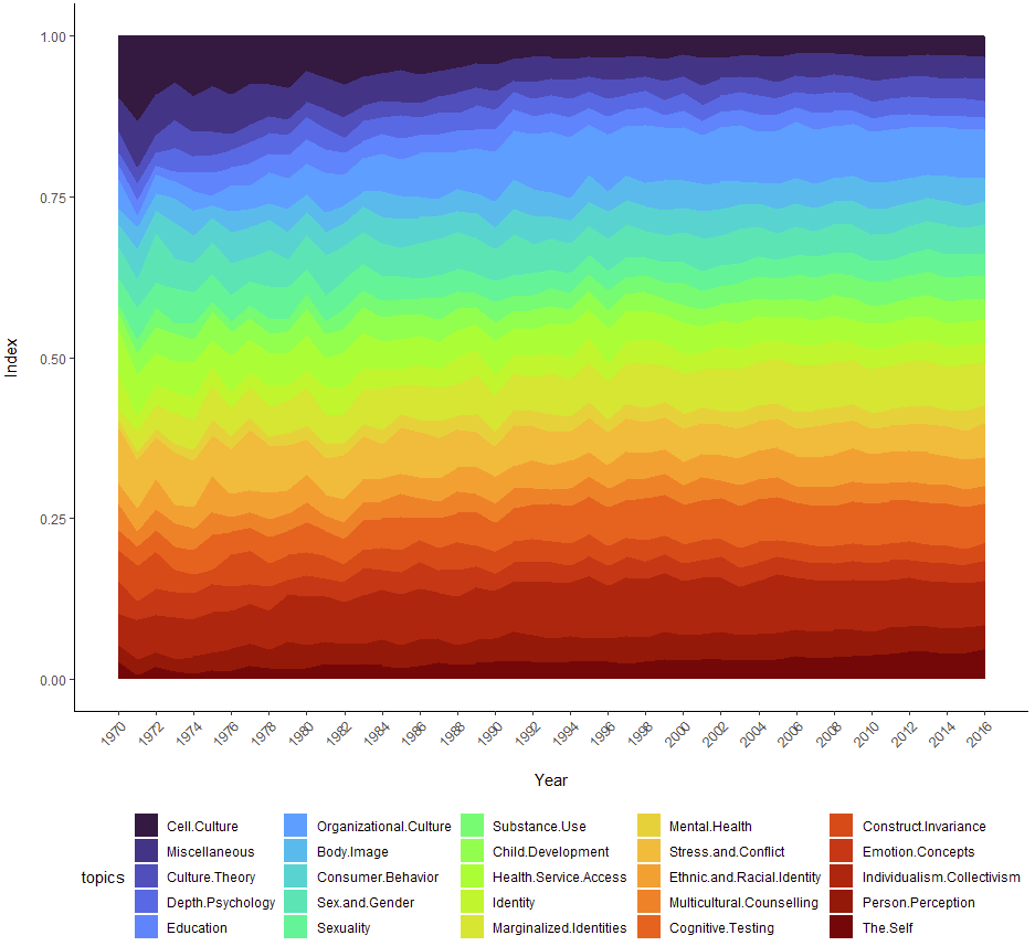
df_long$topics <- factor(df_long$topics,
levels = c("Cell.Culture", "Miscellaneous", # Other/Miscellaneous
"Culture.Theory", "Depth.Psychology", # Culture Theory
"Education", "Organizational.Culture", # Domain Culture
"Body.Image", "Consumer.Behavior", "Sex.and.Gender", "Sexuality", "Substance.Use", # Cultural Norm
"Child.Development", "Health.Service.Access", "Identity", "Marginalized.Identities", "Mental.Health", "Stress.and.Conflict", # Cultural Context
"Ethnic.and.Racial.Identity", "Multicultural.Counselling", # Cross-Ethnic/Multicultural
"Cognitive.Testing", "Construct.Invariance", "Emotion.Concepts", "Individualism.Collectivism", "Person.Perception", "The.Self" # Cross-Cultural
))
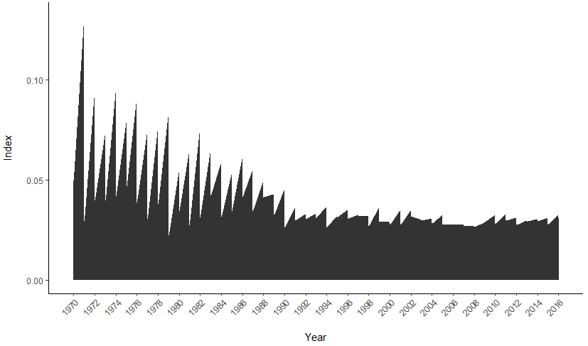
# stacked area chart
area_fig <- ggplot(df_long, aes(x = year, y = index, fill = topics)) +
geom_area() + #alpha = 1, size = 0.5, color = "white") +
#scale_fill_viridis(discrete = T) + # produces the viridis color space
#scale_fill_viridis(discrete = T, option = "inferno") + # produces the inferno color space
scale_fill_viridis(discrete = T, option = "turbo") + # produces the turbo color space
theme_classic() +
xlab("\nYear") +
ylab("Index\n") +
scale_x_continuous(breaks = seq(1970,2017,2)) +
theme(axis.text.x=element_text(angle = 45, hjust = 1)) +
theme(legend.position = 'bottom')