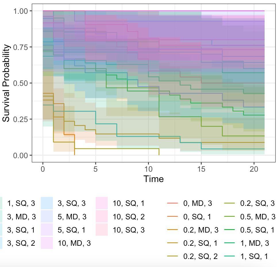
Hello, so I am trying to run Kaplan-Meier survival curve code and I am having trouble getting it to plot correctly. I managed to get each of my plots to work when I separate my data into my three trials on their own data sheets. But when I try to run the combined data set it makes everything look really messy. Is there a way to filter the data (while it is coming from one data sheet) so I can do all of the analyses on one Code-Page? I have three categories for my data: Salinity (7 treatments), Site (2 different sites), Trial (3 different trials)
Here is my code that leads up to this point and then the resulting curve:
#Library-----
library(data.table)
library(ggplot2)
library(survival)
library(survminer)
library(lubridate)
library(ggsurvfit)
library(performance)
#require(AICcmodavg) #allows you to make AIC table!
library(tidyverse)
library(finalfit)
library(dplyr)
library(forcats)
library(survival)

#NOTE: majority of notes are direct quotes from these sources to minimize issue
#of re-wording something incorrectly

#Data Input ------
survival = fread("/Users/haley/documents/Thesis/GROUPED_MASTER_CH1.csv")

#Create a dataset with only healthy crabs

healthy = survival[survival$Parasitized != 1, ]

# healthy = healthy[healthy$Remove != 1, ] unsure if need these
# healthy = healthy[healthy$Gravid.in.Expt != 1, ]
# healthy = healthy[!is.na(healthy$Salinity)]

healthy$Trial = as.factor(healthy$Trial) #was region in Darby's Data
healthy$Site = as.factor(healthy$Site)
healthy$Salinity = as.factor(healthy$Salinity) # was coev history in Darby's
healthy$GROUP = as.factor(healthy$GROUP)  # was Year in Darby's
healthy$Sex = as.factor(healthy$Sex) # Was regional.pop in Darby's

healthy$Initial_Carapace_Width = as.numeric(healthy$Initial_Carapace_Width)

health.all = healthy

glimpse(healthy)
missing_glimpse(healthy) #nothing super important is missing any data
ff_glimpse(healthy)

missing_plot(health.all)

#status = Live (i.e., cenosring)
#0 = event did not happen (i.e., censored)
#1 = event happened (i.e., died)

#Time = Survival (i.e., number of days from the start that the crab was alive or
#number of days of entire trial (if crab was censored))

#What is the replication by site, population, and salinity ----

health.all$one = 1

aggregate(one ~ Site + Trial + Salinity , data = health.all, FUN = sum)
aggregate(one ~ Site + Salinity, data = health.all, FUN = sum)

#.-----
#.-----
#Survival Analysis tutorial with interpretations

# Estimation of Survival Distributions -----
# Kaplan Meier Survival Estimator ----
#Kaplan Meier (KM) survival estimator = non-parametric statistic used to
#estimate the survival function from time-to-event data

survival_object <- healthy %$%
  Surv(Survival, Live)

head(survival_object) # + marks censoring (i.e., alive)

# Model
# overall survival in whole cohort (to do this subsitute "1" for coev below)

my_survfit <- survfit(survival_object ~ Salinity , data = healthy)
my_survfit

# Life table
#A Life table is the tabular form of a KM plot -- shows survival as a
#proportion, together with confidence limits

summary(my_survfit, times = c(0, 2, 5, 10, 15, 20, 25, 28))

#  Figures -----

dependent_os = "Surv(Survival, Live)"
explanatory = c("Salinity")

healthy %>%
  surv_plot(dependent_os, explanatory, pval = TRUE)

# the ggsurvplot function from the survminer package is built on ggplot2,
#and can be used to create Kaplan-Meier plots. Checkout the cheatsheet for
#the survminer package

palette_Salinity = setNames(object = c("#7A0403FF",
    "#E03F08FF", "#18DAC7FF", "#83FF52FF", "#FEAA33FF", "#2E9FDF", "#E7B800"),
    nm = levels(healthy$Salinity))


ggsurvfit(survfit(Surv(Survival, Live) ~ Salinity, data=healthy),
          linetype_aes = FALSE, size = 2) +
  scale_color_manual(values = palette_Salinity) +
  theme_bw() +
  theme(panel.grid.major = element_blank(),
        panel.grid.minor = element_blank()) +
  theme(axis.title.x = element_text(size=20),
        axis.text.x  = element_text(size=16)) +
  theme(axis.title.y = element_text(size=20),
        axis.text.y  = element_text(size=16)) +
  theme(panel.border = element_rect(colour = "black", fill=NA, size=2))+
  theme(axis.ticks = element_line(color = "black", size = 2),
        axis.ticks.length = unit(0.25, "cm")) +
  theme(legend.position = c(.8, .8)) +
  theme(legend.text = element_text(size=16)) +
  guides(color = guide_legend(override.aes = list(size = 10, stroke = 20)))

ggsurvfit(survfit(Surv(Survival, Live) ~ Site, data=healthy),
          linetype_aes = FALSE, size = 2) +
          scale_color_manual(values = c("#38F491FF","#E03F08FF")) +
          theme_bw() +
          theme(panel.grid.major = element_blank(),
          panel.grid.minor = element_blank())

ggsurvfit(survfit(Surv(Survival, Live) ~ Salinity, data=healthy),
          linetype_aes = FALSE, size = 2)

# There is an error with this line for some reason

# ggsurvfit(Surv(Survival, Live) ~ Salinity + Site, data=healthy,
# linetype_aes = FALSE, size = 2)

survfit2(Surv(Survival, Live) ~ Salinity + Site + Trial, data=healthy) %>%
  ggsurvfit() +
  add_confidence_interval()