Can anyone work out why my legend wont show with this coding? I tried scale_color_manual, however, doesn't seem to do much
d.Silo = read_xlsx("Raw_Data_Compiled.xlsx",sheet = 1)
ggplot() +
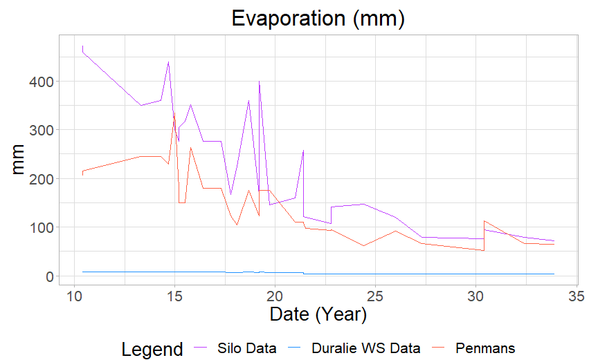
geom_line(data = d.Silo, aes(x = Date, y = evap_comb), color = "darkorchid1") +Current Evaporation (mm/d)), color = "dodgerblue") +Penmans (mm/d)), color = "tomato") +
Flm
November 28, 2022, 10:47am
2
Can you copy and paste the output of dput(head(YOURDF, 10))? You should repeat this for the three data frame you use
A legend is generated automatically when you specify color as one of your fields within aes(). Below is one way to achieve this, making a few adjustments to your current code base for illustration.
For each of your datasets (mtcars in this example), I add a column called type that will correspond to the color coding. For each geom_line, I specify color = type within aes(), and then map each type to the desired color within scale_color_manual(). Please note two other modifications to your code, 1) used d.Strat in the third geom_line, and 2) commented out ylim , as it did not fit this example data. The result is shown below.
library(tidyverse)

d.Silo = mtcars %>% mutate(type = 'Silo Data')
d.Dur = mtcars %>% mutate(type = 'Duralie WS Data')
d.Strat = mtcars %>% mutate(type = 'Penmans')

ggplot() +
  geom_line(data = d.Silo, aes(x = mpg, y = disp, color = type)) +
  geom_line(data = d.Dur, aes(x = mpg, y = cyl, color = type)) +
  geom_line(data = d.Strat, aes(x = mpg, y = hp, color = type)) +
  theme_light() +
  scale_color_manual(values = c("Silo Data" = "darkorchid1",
                                "Duralie WS Data" = "dodgerblue",
                                "Penmans" = "tomato")) +
  labs(x = "Date (Year)", y = "mm", col = "Legend", title = "Evaporation (mm)") +
  # coord_cartesian(ylim =c(0, 15)) +
  theme(legend.position = "bottom") +
  theme(text = element_text(size = 20)) +
  theme(plot.title = element_text(hjust = 0.5)) +
  theme(axis.title.x = element_text(colour = "black"))
system
January 9, 2023, 2:31pm
4
This topic was automatically closed 42 days after the last reply. New replies are no longer allowed.