Machine Learning Model together with Multiple Plots in Shiny

Hello guys, I am relatively new to Shiny and would like to add both 2D and 3D plots to my ML model deployment.

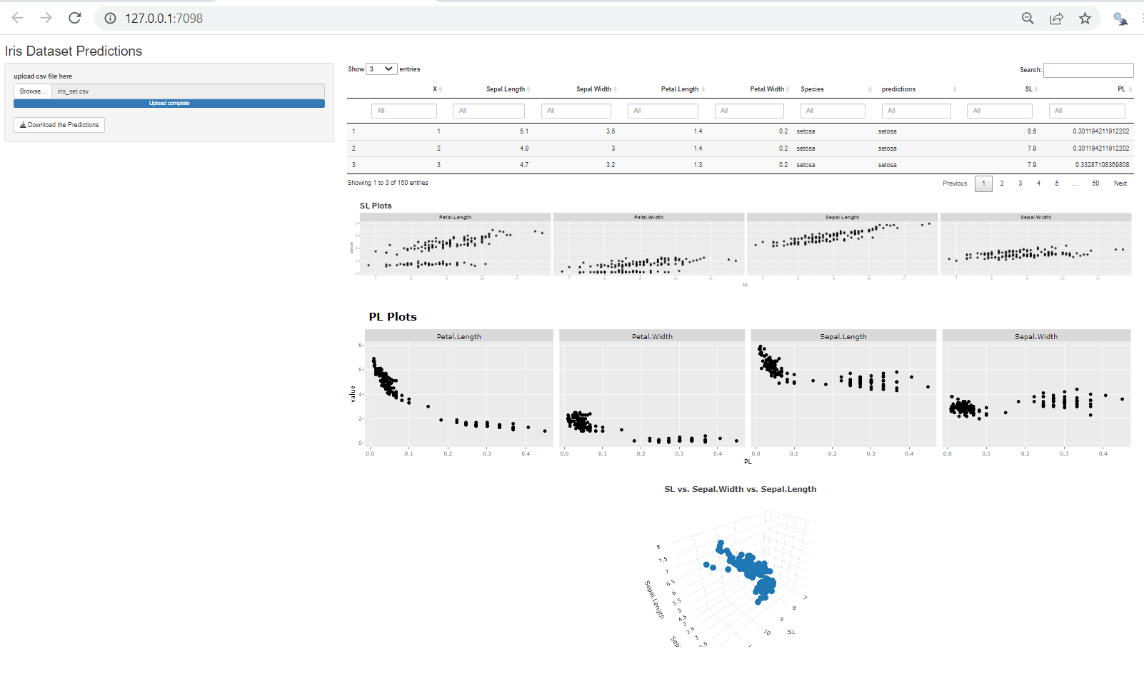
  1. I wish to explore two extra measures (SL=Sepal Length+Sepal width and PL=Exp [Petal width-Petal length])
  2. These two new measures are not expected to form inputs for ML model training. I am just plotting each of them against any of the inputs (sepal length, sepal width, petal length or petal width) for 2D or against two of these for 3D plots
  3. I love to use ggplot for these plots if possible
  4. The essence of these is that I wish to compare my ML predictions with Plots that can be explained with some physics-based principles.

I don't have any clue on overcoming this problem. Your expert and kind opinions/suggestions would be very much appreciated. Many thanks!

The code I have been practicing with are as follows:

Code for Model Generation (courtesy of How to Share your Machine Learning Models with Shiny | R-bloggers):
library(nnet)
model<-multinom(Species~Sepal.Length+Sepal.Width+Petal.Length+Petal.Width,data = iris)
saveRDS(model, "iris_model.rds")

Code for App:
library(shiny)
library(DT)
library(tidyverse)
iris_model <- readRDS("iris_model.rds")

Define UI for application that draws a histogram

ui <- fluidPage(

# Application title
titlePanel("Iris Dataset Predictions"),

# Sidebar with a slider input for number of bins 
sidebarLayout(
    sidebarPanel(
        # Input: Select a file ----
        fileInput("file1", "upload csv file here",
                  multiple = FALSE,
                  accept = c("text/csv",
                             "text/comma-separated-values,text/plain",
                             ".csv")), 
        
        
        # Button
        downloadButton("downloadData", "Download the Predictions")
    ),

    # Show the table with the predictions
    mainPanel(
        DT::dataTableOutput("mytable")
    )
)

)

Define server logic required to draw a histogram

server <- function(input, output) {

reactiveDF<-reactive({
    req(input$file1)
    df <- read.csv(input$file1$datapath, stringsAsFactors = TRUE)
    
    df$predictions<-predict(iris_model, newdata = iris, type ="class")
    return(df)
    
})

output$mytable = DT::renderDataTable({
    req(input$file1)
    
    return(DT::datatable(reactiveDF(),  options = list(pageLength = 100), filter = c("top")))
})


# Downloadable csv of selected dataset ----
output$downloadData <- downloadHandler(
    filename = function() {
        paste("data-", Sys.Date(), ".csv", sep="")
    },
    content = function(file) {
        write.csv(reactiveDF(), file, row.names = FALSE)
    }
)

}

Run the application

shinyApp(ui = ui, server = server)

Below is one approach to producing both 2D and 3D plots in your app. When this example app launches, upload a .csv file of the iris dataset. For the 2D plots, the data is first reshaped into a "long" format using pivot_longer, and then SL/PL are plotted against each of the four numeric columns of the iris dataset in a faceted format using ggplot2. Since I'm not familiar with an easy way to create 3D plots with ggplot2, I chose to generate a 3D plot with plotly. This was done for only one of the combinations (SL, Sepal.Width, Sepal.Length), which could be copied for the other combinations. If you want to keep all of the outputs consistent, I demonstrated how to convert the 2D PL plot into a plotly output.

I hope this example provides some ideas on how to generate your desired outcome.

library(shiny)
library(nnet)
library(DT)
library(tidyverse)
library(plotly)

iris_model<-multinom(Species~Sepal.Length+Sepal.Width+Petal.Length+Petal.Width,data = iris)

ui <- fluidPage(
  
  # Application title
  titlePanel("Iris Dataset Predictions"),
  
  # Sidebar with a slider input for number of bins 
  sidebarLayout(
    sidebarPanel(
      width = 3,
      # Input: Select a file ----
      fileInput("file1", "upload csv file here",
                multiple = FALSE,
                accept = c("text/csv",
                           "text/comma-separated-values,text/plain",
                           ".csv")), 
      
      
      # Button
      downloadButton("downloadData", "Download the Predictions")
    ),
    
    # Show the table with the predictions
    mainPanel(
      width = 7,
      DT::dataTableOutput("mytable"),
      br(),
      plotOutput('plots2D_SL', height = '200px'),
      br(),
      plotlyOutput('plots2D_PL'),
      br(),
      plotlyOutput('plots3D_SL')
    )
  )
)

#Define server logic required to draw a histogram
server <- function(input, output, session) {
  
  reactiveDF <<- reactive({
    req(input$file1)
    df <- read.csv(input$file1$datapath, stringsAsFactors = TRUE)
    
    df$predictions<-predict(iris_model, newdata = iris, type ="class")
    
    df = df %>%
      mutate(SL = Sepal.Length + Sepal.Width,
             PL = exp(Petal.Width - Petal.Length)
             )
    return(df)
    
  })
  
  output$mytable = DT::renderDataTable({
    req(input$file1)
    
    return(DT::datatable(reactiveDF(),  options = list(pageLength = 3), filter = c("top")))
  })
  
  # 2D SL plot - ggplot output
  output$plots2D_SL = renderPlot({
    
    # reshape the data
    d = reactiveDF() %>% 
      select(-Species, -PL) %>% 
      pivot_longer(c(-'X', -'predictions', -'SL'))
    
    # create faceted plot
    ggplot(d, aes(x = SL, y = value)) + 
      geom_point() + 
      facet_wrap(~name, nrow = 1) +
      labs(title = 'SL Plots') +
      theme(strip.text = element_text(face = 'bold', size = '12'),
            plot.title = element_text(face = 'bold', size = '18'))
    
  })
  
  # 2D PL plot - ggplot converted to plotly output
  output$plots2D_PL = renderPlotly({
    
    # reshape the data
    d = reactiveDF() %>% 
      select(-Species, -SL) %>% 
      pivot_longer(c(-'X', -'predictions', -'PL'))
    
    # create faceted plot
    g = ggplot(d, aes(x = PL, y = value)) + 
      geom_point() + 
      facet_wrap(~name, nrow = 1) +
      labs(title = 'PL Plots') +
      theme(strip.text = element_text(face = 'bold', size = '12'),
            plot.title = element_text(face = 'bold', size = '18'))
    
    ggplotly(g)
    
  })
  
  # 3D SL plot - plotly output
  output$plots3D_SL = renderPlotly({
    plot_ly(reactiveDF(), x = ~SL, y = ~Sepal.Width, z = ~Sepal.Length) %>% 
      layout(title = '<b>SL vs. Sepal.Width vs. Sepal.Length</b>')
  })
  
  
  # Downloadable csv of selected dataset ----
  output$downloadData <- downloadHandler(
    filename = function() {
      paste("data-", Sys.Date(), ".csv", sep="")
    },
    content = function(file) {
      write.csv(reactiveDF(), file, row.names = FALSE)
    }
  )
}

# Run the application
shinyApp(ui = ui, server = server)

Below is a look at the output. Apologies for the cramped view (there was a lot to fit in!).

This topic was automatically closed 54 days after the last reply. New replies are no longer allowed.

If you have a query related to it or one of the replies, start a new topic and refer back with a link.