I am new to R. I have 1 million data to analyze the export Wh(meter value). First of all I have to plot the existing data.
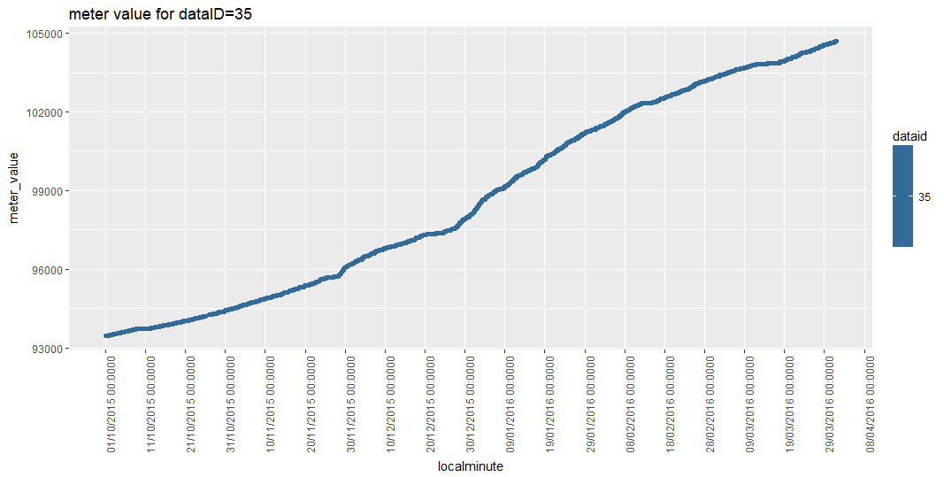
There are 157 dataID, and I manually choose one (dataID=35), and manually extract its’ csv file. I can plot the export Wh value for dataID=35. Below is my coding for plotting dataID=35
> test2 <- read.csv('org_data.csv',colClasses= c('POSIXct', 'integer', 'integer'))
> str(test2)  # string output for original data file
'data.frame':	1584823 obs. of  3 variables:
 $ localminute: POSIXct, format: "2015-10-01 00:00:10" ...
 $ dataid     : int  739 8890 6910 3635 1507 5810 484 6910 6910 5810 ...
 $ meter_value: int  88858 197164 179118 151318 390354 97506 99298 179118 179118 97506 ...
What should I do, if I wanted to add another dataID in the same plot? Is there possible to read data from original file, and filter out the dataID that I wanted to plot?
My original csv file has one million meter-value for 157 dataID, and let’s say if i want to plot only for dataID=35 and dataID=2034?
Since I imagine you may want to plot different combinations of data IDs, it's a good idea to wrap your ggplot2 code in a function so it's easy to reuse. Here's an example of how that might work.
library(data.table)
library(tidyverse)
library(lubridate)
# For a CSV this big, data.table::fread is *much* faster than read.csv
sensor_data <- data.table::fread("dataport_oct2015-mar2016_original.csv")
#> Read 34.7% of 1584823 rows
#> Read 53.0% of 1584823 rows
#> Read 75.7% of 1584823 rows
#> Read 1584823 rows and 3 (of 3) columns from 0.056 GB file in 00:00:05
sensor_data <- sensor_data %>% mutate(
# convert localminute to datetime (fread imports it as character)
localminute = lubridate::as_datetime(localminute),
# convert dataid into a factor that is ordered by the
# maximum meter_value, so that if you plot several dataids
# next to each other with independent y limits (see below),
# adjacent plots will have similarly scaled y axes
dataid = factor(
dataid,
levels = unique(sensor_data[order(sensor_data$meter_value), ]$dataid)
)
)
# Define a plotting function that can take a vector of data IDs
sensor_plot <- function(data, data_id) {
data <- data %>% filter(dataid %in% data_id)
ggplot(data, aes(x = localminute, y = meter_value)) +
geom_line(size = 0.5, color = "steelblue", alpha = 0.5) +
geom_point(shape = 1, size = 0.75) +
# meter_value varies by an order of magnitude between diferent
# data IDs, so the shape of the time series will be clearer
# if you allow each panel to have its own y-axis limits
facet_wrap(~ dataid, scales = "free_y") +
scale_x_datetime(
date_breaks = "10 days",
date_labels = "%d/%m/%Y %H:%M:%S",
minor_breaks = NULL
) +
# using scientific format to simplify y-axis and make
# order of magnitude of data more obvious
scale_y_continuous(
labels = scales::scientific
) +
theme_light() +
theme(axis.text.x = element_text(angle = 90, vjust = 0.5))
}
# Use the plotting function!
# Supply the data IDs that you want to plot in a vector
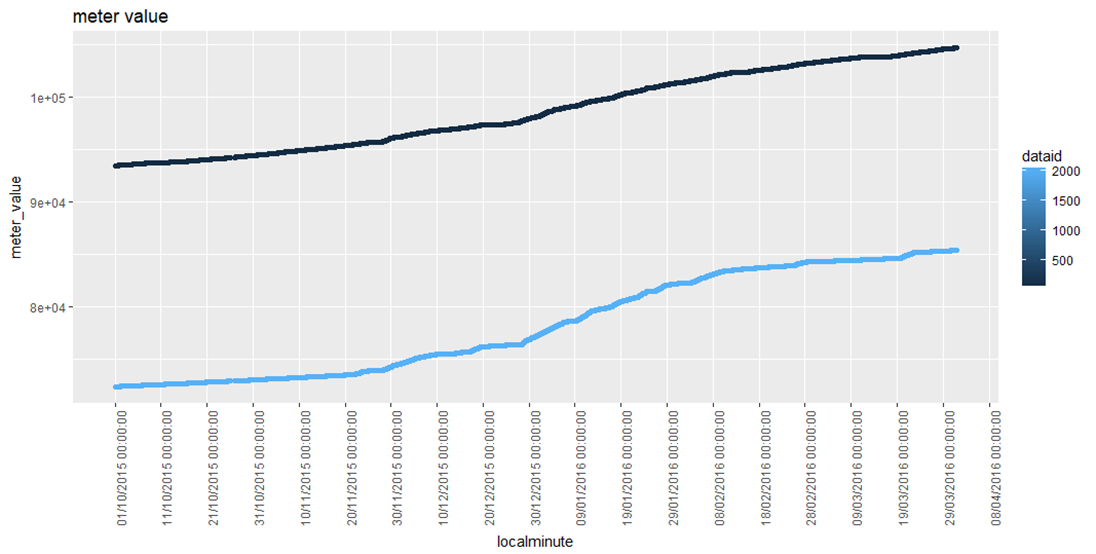
sensor_plot(sensor_data, data_id = c(35, 2034))
Note: I made some plot styling choices in the code above, but you might want to choose different specifications — the documentation has all the details.
More about those freely scaled y-axes...
Your instinct may be to want all the y-axes to match, but I think in this case that is going to obscure your ability to see what's going on with these data.
Here's what happens when you plot a few different data IDs and allow ggplot to choose the best y-axis limits for each panel independently:
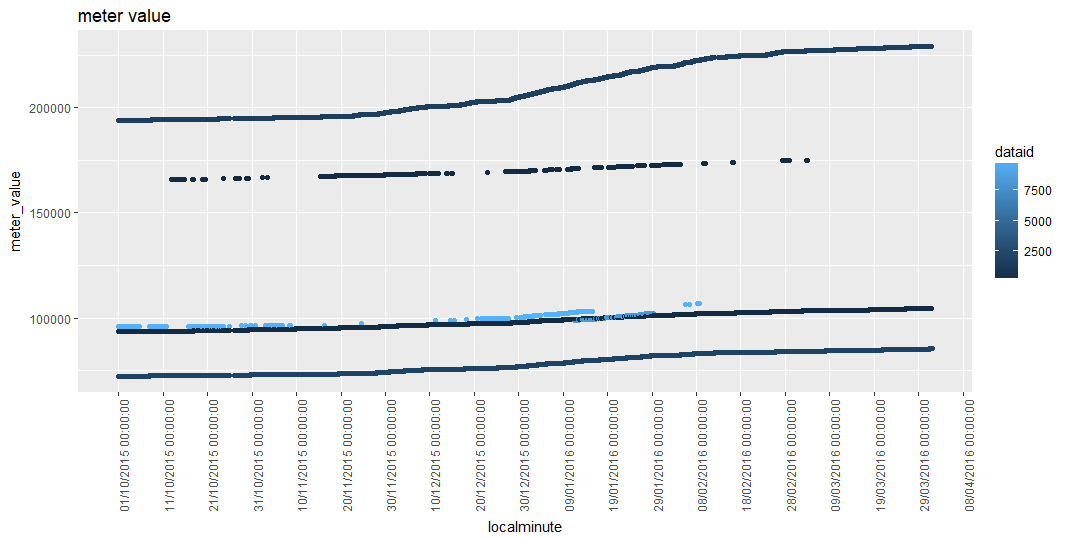
Show all data overlaid. This might be too busy for 157 different series, but you could give it a try. Your existing code should do this, if you feed it the whole original file:
ggplot(test2, aes(x = localminute, y = meter_value,color=dataid))
If it's slow to display, you could try plotting a sampled subset of the data. This might be fine if you're just looking at trends.
ggplot(test2 %>% sample_n(100000), aes(x = localminute, y = meter_value,color=dataid))
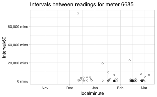
Your earlier post and your question around showing the number of plotted points suggests you are interested in the gaps between measurements. Is that part of the motivation for using geom_point() instead of geom_line() for this sort of time series? If you're interested in highlighted gaps, an alternative approach could be to plot the length of gaps directly -- eg to plot "minutes since prior reading".
Thanks for your suggestion. I will try and post it if I have any issues. From the graphs that you plotted, let's say for dataID=35, I have 11872 data, how should I verify that the graph has plotted all meter value for dataID=35?
I tried your suggested code for plotting two dataIDs in one graph, but legend and Y-axis is not in integer format. How should I display Y-axis as in integer format? I dont want t display as 1e+05.
For using geom_point(), I want to highlight that there is missing data in between. Would you mind, can you show/explain how to plot "minutes since prior reading?
I really think dataid need to be a factor here, since it is categorical data. Right now, since ggplot thinks it's integer data, it's giving it a default continuous color ramp scale. To simplify my code from above, I'd put at least this much at the beginning of your script (you can name the data frame whatever you like, of course!):
sensor_data <- data.table::fread("dataport_oct2015-mar2016_original.csv")

sensor_data <- sensor_data %>% mutate(
  # convert localminute to datetime (fread imports it as character)
  localminute = lubridate::as_datetime(localminute),
  # convert dataid into factor
  dataid = factor(dataid)
)
If you do that before you plot, then ggplot will automatically choose different colors for each value of dataid, instead of a color ramp.
The numbers are large, so you're getting automatic scientific formatting. You can force the large integers to be fully displayed with:
(you can also use the format_format() formatter to access any of the other number formatting options from base format()).
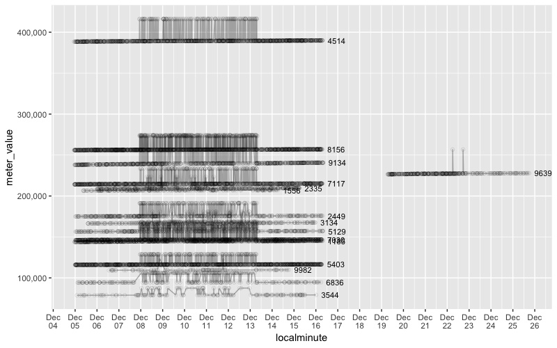
One approach is to use a large faceted plot to visually inspect all the data — it will be a ridiculously big plot, but it will give you a quick overview of where there are meters with noisy out-of-range values. Here's an example. I'm using a line plot because it makes it a lot more obvious where there's a problem:
sensor_plot_all <- ggplot(sensor_data, aes(x = localminute, y = meter_value)) +
    geom_line(size = 0.5) +
    facet_wrap(~ dataid, scales = "free_y") +
    scale_x_datetime(
      date_breaks = "10 days",
      date_labels = "%d/%m/%Y %H:%M:%S",
      minor_breaks = NULL
    ) +
    scale_y_continuous(labels = scales::format_format(scientific = FALSE)) +
    theme_light() +
    theme(axis.text.x = element_text(angle = 90, vjust = 0.5))
}

# It's easier to see the plots if you save to a file with a large width and height.
# I chose PDF because it's resolution independent so the fine details are preserved,
# but you could also save to a PNG.
ggsave(
  "sensor_plot_all.pdf",
   plot = sensor_plot_all,
   height = 50, width = 75, units = "cm",
   limitsize = FALSE
)
It's pretty common for instruments to occasionally experience noisy readings (all the sensor data I have ever worked with has suffered from this problem to some extent!). Your noisy meters just have a few spikes in the middle of otherwise reasonable values (take a look at the big plot!). It's common to remove obviously out-of-range values like these from sensor data as an initial screening step. This means there will be data gaps, which you might just leave in place, or choose to interpolate over — either one can be valid, depending on your scenario.
Sorry I didn't get to this before. Generally speaking, if ggplot doesn't give you a warning that data have been omitted, then all the data have been plotted.
Beyond that, I agree with @jonspring that looking at the intervals between your measurements will give you a better sense of their irregularity. From taking a quick look at your data, there is definitely variation between meters, with some having fairly large gaps between readings, so if that's unexpected (I have no idea where these data come from!), it's definitely worth pursuing further.
You can get the interval between readings for each meter with:
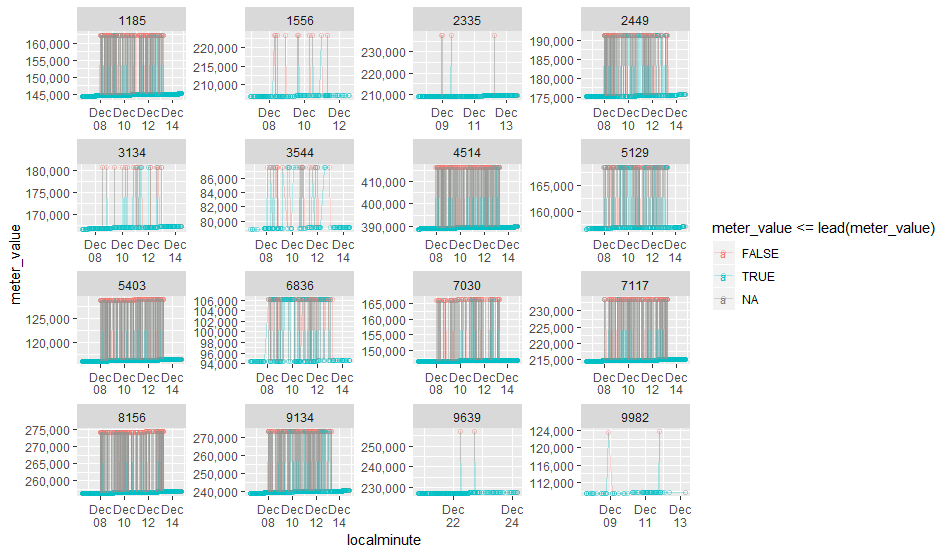
The "noisy" data I noticed before were situations where a meter_value seemed to oscillate between values. On the assumption that a meter reading should always increase, we can identify the ones that break this assumption:
library(data.table)
library(tidyverse)
library(lubridate)

# For a CSV this big, data.table::fread is *much* faster than read.csv
sensor_data <-
  data.table::fread("Downloads/dataport_oct2015-mar2016_original.csv") %>%

  # convert localminute to datetime (fread imports it as character)
  mutate(localminute = lubridate::as_datetime(localminute)) %>%

  # arrange each meter separately
  group_by(dataid) %>%
    arrange(localminute, .by_group = TRUE) %>%
    mutate(interval_hr = (localminute - lag(localminute)) / lubridate::dhours(1),
           meter_change = meter_value - lag(meter_value)) %>%
    ungroup()

# Which have noisy data? (I'm assuming a negative change indicates an error)
noisy_readings <-
  sensor_data %>%
  filter(meter_change < -100)   # Setting here to ignore small changes

# Full list of meters with at least one negative value change
noisy_meters <- unique(noisy_readings$dataid)
# ADDED 2018-05-28

# For each meter with noisy data, define a time window on either side of the noise.
# Window in seconds, so 60*60*24 is one day
noisy_ranges <-
  noisy_readings %>%
  group_by(dataid) %>%
  summarize(min_range = min(localminute) - 60*60*24*3,
            max_range = max(localminute) + 60*60*24*3)

# Join the time window to the original data frame, and only keep rows near noise.
noisy_context <-
  sensor_data %>%
  left_join(noisy_ranges) %>%
  filter(localminute >= min_range,
         localminute <= max_range)

# Plot all the examples of noise
ggplot(noisy_context, aes(localminute, meter_value, group = dataid, label = dataid)) +
  geom_point(shape = 1, alpha = 0.1) +
  geom_line(alpha = 0.3) +
  geom_text(data = noisy_context %>% group_by(dataid) %>% top_n(1, localminute),
            hjust = -0.3, size = 3) +
  scale_y_continuous(labels = scales::comma) +
  scale_x_datetime(date_breaks = "1 day", date_labels = "%b\n%d")
Interesting. It seems a subset of meters went through a period from Dec 8-13 (mostly) where the readings oscillated between a value that was consistent with trend and something roughly 10% higher.
One meter briefly had a similar issue two weeks later.
"mutate" means adding new variable, so the code below is adding localminute which converts 'chr' to 'datetime' and dataid which converts 'int' to 'factor'?
I want to know what will happen,if i run this code, but error as output.
mutate(localminute = lubridate::as_datetime(localminute),dataid = factor(dataid, levels = unique(sensor_data[order(sensor_data$meter_value), ]$dataid) ))
Error in lubridate::as_datetime(localminute) :  #error output
  object 'localminute' not found
I try to understand this part, but abit lost! Would you mind, why use data,data_id function for plotting?
> sensor_plot <- function(data, data_id)
> {
>   data <- data %>% filter(dataid %in% data_id)
I want to plot for fixed Y-axis, how should I change it?
should i change here? correct me, if I am wrong.
The data.table package adds its own class to data frames it creates. It also adds certain attributes related to memory management. This infrastructure is part of how data.table is able to be very fast at handling very large data frames. The data frame is still also a data frame, so you generally don't need to worry about the extra layers of data table attributes.
Yes, data.table tries to auto-detect data types on import, but it falls back to character when that doesn't work, as in this case. You can supply data type information to fread() via a colClasses argument, but I find it more flexible to let lubridate handle the conversion after import (frankly, I find that lubridate does a better job parsing date times).
If you check the documentation for lubridate::as_datetime, you'll see that it parses into UTC by default. Your data have UTC timezone offsets, so this is a reasonable choice. You can choose later to format the date times for display in any time zone you want, but the default display will be in UTC, so:
"2015-10-01 00:00:10-05" before parsing is displayed as
That's the line of code that tells the function as_datetime from the package lubridate to parse localminute from character into POSIXct format.
packageName::functionName is how R represents namespaces — meaning it's how you tell R to look for a function in a specific package, even if that package is not loaded. Strictly speaking, I didn't have to use it here, since lubridate was already loaded at the beginning of my script. However, when I'm using one function from a package that has a similar name to a base function (here, lubridate::as_datetime vs base::as.Date and its variants), I tend to include the namespace just so it's very clear where I'm getting this function from. (Though in this case, maybe it wasn't so clear since you were unfamiliar with the namespace syntax! )
I'm using the base R function order(), which can reorder vectors and data frames in a very powerful way, but unfortunately not a very readable way. Here's a breakdown of the steps, working from the inside out:
order(sensor_data$meter_value) takes the entire vector of meter values and puts it in ascending order
sensor_data[order(sensor_data$meter_value), ] selects the rows of the sensor_data data frame, sorted in order of the meter values; also selects all the columns of the data frame, since the column specification (after the comma) is left blank — so basically, this sorts the whole data frame in ascending order of meter_value
sensor_data[order(sensor_data$meter_value), ]$dataid selects just the dataid column from the data frame that has been sorted by meter_value
unique(sensor_data[order(sensor_data$meter_value), ]$dataid) grabs just the unique values of dataid from the whole vector of dataIDs that was sorted by meter_value
levels = unique(sensor_data[order(sensor_data$meter_value), ]$dataid) passes the result to the levels argument of factor().
The result of all this is that the dataid categories will be displayed in an order that keeps dataIDs with similar meter value ranges closer to each other than would be the case if you just put them in numeric order. You can skip this step (as I did in later code), and you'll get the dataid categories in numerical order.
mutate doesn't just add new variables, it also changes existing variables. If you tell it a new name, it will make a new variable, but if you tell it an existing variable name, it will replace that variable with the new definition you supply. So my mutate() statement converts old character localminute into new POSIXct localminute, and it converts old integer dataid into new factor dataid. The resulting data frame still has 3 variables: localminute, dataid, and meter_level.
If you're going to run dplyr code outside of a pipeline (not using %>%), then you need to supply the data frame as the first argument (the pipe normally supplies this for you). Have you read the dplyr introduction?
Once you've defined a function, you can make many different plots with just one line:
sensor_plot(data = sensor_data, data_id = c(2645, 1619, 2043)) makes a plot with 3 dataIDs.
sensor_plot(data = sensor_data, data_id = c(35)) makes a plot with just dataID 35.
sensor_plot(data = sensor_data, data_id = c(4874, 9295, 7030, 2575)) makes a plot with 4 dataIDs.
Nope, you want to change the value supplied to the scales argument in facet_wrap(), like so: facet_wrap(~ dataid, scales = "fixed"). Have you taken a look at the documentation for facet_wrap, especially the examples? If you want to set your own y-axis limits, you would do that with a separate call to scale_y_continuous:
Right, that's why I recommended in my comment that you immediately save the plot object to a file with a very large page size, and inspect the file rather than trying to look at this plot in the RStudio viewer. It's much too big and slow to look at in the viewer!
As a general note, I think it's great that you're puzzling through the code that people show you and asking questions! If you're finding that you need some more background information on R to make sense of things, you might take a look at this thread which is full of really great suggestions for places to learn about R if you're just getting started:
(for instance, if you want to understand more about that weird trick with order() that I used, I think Hands On Programming with R or The Art of R (both linked in the above thread) are really good resources)
Thanks alot for your explaination. I will read more from the resources that you suggested.
I save the plot object into file and the file is same as what I posted in comment#13, could not able to see graphs if I use facet_wrap(~dataid, scales = "free_y")
Here's what I get when I run the code that I posted before:
It's not at all what I'd recommend for presentation, but it does allow a very quick scan of the data. From there, you might choose individual data IDs to plot, or dig into patterns in other ways (like @jonspring's great suggestions). There's also lots of information out there on automated methods for detecting anomalies in time series data.
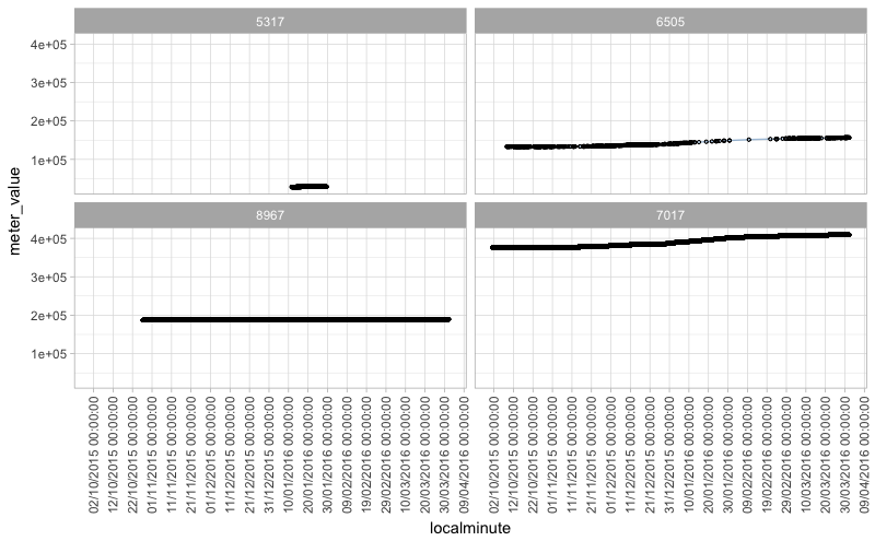
From that 157plots, that Jcblum's "sensor_plot_all.pdf",
I found spikes in these line graphs: 1185,1556,2335,2449,3134,3544,4514,5129,5403,6836,7030,7117,8156,9134,9639,9982,
Can I assume those thick spikes are oscillated/noisyy values? How should we remove those thick spikes from the plot?
There are some overlapping plots in your "Rplot01.jpg". Is it possible to separate each dataID (which has spiky value), like facets function?
I added some analysis to one of my posts last week that isolated the noisy values. I looked for sections where there were negative changes and then filtered to grab those meters and the data on either side of the anomalies. Intriguingly, most of the anomalies happened during the same period, and were of similar scale. That might suggest something unusual happening somewhere in the data chain for those days that affected many meters in similar ways.
One approach to remove those noisy values could be to remove any value that precedes a decline. For instance, you could add something like this early in your data processing, maybe right after load:
This would filter out any values that precede a decline. But it wouldn’t work if there are multiple noisy values in a row, or if any of the noise is below trend.
I imagine a better filter might make a trend line and filter out anomalies that are farther than some threshold away.
Or maybe we could find the median of the last X values, on the assumption that he noise is not the majority of values over that range of data.
Automatic anomaly detection is a tough problem if you don’t know ahead of time what kinds of errors to look out for...
Yes, to facet, you can add "+ facet_wrap(~dataid, scales = "free"). That gives each meter its own facet, and scales the axis for each one.
I was curious to see if my first suggestion would work (answer: not that well) to filter out the readings that have higher readings than the next reading. To try this out quickly, I added a color coding to each point that changes based on that rule. If the test thinks a point is noise, it's red. It works for some of the noisy readings, but not all.