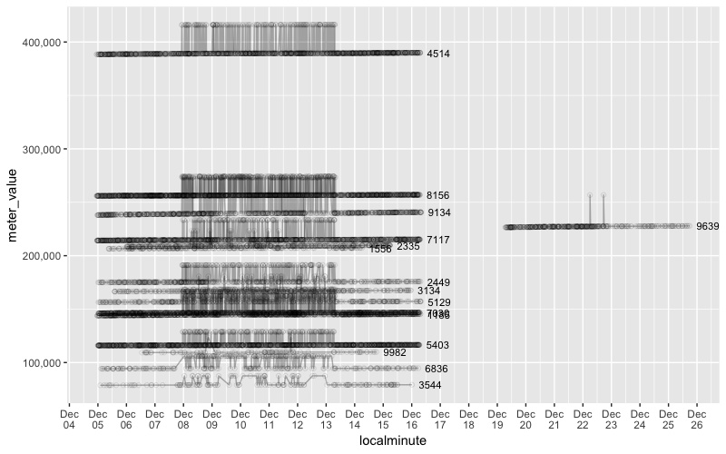
The "noisy" data I noticed before were situations where a meter_value seemed to oscillate between values. On the assumption that a meter reading should always increase, we can identify the ones that break this assumption:
library(data.table)
library(tidyverse)
library(lubridate)

# For a CSV this big, data.table::fread is *much* faster than read.csv
sensor_data <-
  data.table::fread("Downloads/dataport_oct2015-mar2016_original.csv") %>%

  # convert localminute to datetime (fread imports it as character)
  mutate(localminute = lubridate::as_datetime(localminute)) %>%

  # arrange each meter separately
  group_by(dataid) %>%
    arrange(localminute, .by_group = TRUE) %>%
    mutate(interval_hr = (localminute - lag(localminute)) / lubridate::dhours(1),
           meter_change = meter_value - lag(meter_value)) %>%
    ungroup()

# Which have noisy data? (I'm assuming a negative change indicates an error)
noisy_readings <-
  sensor_data %>%
  filter(meter_change < -100)   # Setting here to ignore small changes

# Full list of meters with at least one negative value change
noisy_meters <- unique(noisy_readings$dataid)
# ADDED 2018-05-28

# For each meter with noisy data, define a time window on either side of the noise.
# Window in seconds, so 60*60*24 is one day
noisy_ranges <-
  noisy_readings %>%
  group_by(dataid) %>%
  summarize(min_range = min(localminute) - 60*60*24*3,
            max_range = max(localminute) + 60*60*24*3)

# Join the time window to the original data frame, and only keep rows near noise.
noisy_context <-
  sensor_data %>%
  left_join(noisy_ranges) %>%
  filter(localminute >= min_range,
         localminute <= max_range)

# Plot all the examples of noise
ggplot(noisy_context, aes(localminute, meter_value, group = dataid, label = dataid)) +
  geom_point(shape = 1, alpha = 0.1) +
  geom_line(alpha = 0.3) +
  geom_text(data = noisy_context %>% group_by(dataid) %>% top_n(1, localminute),
            hjust = -0.3, size = 3) +
  scale_y_continuous(labels = scales::comma) +
  scale_x_datetime(date_breaks = "1 day", date_labels = "%b\n%d")
Interesting. It seems a subset of meters went through a period from Dec 8-13 (mostly) where the readings oscillated between a value that was consistent with trend and something roughly 10% higher.
One meter briefly had a similar issue two weeks later.