I have a data frame showing the number of patents by category by country.
I want to create a nested doughnut plot showing the proportion of patents per category on the inner plot and then the breakdown of patent classes by country on the outer plot. Alternatively, I want to show the proportion of countries patenting on the inner plot and then the breakdown of patent classes on the outer plot.
I tried webr and it does this but I have little control over formatting. I prefer to do this in ggplot but I am getting my knickers in a serious knot.
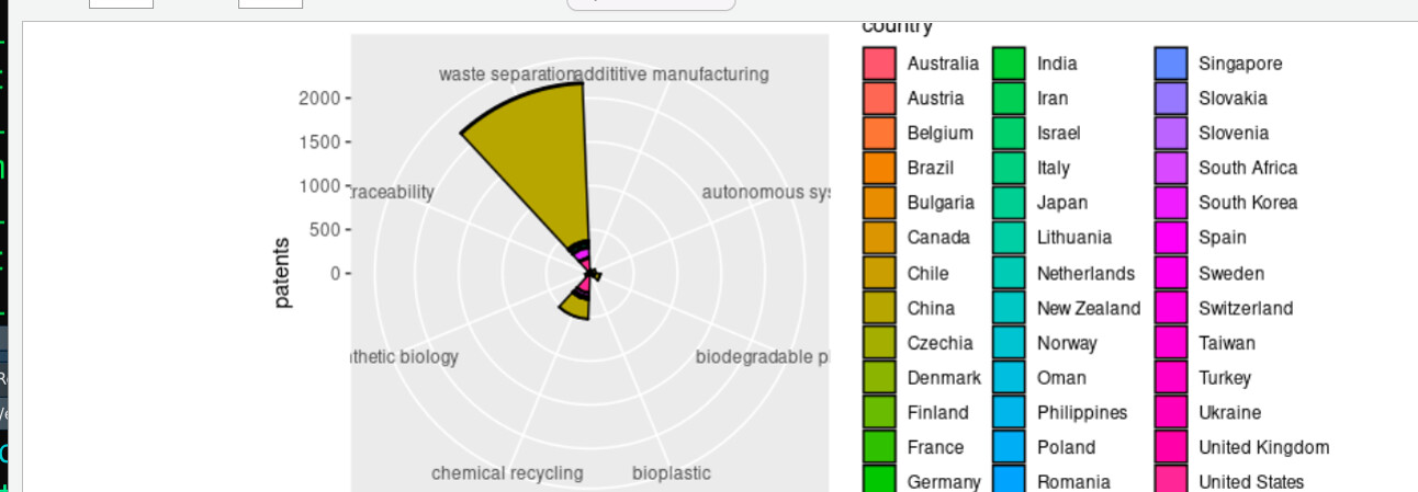
I agree that a pie or donut chart is not appropriate here. Your patent counts are spread across several orders of magnitude, which requires a logarithmic scale. Also, you have too many countries to mark with colour in one plot.
Look at this possible solution. I put a limit on the total number of patents in a country, below this limits all countries are aggregated to "Others". And I use a logarithmic scale. This code will need a lot of tweaking to make a clean, readable plot.