I am working with the R programming language.
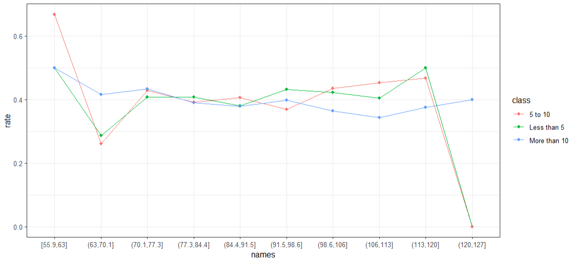
I simulated a dataset, did some data manipulation (in a very clumsy way) and made the following plot.
Simulate Data:
# Step 1 : Simulate Data

set.seed(123)
Hospital_Visits = sample.int(20,  5000, replace = TRUE)
Weight = rnorm(5000, 90, 10)

disease <- c("Yes","No")
disease <- sample(disease, 5000, replace=TRUE, prob=c(0.4, 0.6))
Disease <- as.factor(disease)

my_data = data.frame(Weight, Hospital_Visits, Disease)

my_data$hospital_ntile <- cut(my_data$Hospital_Visits, breaks = c(0, 5, 10, Inf), labels = c("Less than 5", "5 to 10", "More than 10"), include.lowest = TRUE)
Data Manipulation:
# Step 2: Data Manipulation:

my_data$weight_ntile <- cut(my_data$Weight, breaks = seq(min(my_data$Weight), max(my_data$Weight), by = (max(my_data$Weight) - min(my_data$Weight)) / 10), include.lowest = TRUE)


# Create a dataset for rows where hospital_ntile = 'Less than 5'
df1 <- subset(my_data, hospital_ntile == "Less than 5")

# Create a dataset for rows where hospital_ntile = '5 to 10'
df2 <- subset(my_data, hospital_ntile == "5 to 10")

# Create a dataset for rows where hospital_ntile = 'More than 10'
df3 <- subset(my_data, hospital_ntile == "More than 10")

avg_disease_rate_df1 <- tapply(df1$Disease == "Yes", df1$weight_ntile, mean)
avg_disease_rate_df2 <- tapply(df2$Disease == "Yes", df2$weight_ntile, mean)
avg_disease_rate_df3 <- tapply(df3$Disease == "Yes", df3$weight_ntile, mean)

avg_disease_rate_df1[is.na(avg_disease_rate_df1)] <- 0
avg_disease_rate_df2[is.na(avg_disease_rate_df2)] <- 0
avg_disease_rate_df3[is.na(avg_disease_rate_df3)] <- 0

#transform into dataset

names = names(avg_disease_rate_df1)
rate_1 = as.numeric(avg_disease_rate_df1)
rate_2 = as.numeric(avg_disease_rate_df2)
rate_3 = as.numeric(avg_disease_rate_df3)

# stack data
d1 = data.frame(class = "Less than 5", names = names, rate = rate_1)
d2 = data.frame(class = "5 to 10", names = names, rate = rate_2)
d3 = data.frame(class = "More than 10", names = names, rate = rate_3)

plot_data = rbind(d1, d2, d3)
Make Plot:
library(ggplot2)
ggplot(plot_data, aes(x=names, y=rate, group = class,  color=class)) + geom_point() + geom_line() +  theme_bw()

For some reason, the ordering on the x-axis is not in order - right now it appears randomly, I would like to make it from smallest to largest.
I consulted some references which showed how to change this manually - but is there some option within ggplot2 that allows for this ordering to be automatically corrected?
Thanks!