Pie chart outer panel background color

Hi,
I was doing a dark mode RMarkdown page and had problems with ggplot2 theme parameters.
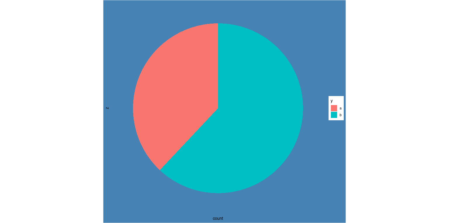
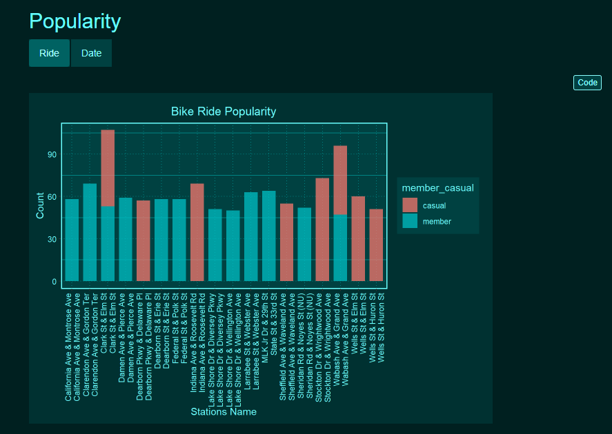
I used bar_point, geom_col for other graphs and the image shows how I want it to.
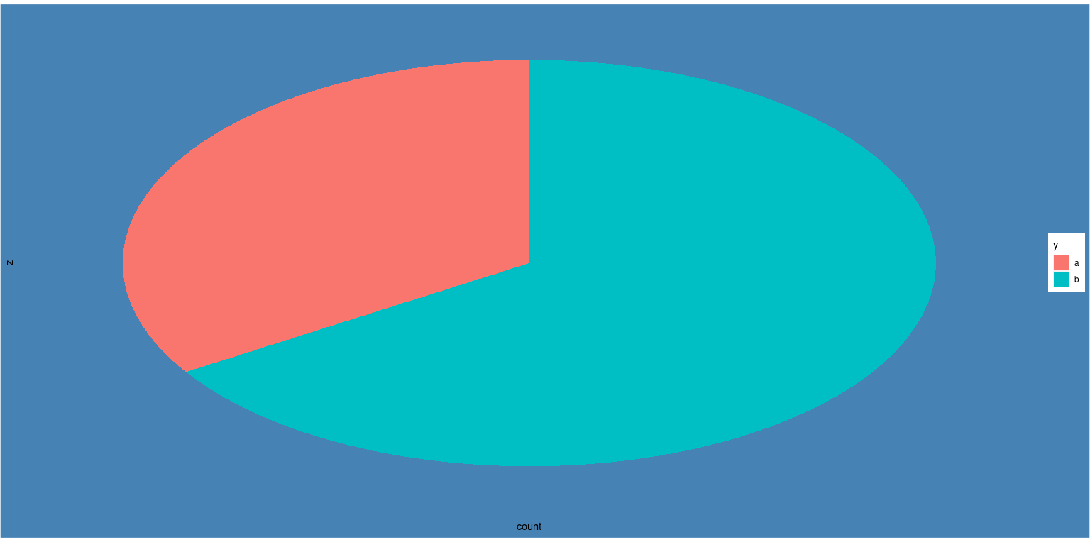
The problem is when I want to introduce a pie chart using geom_point, there is an outer panel background color set to white and I can't seem to change its color.


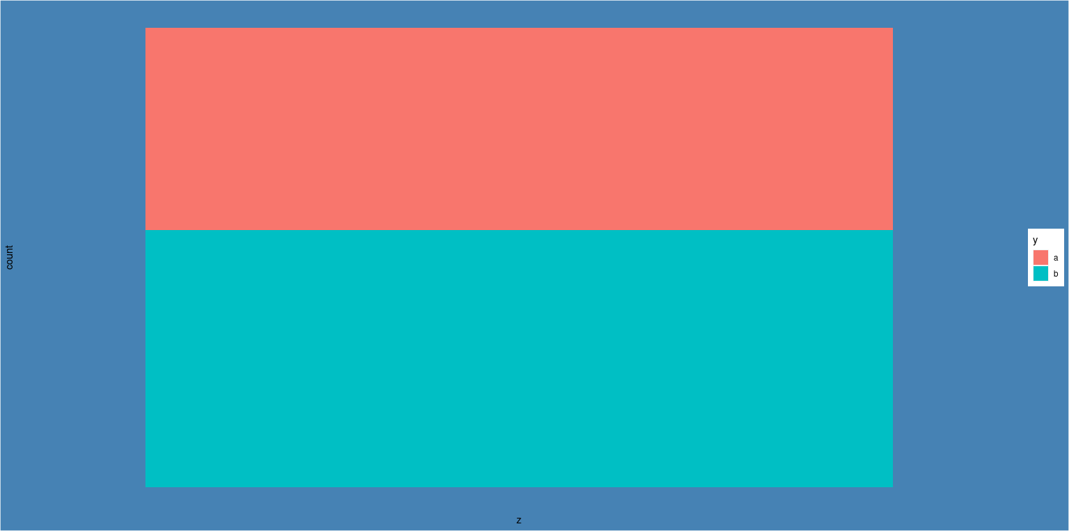
Here is a bar-chart with no problems (other than the label name but shhh)

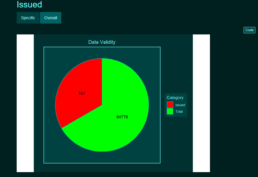
Note: No white outer space in "Specific" tab so it is really the pie chart's image
There are two things I would like to have here today;
I would need the white to be filled by tblCol[4] and also I can't seem to render the filled colors with alpha option inside scale_fill_manual like I would inside geom

Here is the code for the pie chart:

filter(df_Agg, Category == "Total" | Category == "Issued") %>%
  ggplot(mapping = aes(x = "", y = Amount, fill = Category)) +
  geom_bar(stat = "identity", width = 0.75) + 
  geom_col(color = tblCol[12]) + 
  geom_text(aes(label = Amount),
            position = position_stack(vjust = 0.5)) +
  labs(title = "Data Validity",
       x = "",
       y = "") + 
  coord_polar(theta = "y", start = 0) + 
  scale_fill_manual(values = c("red", "green")) +
  theme(axis.title.x = element_text(color = tblCol[22]),
        axis.title.y = element_text(color = tblCol[22]),
        axis.text.x = element_blank(),
        axis.ticks = element_blank(),
        legend.background = element_rect(fill = tblCol[4]),
        legend.key = element_rect(fill = tblCol[4]),
        legend.text = element_text(color = tblCol[22]),
        legend.title = element_text(color = tblCol[22]),
        legend.position = "right",
        panel.background = element_rect(fill = tblCol[4], color = tblCol[4]), 
        panel.grid = element_blank(),
        panel.border = element_rect(fill = NA, color = tblCol[22], size = 1),
        plot.background = element_rect(fill = tblCol[3], color = tblCol[3]),
        plot.title = element_text(color = tblCol[22], hjust = 0.5),
        plot.margin = unit(c(1, 1, 0.5, 0.5), "lines"))

I find it confusing how on the internet there is either lack of explanation or lack of complexity or in-depth about ggplot theme topic. Creating custom theme research leads to custom theme using pre-made themes..

Hello @Xanadu ,

I think this has to do with aspect ratio with polar coords. Given that the panel and plot backgrounds are set to the same colour. Consider the following example, here I replicate the issue you are mentioning.

library(ggplot2)


tibble::tibble(
  x = rnorm(50,150,20),
  y = sample(c("a","b"),
             size = 50,
             replace = T,
             prob = c(0.4,0.6)),
  z = "group"
)|>
  ggplot(aes(z))+
  geom_bar(aes(fill = y),
           position = "fill")+
  #coord_polar(theta = "y")+
  theme(
    panel.grid = element_blank(),
    axis.text = element_blank(),
    axis.ticks = element_blank(),
    plot.background = element_rect(fill = "steelblue"),
    panel.background = element_rect(fill = "steelblue")
    
  )

so for cartesian coords the entire space is filled. But not when I change the coords to polar.

library(ggplot2)


tibble::tibble(
  x = rnorm(50,150,20),
  y = sample(c("a","b"),
             size = 50,
             replace = T,
             prob = c(0.4,0.6)),
  z = "group"
)|>
  ggplot(aes(z))+
  geom_bar(aes(fill = y),
           position = "fill")+
  coord_polar(theta = "y")+
  theme(
    panel.grid = element_blank(),
    axis.text = element_blank(),
    axis.ticks = element_blank(),
    plot.background = element_rect(fill = "steelblue"),
    panel.background = element_rect(fill = "steelblue")
    
  )

So, to address this, If I change the aspect ratio in theme the white space is consumed by the plot.

library(ggplot2)


tibble::tibble(
  x = rnorm(50,150,20),
  y = sample(c("a","b"),
             size = 50,
             replace = T,
             prob = c(0.4,0.6)),
  z = "group"
)|>
  ggplot(aes(z))+
  geom_bar(aes(fill = y),
           position = "fill")+
  coord_polar(theta = "y")+
  theme(
    panel.grid = element_blank(),
    axis.text = element_blank(),
    axis.ticks = element_blank(),
    plot.background = element_rect(fill = "steelblue"),
    panel.background = element_rect(fill = "steelblue"),
    aspect.ratio = 0.5 ### set appropriate value here 
    
  )

Admittedly, this is a hacky solution. But I hope this helps.

Regards,
Ayush

3 Likes

Thanks a lot! Really great answer.
aspect.ratio = 0.772 seems to be the very solution for me.

2 Likes

This topic was automatically closed 7 days after the last reply. New replies are no longer allowed.

If you have a query related to it or one of the replies, start a new topic and refer back with a link.