plot discrete data set

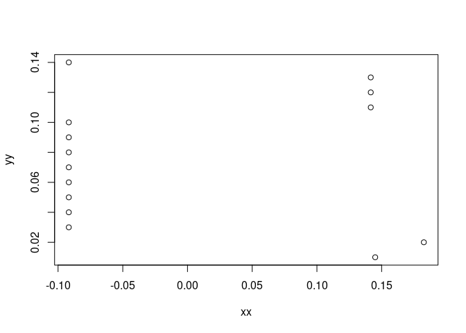
I have a set of discrete values.

x= [0.14504024 , 0.18261047, -0.09171451 ,-0.09171451, -0.09171451 ,-0.09171451 ,-0.09171451 ,-0.09171451, -0.09171451 ,-0.09171451, 0.14160323 , 0.14160323, 0.14160323 -0.09171451 ]

y= [ .01,.02,.03,.05 ,..., . 14]

my first question : how can I plot these discrete data set in a way that can show me the decreasing and increasing in my data ?

Secondly, for y .03 to y .10 and y .14 we have the same value = -0.09171451, how can I assign the values to all of them without repeating. especially if I a have 100 data for example rather than this small set

Thank you

Is this a python, rather than an R question?

This implies that you don't have a data source from which you import the values ? typically data comes to analysts via files, api calls, or database queries; can you confirm that none of these types are your source for data ?

it is R question . The values I want to plot are results from my calculation. each value in x correspond to the y value . e.g. ( 0.14504024 , .01) and ( 0.18261047,.02) etc

We really need some usable sample data.

is not it. Firstly

x= [0.14504024 , 0.18261047, -0.09171451 ,-0.09171451, -0.09171451 ,-0.09171451 ,-0.09171451 ,-0.09171451, -0.09171451 ,-0.09171451, 0.14160323 , 0.14160323, 0.14160323 -0.09171451 ]

is not a valid statement in R

x  = c(0.14504024 , 0.18261047, -0.09171451 ,-0.09171451, -0.09171451 ,-0.09171451 ,-0.09171451 ,-0.09171451, -0.09171451 ,
    -0.09171451, 0.14160323 , 0.14160323, 0.14160323 -0.09171451)

or preferably

x  <-   c(0.14504024 , 0.18261047, -0.09171451 ,-0.09171451, -0.09171451 ,-0.09171451 ,-0.09171451 ,-0.09171451, -0.09171451 ,
    -0.09171451, 0.14160323 , 0.14160323, 0.14160323 -0.09171451)

are valid.

is meaningless in relation to x since x has 13 elements and there is no obvious way to expand y to 13 elements.

Havee a look at FAQ: How to do a minimal reproducible example ( reprex ) for beginners

Then it seems I don't understand the problem you face; you ask how to assign values, that you already have as a result of a calculation....

x  <-   c(0.14504024 , 0.18261047, -0.09171451 ,-0.09171451, -0.09171451 ,-0.09171451 ,-0.09171451 ,-0.09171451, -0.09171451 ,
    -0.09171451, 0.14160323 , 0.14160323, 0.14160323,  -0.09171451)

[/quote]

sorry I forgot the comma between the last two values 0.14160323 , -0.09171451.

So in total we have 14 values for x

my first question is about plotting. My second question is how to assign the same value to multiple variables at once.

you can use rep() to repeat a value; I don't see why you would need to unless you were inventing data. otherwise you would just pull the required data from its source ...

here is a simple plot example :

# some made up data not sourced from any other data i..e handcrafted 
(myexample_x <- 1:10)
(myexample_y <- c(5:1,2*(1:5)))

# now we have some data, can plot 
plot(x=myexample_x,
     y=myexample_y)

I think @ safara has a data set that looks like this

xx <- c(0.14504024 , 0.18261047, -0.09171451 ,-0.09171451, -0.09171451 ,-0.09171451 ,-0.09171451 ,-0.09171451, -0.09171451 ,
    -0.09171451, 0.14160323 , 0.14160323, 0.1416032, -0.09171451)

yy <- seq(0.01, 0.14, by = 0.01)

plot(xx, yy)


table(xx)
#> xx
#> -0.09171451   0.1416032  0.14160323  0.14504024  0.18261047 
#>           9           1           2           1           1

Created on 2023-02-21 with reprex v2.0.2

thank you jrkrideau;
on that basis I might try an approach like :

xx <- c(0.14504024 , 0.18261047, -0.09171451 ,-0.09171451, -0.09171451 ,-0.09171451 ,-0.09171451 ,-0.09171451, -0.09171451 ,
        -0.09171451, 0.14160323 , 0.14160323, 0.1416032, -0.09171451)

yy <- seq(0.01, 0.14, by = 0.01)

library(tidyverse)

(data_prep <- data.frame(my_y=xx,
           my_x=yy) |> mutate(ydiff=lead(my_y) - my_y ,
                           change=case_when(ydiff>0~">",
                                            ydiff<0~"<",
                                            TRUE ~ "="
                                            )))
ggplot(data=data_prep,
       aes(x=my_x,
           y=my_y,color=change,group=1)) + 
  geom_point(color="green",size=4) + 
  geom_line(alpha=.5) + scale_color_manual(
    values=c(">"="blue","<"="red","="="black")
  )

Thank you very much! I copied your code but unfortunately it gave me error

Error: unexpected '>' in:
"(data_prep <- data.frame(my_y=xx,
                         my_x=yy) |>"
>                                             change=case_when(ydiff>0~">",
+                                                              ydiff<0~"<",
+                                                              TRUE ~ "="
+                                             )))
Error: unexpected ')' in:
"                                                             TRUE ~ "="
                                            ))"


I am not sure why I received this error while I copied your code 

It could be you are using an old r version.
If so you can upgrade R, or replace every
|> with %>%

I am using Rstudio. After I replace |> with %>% the first command work with me. however when I run the ggplot function I received

Error in datggplot(data = data_prep, aes(x = my_x, y = my_y, color = change,  : 
  could not find function "datggplot"

It looks like a copy & paste error. Try

ggplot(data=data_prep,
                      aes(x=my_x,
                          y=my_y,color=change,group=1)) + 
         geom_point(color="green",size=4) + 
         geom_line(alpha=.5) + scale_color_manual(
           values=c(">"="blue","<"="red","="="black")
         )

Thank you very much!

This topic was automatically closed 7 days after the last reply. New replies are no longer allowed.

If you have a query related to it or one of the replies, start a new topic and refer back with a link.