plot using normalized values

Hello,

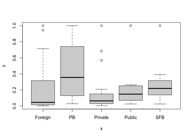
Using a cross-sectional data for banks, I am trying to make a plot (sample attached) using the normalized values for different ownership groups mentioned in the sample data.

Please help me.

Thanks in advance

bank	ownership	ta_nrm
HSBC	Foreign	1
CITI	Foreign	0.944
STANC	Foreign	0.713
DB	Foreign	0.598
DBSI	Foreign	0.341
BOA	Foreign	0.289
BNPP	Foreign	0.237
SUIS	Foreign	0.084
CACIB	Foreign	0.067
ANZ	Foreign	0.051
SOCGEN	Foreign	0.037
SBMBI	Foreign	0.033
NTWST	Foreign	0.019
ICBC	Foreign	0.015
RABO	Foreign	0.015
BBK	Foreign	0.01
UOBM	Foreign	0.006
DOHAB	Foreign	0.005
SBER	Foreign	0.004
FIRST	Foreign	0.001
IPPB	PB	0.481
AIRTEL	PB	0.229
NSDLPB	PB	0.027
PAYTM	PB	1
AXIS	Private	0.568
BNDHN	Private	0.067
BOM	Private	0.111
CSB	Private	0.012
CSFB	Private	0.003
CUB	Private	0.03
DCB	Private	0.022
DLB	Private	0.007
FED	Private	0.107
HDFC	Private	1
ICICI	Private	0.684
IDBI	Private	0.146
IDFC	Private	0.092
INDUS	Private	0.195
JKB	Private	0.063
KRNTK	Private	0.045
KARUR	Private	0.039
KOTAK	Private	0.208
NB	Private	0.004
RBL	Private	0.051
SOUTH	Private	0.048
TMB	Private	0.026
YES	Private	0.154
BOB	Public	0.256
BOI	Public	0.147
CNRB	Public	0.246
CBI	Public	0.078
IND	Public	0.135
IOB	Public	0.06
PSB	Public	0.024
PNB	Public	0.263
SBI	Public	1
UCO	Public	0.054
UNION	Public	0.238
AUSFB	SFB	1
ESFB	SFB	0.39
ESAF	SFB	0.256
FSFB	SFB	0.162
FINO	SFB	0.024
JANA	SFB	0.292
NESFB	SFB	0.034
SSFB	SFB	0.118
USFB	SFB	0.341
UNITY	SFB	0.156
UTKRSH	SFB	0.218

Consider using the more informative boxplot

d <- tibble::tribble(
     ~bank, ~ownership, ~ta_nrm,
    "HSBC",  "Foreign",       1,
    "CITI",  "Foreign",   0.944,
   "STANC",  "Foreign",   0.713,
      "DB",  "Foreign",   0.598,
    "DBSI",  "Foreign",   0.341,
     "BOA",  "Foreign",   0.289,
    "BNPP",  "Foreign",   0.237,
    "SUIS",  "Foreign",   0.084,
   "CACIB",  "Foreign",   0.067,
     "ANZ",  "Foreign",   0.051,
  "SOCGEN",  "Foreign",   0.037,
   "SBMBI",  "Foreign",   0.033,
   "NTWST",  "Foreign",   0.019,
    "ICBC",  "Foreign",   0.015,
    "RABO",  "Foreign",   0.015,
     "BBK",  "Foreign",    0.01,
    "UOBM",  "Foreign",   0.006,
   "DOHAB",  "Foreign",   0.005,
    "SBER",  "Foreign",   0.004,
   "FIRST",  "Foreign",   0.001,
    "IPPB",       "PB",   0.481,
  "AIRTEL",       "PB",   0.229,
  "NSDLPB",       "PB",   0.027,
   "PAYTM",       "PB",       1,
    "AXIS",  "Private",   0.568,
   "BNDHN",  "Private",   0.067,
     "BOM",  "Private",   0.111,
     "CSB",  "Private",   0.012,
    "CSFB",  "Private",   0.003,
     "CUB",  "Private",    0.03,
     "DCB",  "Private",   0.022,
     "DLB",  "Private",   0.007,
     "FED",  "Private",   0.107,
    "HDFC",  "Private",       1,
   "ICICI",  "Private",   0.684,
    "IDBI",  "Private",   0.146,
    "IDFC",  "Private",   0.092,
   "INDUS",  "Private",   0.195,
     "JKB",  "Private",   0.063,
   "KRNTK",  "Private",   0.045,
   "KARUR",  "Private",   0.039,
   "KOTAK",  "Private",   0.208,
      "NB",  "Private",   0.004,
     "RBL",  "Private",   0.051,
   "SOUTH",  "Private",   0.048,
     "TMB",  "Private",   0.026,
     "YES",  "Private",   0.154,
     "BOB",   "Public",   0.256,
     "BOI",   "Public",   0.147,
    "CNRB",   "Public",   0.246,
     "CBI",   "Public",   0.078,
     "IND",   "Public",   0.135,
     "IOB",   "Public",    0.06,
     "PSB",   "Public",   0.024,
     "PNB",   "Public",   0.263,
     "SBI",   "Public",       1,
     "UCO",   "Public",   0.054,
   "UNION",   "Public",   0.238,
   "AUSFB",      "SFB",       1,
    "ESFB",      "SFB",    0.39,
    "ESAF",      "SFB",   0.256,
    "FSFB",      "SFB",   0.162,
    "FINO",      "SFB",   0.024,
    "JANA",      "SFB",   0.292,
   "NESFB",      "SFB",   0.034,
    "SSFB",      "SFB",   0.118,
    "USFB",      "SFB",   0.341,
   "UNITY",      "SFB",   0.156,
  "UTKRSH",      "SFB",   0.218
  )
d$ownership <- as.factor(d$ownership)
plot(d$ownership,d$ta_nrm)

Created on 2023-03-26 with reprex v2.0.2

1 Like

Thanks a lot. I need a plot in the format mentioned.

When i look at your post, i see a plot. Is there something wrong with it ?

this the sample plot I need to plot according to the different ownership categories.

What method would you use to aggregate ?

The only group variable is ownership because all the bank values are unique. All that is left to plot against is the continuous variable ta_nrm and it has different ranges across the groups. Without some further decomposition of the continuous variable, there is no way to show comparisons among the five groups. As it stands, there is no way to construct the plot because it is unknown whether the y-axis should represent min, max, mean, median, sd or some other statistic. Even if there were line is the wrong aesthetic to relate groups because there is no continuous x-axis.

1 Like

Thank you I made the graph using ggplot.

This topic was automatically closed 7 days after the last reply. New replies are no longer allowed.

If you have a query related to it or one of the replies, start a new topic and refer back with a link.