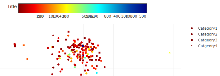
I've created a scatter graph using plotly within R.
The colour of the dots indicates one thing, and the shape of the dots indicates another thing.
I'm using a colourscale to show values but the legend is all mixed up; it seems to be overlapping numbers (possibly from x axis and actual data values).
How do I solve this?
Thanks for providing code. Could you kindly take further steps to make it easier for other forum users to help you? Share some representative data that will enable your code to run and show the problematic behaviour.
How do I share data for a reprex?
You might use tools such as the library datapasta, or the base function dput() to share a portion of data in code form, i.e. that can be copied from forum and pasted to R session.