im trying to plot daily log stock returns using ggplot
> ggplot(dwx, aes(x = date, y= log_returns)) + geom_line()
this is the resulting plot
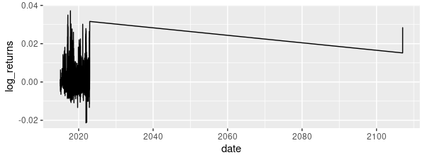
my data range is from 1/1/2015 to 22/12/2022 so this is really bizarre.
heres a glimpse at my data
> head(dwx)
# A tibble: 6 × 7
  date                index  ...3  ...4 ramadan simple_ret log_returns
  <dttm>              <dbl> <dbl> <dbl>   <dbl>      <dbl>       <dbl>
1 2015-01-05 00:00:00 1268.     1     5       0  NA          NA
2 2015-01-06 00:00:00 1268.     1     6       0  -0.000520   -0.000521
3 2015-01-08 00:00:00 1267.     1     8       0  -0.000181   -0.000181
4 2015-01-12 00:00:00 1266.     1    12       0  -0.000939   -0.000939
5 2015-01-13 00:00:00 1268.     1    13       0   0.00129     0.00129
6 2015-01-14 00:00:00 1268.     1    14       0   0.000410    0.000410
i tried everything from removing na values to set a limit for dates but kept getting error messages
 > p3 <- ggplot(dwx, aes(x=date, y=log_returns)) + geom_line() + ggtitle("daily log returns of dwx") + xlab("year") + ylab("Log Returns") +  scale_x_date(limits = as.Date(c('2015-01-05','2022-12-22')))
> p3
Error: Invalid input: date_trans works with objects of class Date only
i do not know what im doing wrong