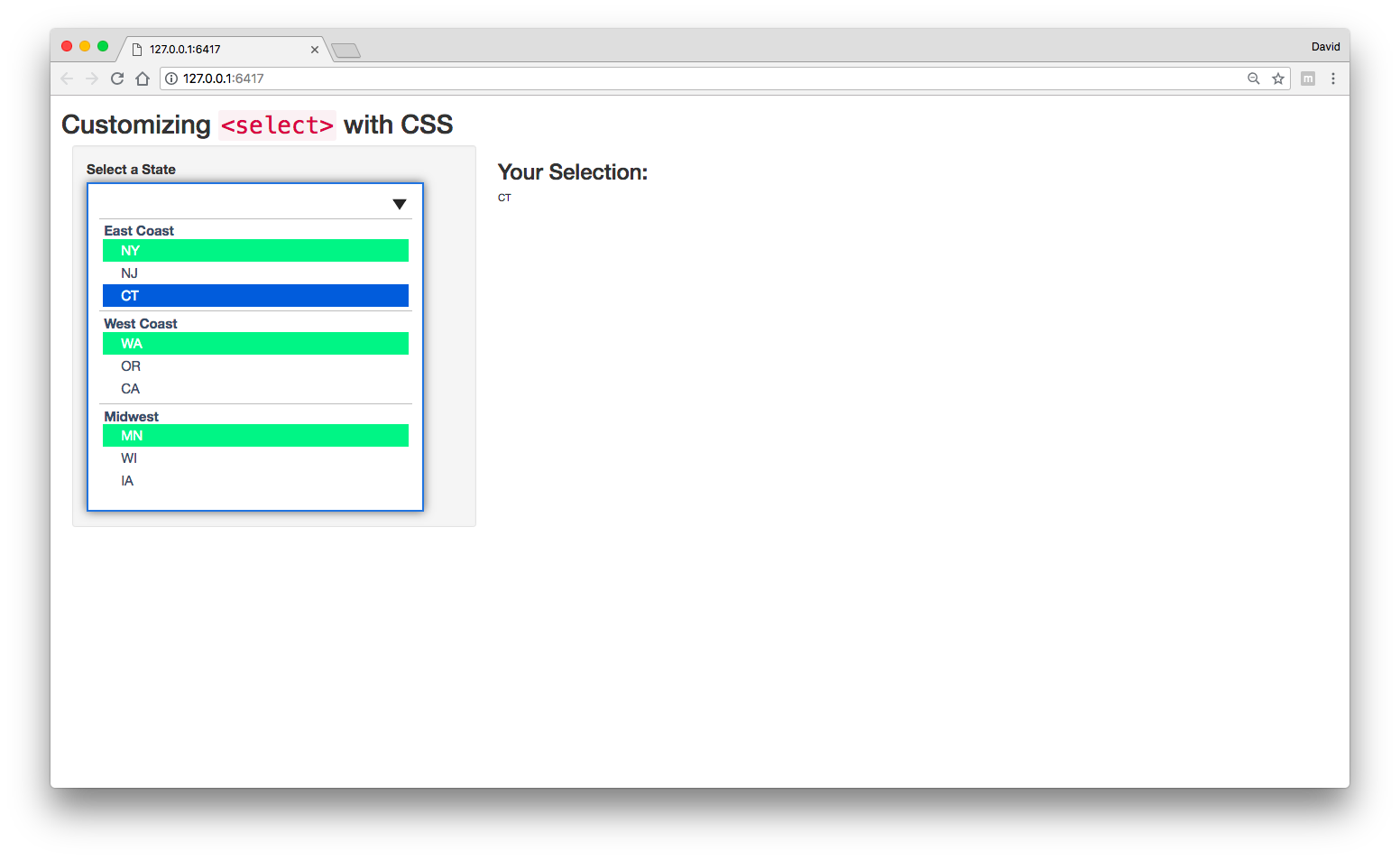
This was a fun one! I went ahead and applied custom styling for <select>. Here's what it looks like.
The first thing I did was create a new r project and created a separate css file. I originally had it all in one file, but it was starting to become difficult to manage. At the end of this post, you can find a link to the project on github.
ui.R
The two things that I'd like to point out are the label and select elements. In the previous post, I mentioned that using tags$select might be a better option for adding custom styling. The structure to create the input using example provided ended up looking like this.
# label
tags$label("for"="state", "Select a State", class="input-label"),

# input
tags$select(id="state","onfocus"='this.size=13;', "onblur"='this.size=1;' ,
            "onchange"='this.size=1; this.blur();',

            # default
            tags$option(value = "none", ""),

            # east coast
            tags$optgroup("label" = "East Coast",
                          tags$option(value = "NY", "NY"),
                          tags$option(value = "NJ", "NJ"),
                          tags$option(value = "CT", "CT")
            ),

            # west coast
            tags$optgroup("label" = "West Coast",
                          tags$option(value = "WA","WA"),
                          tags$option(value = "OR","OR"),
                          tags$option(value = "CA","CA")
            ),

            # midwest
            tags$optgroup("label" = "Midwest",
                          tags$option(value = "MN","MN"),
                          tags$option(value = "WI","WI"),
                          tags$option(value = "IA","IA")
            )
)
In tags$select, the attributes onfocus, onblur, and onchange are event listeners and allow you to define the behaviors when the input is active, inactive, and closed. For example, If you used "onfocus"='this.size=6;', you will only see the first 6 elements (-ish depending on other styling - padding, margins, etc.). onblur sets the number of elements to display after is inactive (no longer focused; e.g., if the menu is opened and the user clicks another part of the page) and onchange sets the number of elements to display once an option is selected.
CSS
I won't go through all of the css properties as I'd like to highlight the parts the address your questions. I've added comments in the css file that explain what each block is doing.
Styling <select>
In order to add styling to the input, I set the -webkit-appearance to none (webkit and moz are vender prefixes for chrome and mozilla's FireFox). I set the width of the input to 90% of the parent element (sidebarPanel). This will allow the input to be resized accordingly when the browser dimensions are changed (resized).
Since we are adding new styles, I wrote a menu button and set it as the background. background-position sets the position of the icon (x = 95%; y = 20px).
/* primary styling for <select> + manually add menu button */
#state{
    -webkit-appearance:none;
    -moz-appearance:none;
    width: 90%;
    padding: 15px;
    font-size: 14pt;
    border-radius: 0;
    outline: none;
    border: 2px solid #3A506B;
    color: #3A506B;
    background: url(menu-chevron-down.svg) no-repeat;
    background-position: 95% 20px;
    background-color: white;
}
For the first <option> in each <optgroup>, set the background to green
For setting the background color, I used descendent selector paths to select the first element in each group. This says within the element with the id of state select the option groups, and then select the first child in each group. (If you wanted the second item in each group, it would be :nth-child(2)).
#state optgroup option:nth-child(1){
    background-color: #31E981 !important;
    color: white;
}
I was a bit confused as to if you wanted the first options in all of the groups or the first options in the first two groups. If the later, use the following recipe:
#state optgroup:nth-child(-n+3) option:nth-child(1){...}
For other options, see the css tricks :nth-child recipes doc.
Hope that helps!
As promised, here's the link to the github repo: shiny select input styling demo.