Hi,
I have a data of growth rate year-wise. I have 2 issues here:
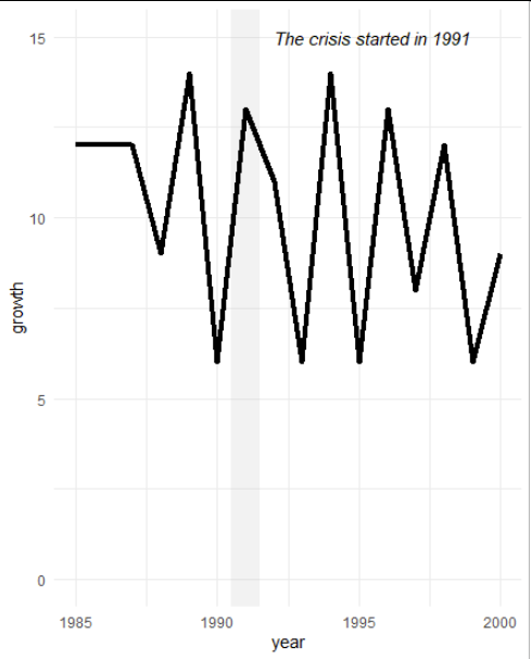
An additional requirement is that an economic crisis happened in 1991. I need to shade that area with a particular color (let's say grey) to highlight that a crisis was there.
I need to give Y-axis scale from 0 to 14. Now it is showing 6 to 14.
to draw the shaded area you can use "annotate" and draw a rectangle, defined by its 4 corners.
data %>%
  ggplot(aes(year,growth))+

  theme_minimal() +
  # show a rect defining the time
  annotate(geom = "rect",
           xmin = 1990.5, xmax = 1991.5,
           ymin = -Inf, ymax = Inf,
           fill = "grey", alpha = 0.2) +
  # add some text
  annotate(geom = "text",
           x = 1992, y = 15,
           label = "The crisis started in 1991",
           fontface = "italic", hjust = 0) +
  geom_line(size=1.5)+
  scale_y_continuous(limits = c(0, 15))   # set the limits to include the 0
Inf and -Inf refers to the boundaries of the plot, in this way you don't have to tweak the numbers so it matches what is shown but just draws it along the full y-axis range.