Hi All,
I've recently been using a newly published package called ordinalEditDistance.
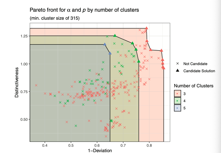
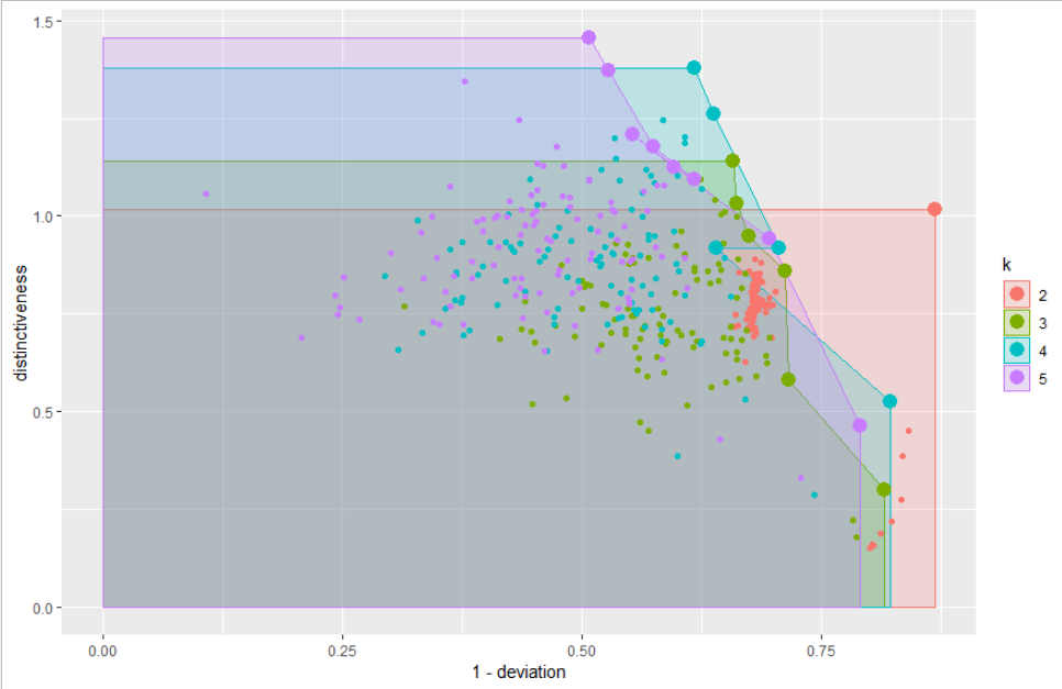
It is a clustering routine, but with some novel cluster performance metrics. These performance metrics are typically visualised in terms of a frontier type diagram.
However, there's a departure between the example code, and published visuals. I wondered if someone could help with a process of making the the example output look more like published output?
This would include a demonstration on how to include shaded regions in the demo diagram, and joining the regions so that the frontiers meet both axes.
Any help would be appreciated ![]()
devtools::install_github(“HannahJohns/ordinalEditDistance”)library(ordinalEditDistance)
library(parallel)
library(ggplot2)
library(tibble)
library(rPref)
#EXAMPLE DATA
df <- example_data
#DATA AS LIST
levelList <- by(example_data,example_data$id,function(df){
df$state[order(df$step)]
})
#EVALUATING CLUSTER PERFORMANCE
cl <- makeCluster(round(0.6*parallel::detectCores()))
results <- evaluateClusters(levelList,
a=seq(0,1,length.out=11),
p=seq(1,5,length.out=11),
k = c(2,3,4,5),cl = cl)
stopCluster(cl)
## IDENTIFYING PARETO OUTPUT
pareto <- do.call("rbind",by(results,results$k,function(df){
psel(df,high(distinctiveness) * low(deviation))
}))
## PLOT
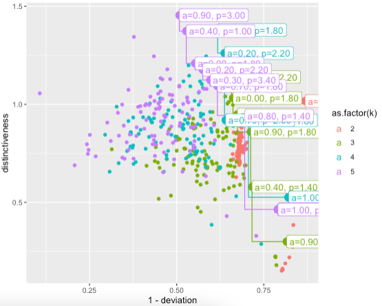
ggplot(results,
aes(x=1-deviation,
y=distinctiveness,
color=as.factor(k))
) +
geom_point()+
geom_point(data=pareto,size=4)+
geom_step(data=pareto,direction = "vh")+
geom_label(data=pareto,size=4,hjust=0,
aes(label=sprintf("a=%0.2f, p=%0.2f",a,p))
)
DEMO
PUBLISHED