Hye there,
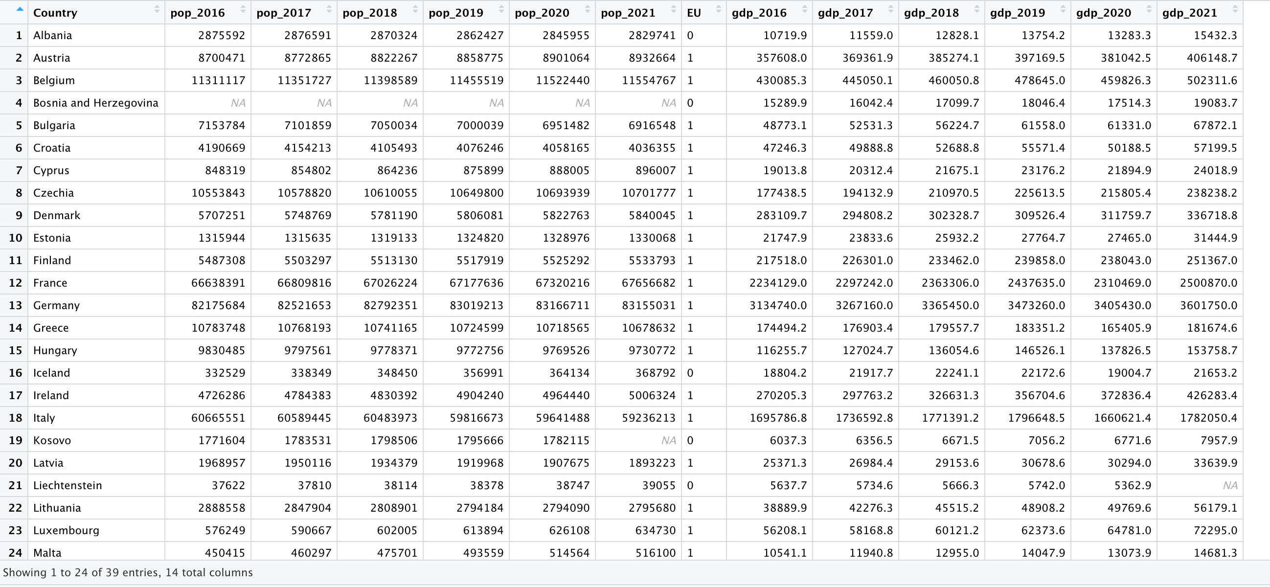
I have a dataset (dataset4) representing the gdp over years for different countries.
I have EU and non EU country.
I need to do a figure representing the maxium gdp over the years for each type of countries by two lines : one for EU countries and the other one for non-EU countries. I am struggling a lot. I don't know how to do so.
I have tried this code but it doesn't work.
library(dplyr)
library(ggplot2)
ggplot(dataset4, aes(x=years, y=gdp, col=CountryName)) +
geom_line() +
geom_line(data=dataset4, aes(y=m), col="blue", lty=2) +
labs(caption = "maximum gdp over years") +
theme_minimal() +
theme(legend.title=element_blank(), legend.position = "bottom",
plot.caption = element_text(hjust = 0, face="italic"))
If someone knew how to solve it, it would be great.
Thanks in advance,
Alex
What have you tried so far? what is your specific problem?, we are more inclined towards helping you with specific coding problems rather than doing your work for you.
Could you please turn this into a self-contained REPRoducible EXample (reprex)? A reprex makes it much easier for others to understand your issue and figure out how to help.
If you've never heard of a reprex before, you might want to start by reading this FAQ:
I agree with @nirgrahamuk that you should use the pivot_longer() function. You need to create the "years" column that is in the code from your first post but does not currently exist in your data set.
After pivoting and a bit of tidying, your data should look something like this, with a "EU" column instead of "continent" and "gdp" instead of "gdpPercap".
For the next step I suggest reading section 5.6 (Grouped summaries with summarise()) from chapter 5 of the same book.
gapminder::gapminder |> head(n = 20)
#> # A tibble: 20 × 6
#>    country     continent  year lifeExp      pop gdpPercap
#>    <fct>       <fct>     <int>   <dbl>    <int>     <dbl>
#>  1 Afghanistan Asia       1952    28.8  8425333      779.
#>  2 Afghanistan Asia       1957    30.3  9240934      821.
#>  3 Afghanistan Asia       1962    32.0 10267083      853.
#>  4 Afghanistan Asia       1967    34.0 11537966      836.
#>  5 Afghanistan Asia       1972    36.1 13079460      740.
#>  6 Afghanistan Asia       1977    38.4 14880372      786.
#>  7 Afghanistan Asia       1982    39.9 12881816      978.
#>  8 Afghanistan Asia       1987    40.8 13867957      852.
#>  9 Afghanistan Asia       1992    41.7 16317921      649.
#> 10 Afghanistan Asia       1997    41.8 22227415      635.
#> 11 Afghanistan Asia       2002    42.1 25268405      727.
#> 12 Afghanistan Asia       2007    43.8 31889923      975.
#> 13 Albania     Europe     1952    55.2  1282697     1601.
#> 14 Albania     Europe     1957    59.3  1476505     1942.
#> 15 Albania     Europe     1962    64.8  1728137     2313.
#> 16 Albania     Europe     1967    66.2  1984060     2760.
#> 17 Albania     Europe     1972    67.7  2263554     3313.
#> 18 Albania     Europe     1977    68.9  2509048     3533.
#> 19 Albania     Europe     1982    70.4  2780097     3631.
#> 20 Albania     Europe     1987    72    3075321     3739.