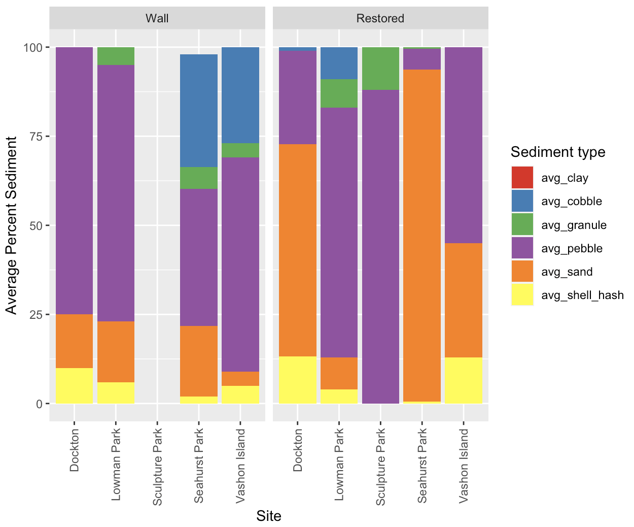
I want to modify this output graph so that each Wall and Restored bar is next to each other for each site. The wall and restored are the site types:
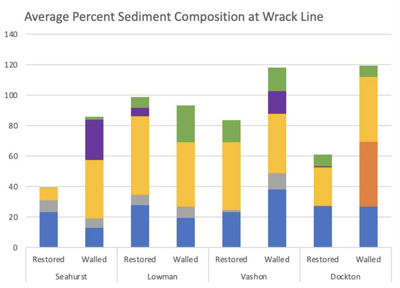
This is the graph that I would like it to resemble in terms of formatting the bar placements:
Here is my code:
ggplot(sed_avg_long, aes(x = Site, y = Avg_Percentage, fill = Sediment_Type))+
geom_bar(stat = "identity") +
facet_grid(~Site_Type, scales = "fixed") +
labs(x = "Site", y = "Average Percent Sediment", fill = "Sediment type") +
theme(axis.text.x = element_text(angle = 90, vjust = 0.5, hjust=1)) +
scale_fill_brewer(palette="Set1")
Please Help!